
Further Exploring The Fujifilm X100F
Exploring The Film Simulation Modes Of The X100F
As I mentioned a couple of weeks ago, I purchased a Fujifilm X100F while on business trip to South Africa. And based on the numerous reviews available, and my own first impressions with this camera, I am convinced that this is the perfect tool for street photography.
The process of obtaining my visa and work permit for South Africa is unfortunately taking longer than expected, and I am still here in the USA. So last week I took the X100F out for a walk downtown Greenville, SC.
Besides working on my street photography skills, I wanted to explore some of the built-in film simulation modes this camera has.
Build-In Film Simulation Presets
Developing Film Simulation Presets
Acros
Cross Process Film
Conclusion
Build-In Film Simulation Presets
The Fujifilm X100F comes with several film simulation modes, based on Fujifilm's film emulsions, which can be used right 'out of the box':
Provia (the standard-setting)
Velvia (for more vibrant colors)
Astia (softer colors and contrast)
Classic Chrome (probably Fuji's simulation for Ektachrome)
PRO Negative High (for slightly enhanced contrast)
PRO Negative Standard (for soft gradations and skin tones)
Acros (based on the famous Acros film emulsion; and to be combined with Yellow, Red, or Green filter effects)
Monochrome (Fujifilm's standard black and white simulation; also to be combined with Yellow, Red, or Green filter effects)
Sepia (for those who want this: shooting in sepia tone)
The real fun, however, starts when using any of these presets as the basis for your own film simulations.
Developing Film Simulation Presets
While doing some research on Fujifilm's film simulations, I read about the specific settings Ritchie Roesch uses for his film simulation presets. Based on the available standard presets as mentioned above, he has developed settings that simulate specific film emulsions and I recommend you read about those on his site.
While I am not a proponent of just copy-pasting other people's presets, I was quite curious about these settings and the results that can be obtained.
I specifically wanted to try the Acros and Vintage Kodachrome settings.
Acros
Since I have a preference for black and white images, the first emulsion setting I wanted to give a try was the Acros simulation. Guided by Roesch, my settings are as follows:
Film Simulation: Acros
Grain Effect: off
Dynamic Range:200
White Balance: auto
Highlight Tone: +2
Shadow Tone: +2
Sharpness: +2
Noise Reduction: -2
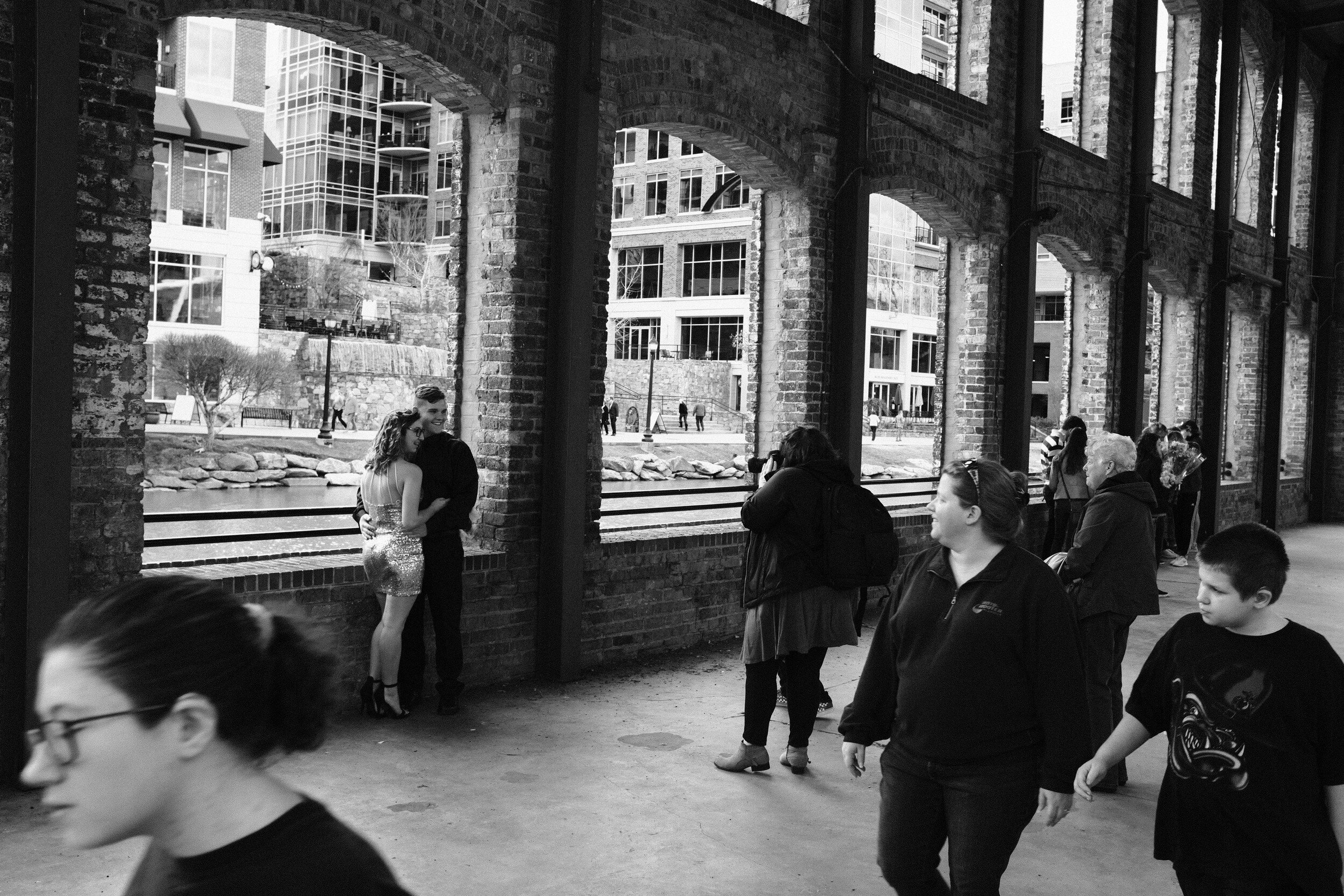
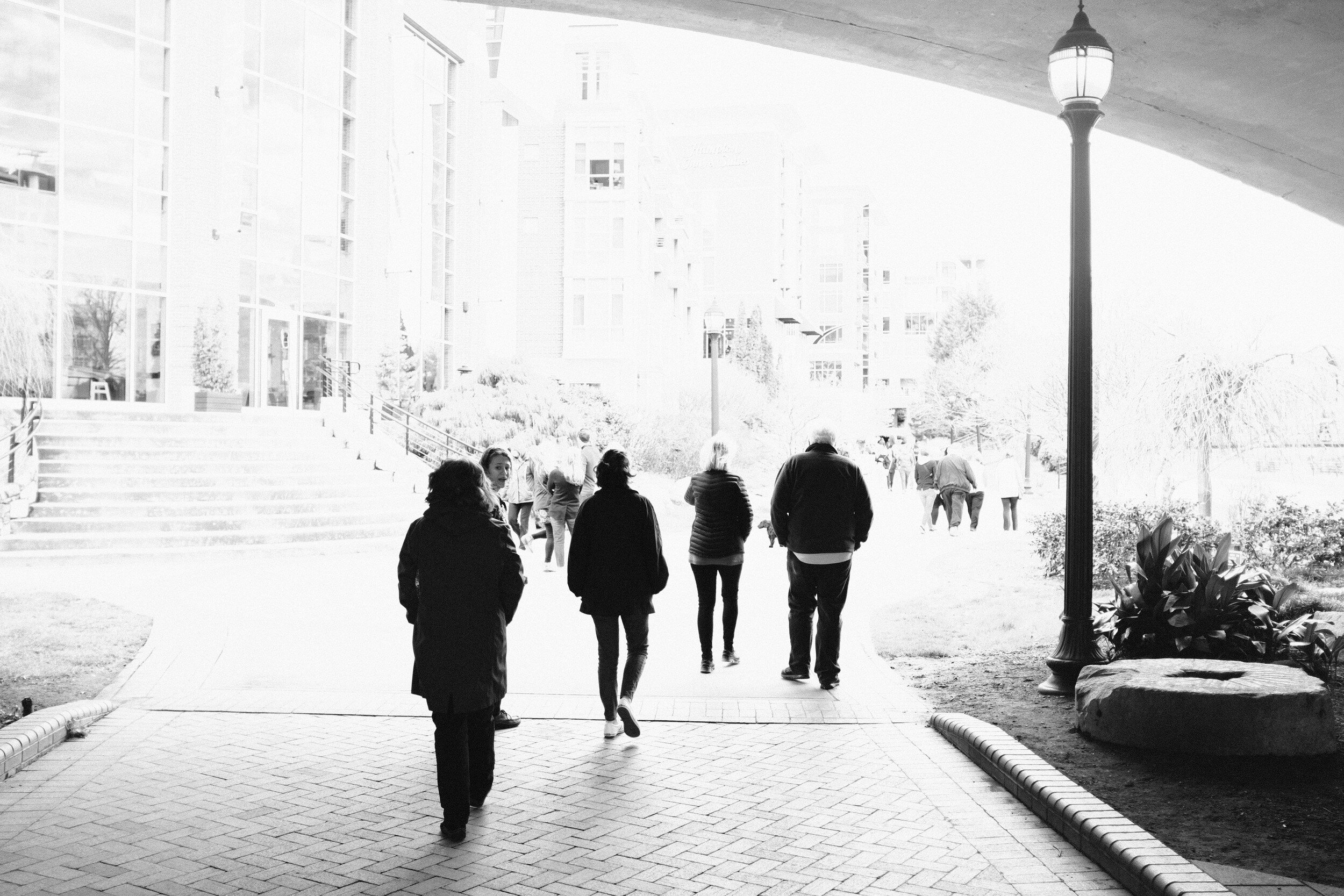
These settings create a nice contrasty image, which I like far better than the standard black and white or the standard Acros setting. My favorite black and white image from that day is Gothic Fairies (see below).

The two images below provide great examples of what this camera, with this specific setting, is capable of.
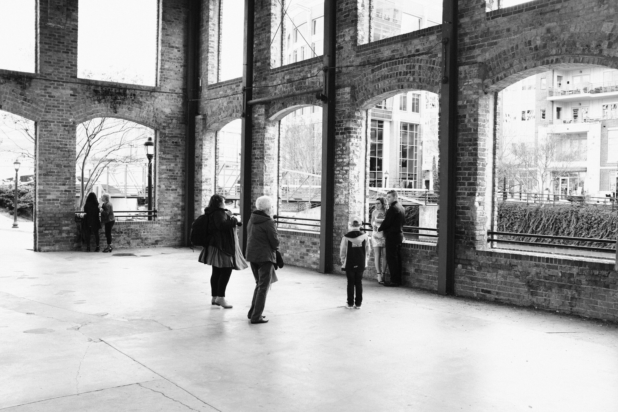
When using these settings, it is still possible to create images with quite different moods. This can be done for example by using the Exposure Compensation dial on the top plate of the camera.
And this is actually one of the reasons I love this little tool: while using menu presets, it is very easy to change the look and feeling of images by using the manual aperture, shutterspeed, ISO, and Exposure Compensation dials.
The next two images below are literally taken seconds apart and from almost exactly the same viewpoint.
The first one has the people in the image as nice black silhouettes against the light background.

The second one, by pumping exposure compensation up, resulted in a high-key image with more detail in the people…
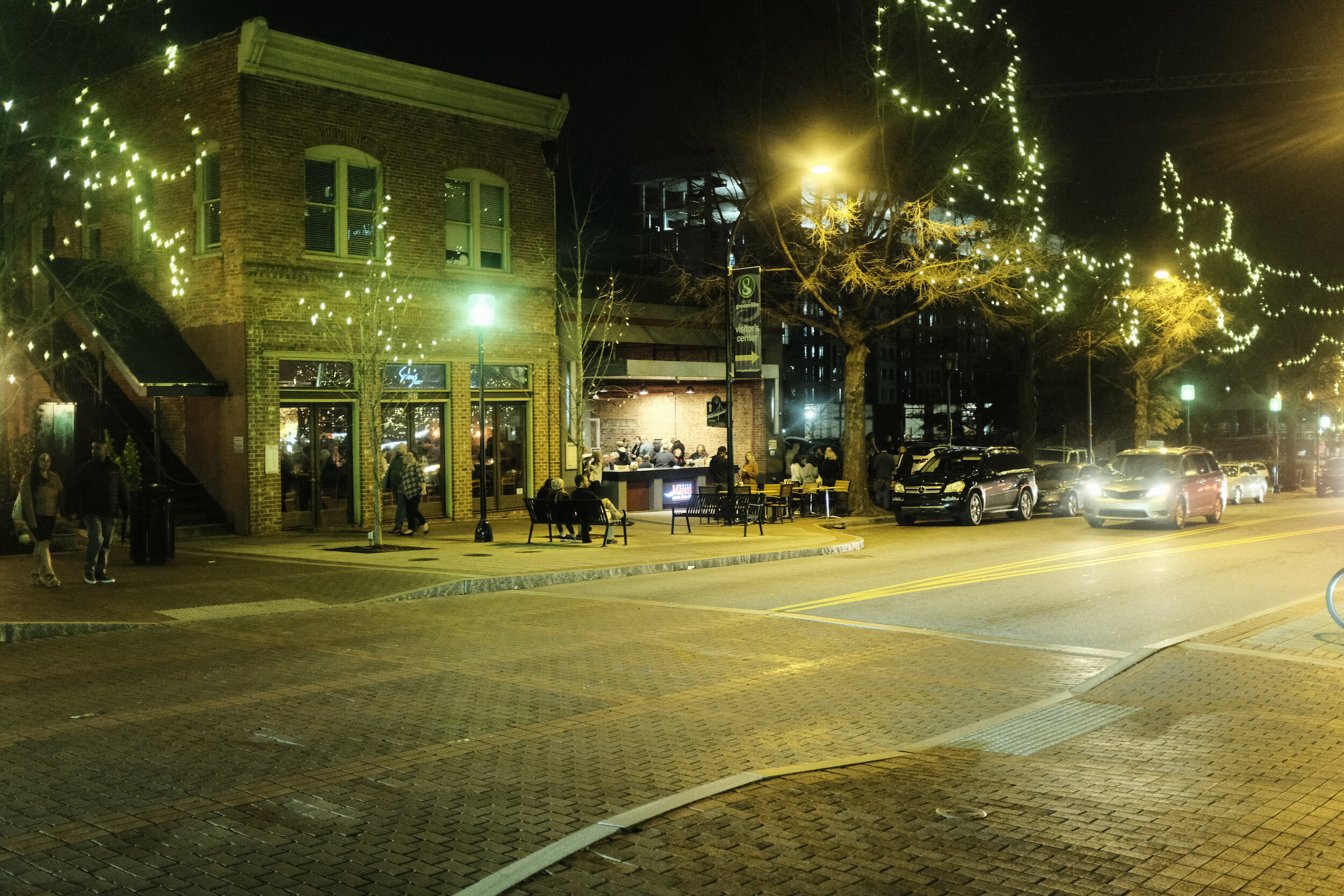
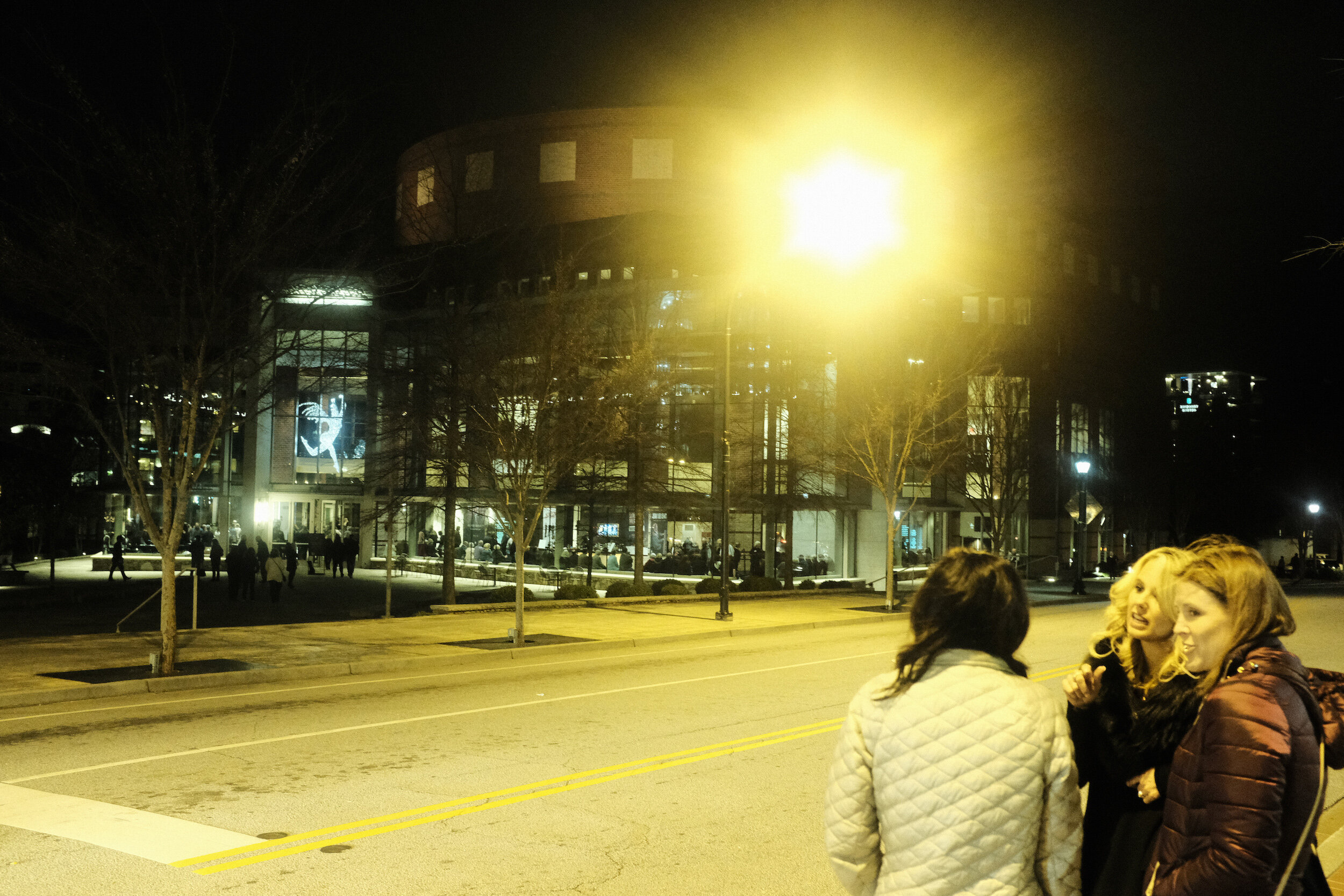
Cross Process Film
Next to try was one of the color film simulations: Cross Process Film Simulation, using one of Ritchie Roesch's recipes as the basis.
Film Simulation: Classic Chrome
Grain Effect: weak
Dynamic Range: 200
White Balance: auto; R:-3 B:-8
Highlight Tone: +1
Shadow Tone: +2
Color: -1
Sharpness: +1
Noise Reduction: -3
These settings result in an 'old fashioned' film effect.
Although I in the first instance was quite skeptic about this setting, I like the results very much. Even to the level that I wonder if I should create more images using this particular color setting.


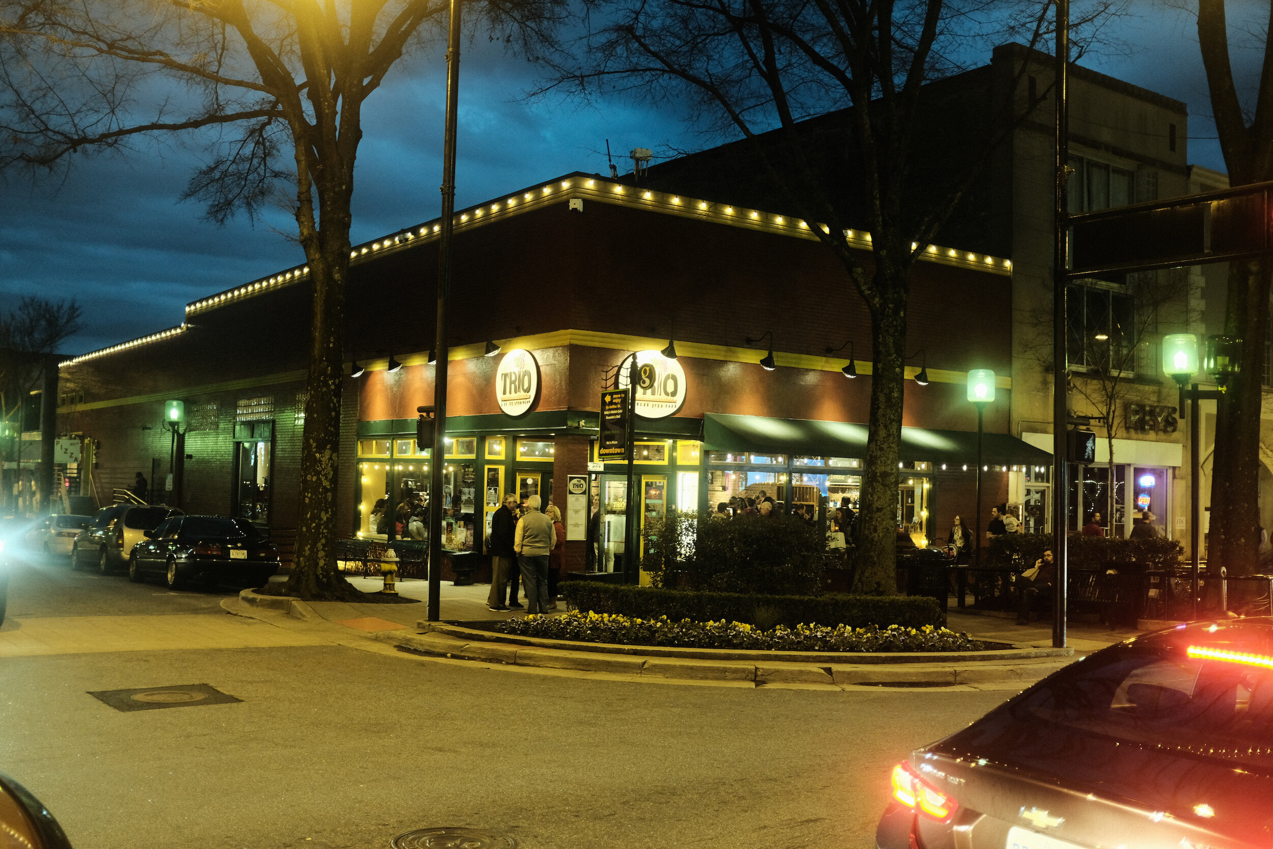
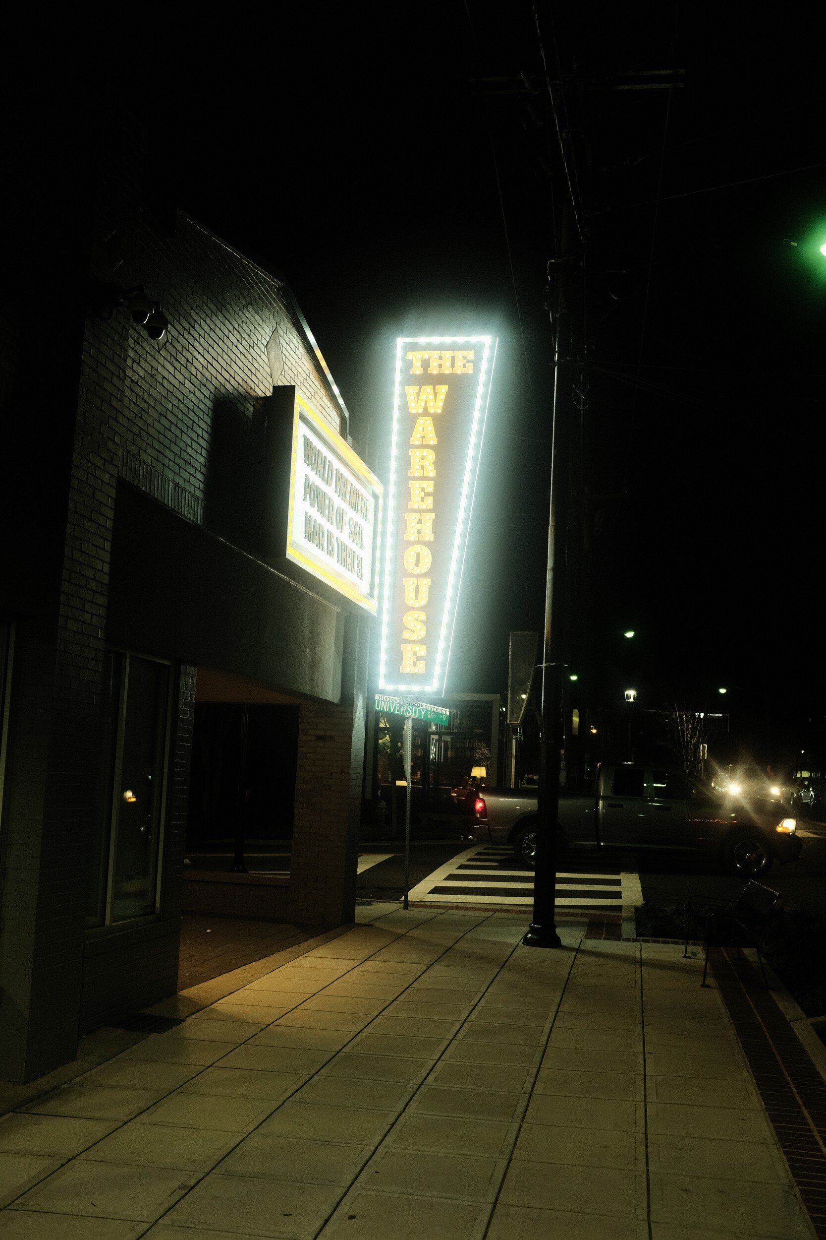
The next two images provide some insights into the performance of the X100F and the results with this film simulation setting inside, in a rather dark environment.


Taking pictures with the same setting outside, after dark, gave the same stunning results.
Note that all the images in this post are Straight Out Of Camera JPEGs!
Conclusion
As mentioned: I am not a proponent of just copy-pasting presets. Whether for in-camera film simulation or post-processing. The results from the presets as developed by Ritchie Roesch, however, definitely have me wanting to experiment more with presets. Maybe tweaking them a bit more, maybe experimenting with some other film simulations.
Another rather interesting observation I have is that looking at these images, I like the 3:2 aspect ratio.
As you might remember from a post quite some time ago, I have a preference for the 5:4 aspect ratio of medium format film. Reviewing the results above however, I find the aspect ratios of these images rather pleasing. I don't know if this is because they look so much like the old 135 film images I used to make in the past?
Maybe another change going forward? Not sure yet, but what these color images and aspect ratios have learned me is that photography is a continuous learning process, that never ends.