
Black and White Versus Color in Photography
What works better: black and white, or color images?
Browsing through my pictures to see what subject matter I like most to create images of, the other question that always pops up is: what do I like more, black and white or color images. As I mentioned in a previous post, I have a preference for black and white images; the real answer to this question however, as always, is: it depends...
Below I will share some examples and thoughts on each of these, but first lets have a look at
5 Factors to consider when selecting black and white versus color images
Every image has the potential to work best in black and white or color, depending on:
1. General subject matter;
2. The amount of texture and patterns;
3. The amount of contrast;
4. Whether color is a defining factor for the image;
5. Where and how the image is displayed.
Now let's have a closer look at each of these factors.
1. Subject matter
Some subject matter in general looks better in black in white, while other in general looks better in color. Architectural photography for example usually looks great in black in white, while color is the way to go when photographing flowers and food. However, as we will see, in some architecture color is such an important part of the whole concept that representing it in black and white would leave the essence of the object out (think for example of Gaudí's creations). And whereas color in flowers usually is the reason for taking pictures, when there is a lot of texture it might work to create a black and white image. Food photography generally only can (or should) be done in color: most food and dishes just don't look edible in black and white. But of course, there's always the exception: remember Edward Weston's Pepper No. 30?
2. Texture and patterns
In general, when there is a lot of texture the subject just begs to be photographed in black and white. The monochrome brings out texture and helps the viewer focusing on the patterns.
3. Contrast
This is a bit of a tricky one: I am speaking of "light contrast" here, not "color contrast". When there is a lot of contrast between light and dark areas in an image, I advise rendering in black and white. The monochrome enhances the contrast and brings out patterns and texture. Of course, when there are a lot of contrasting (or complementary) colors in a scene, you definitely should use that to get your story across.
4. Color as 'defining factor'
As mentioned above, this often is the case when photographing flowers and food. But think also about scenes with a lot of complementary colors, and architecture that uses color. In these cases, it is almost a 'no-brainer' to use color images.
5. Display
All the above applies when an image is being looked at in general. But then you also have to consider that image on display. How does the image look in your interior? What looks great on a screen, or hanging in a gallery might or might not work in your own home or office. The total style of your interior (e.g. classic or modern, minimalist or cozy) and, even more important, the color scheme of your interior will have a big impact on how the image you are looking at will work, or not work, in its eventual place of display.
And then there is a big caveat to all of the above: in the end, it is your artistic vision and personal style that will help you define how you want to capture an image, or how it will work in your interior design! None of the 5 considerations I mentioned above is a rule, they are suggestions based on my personal vision and style. And suggestions, even more than rules, are there to be broken.
Some examples
Below I provide some images in sets of two: each set has a color and a black and white rendering of the same image. I will explain which of the two works best for me, and why (you can click on each image to get a bigger view).
What is your preference for these images? Leave your input in the Comments section below.
Grass With Water Drops
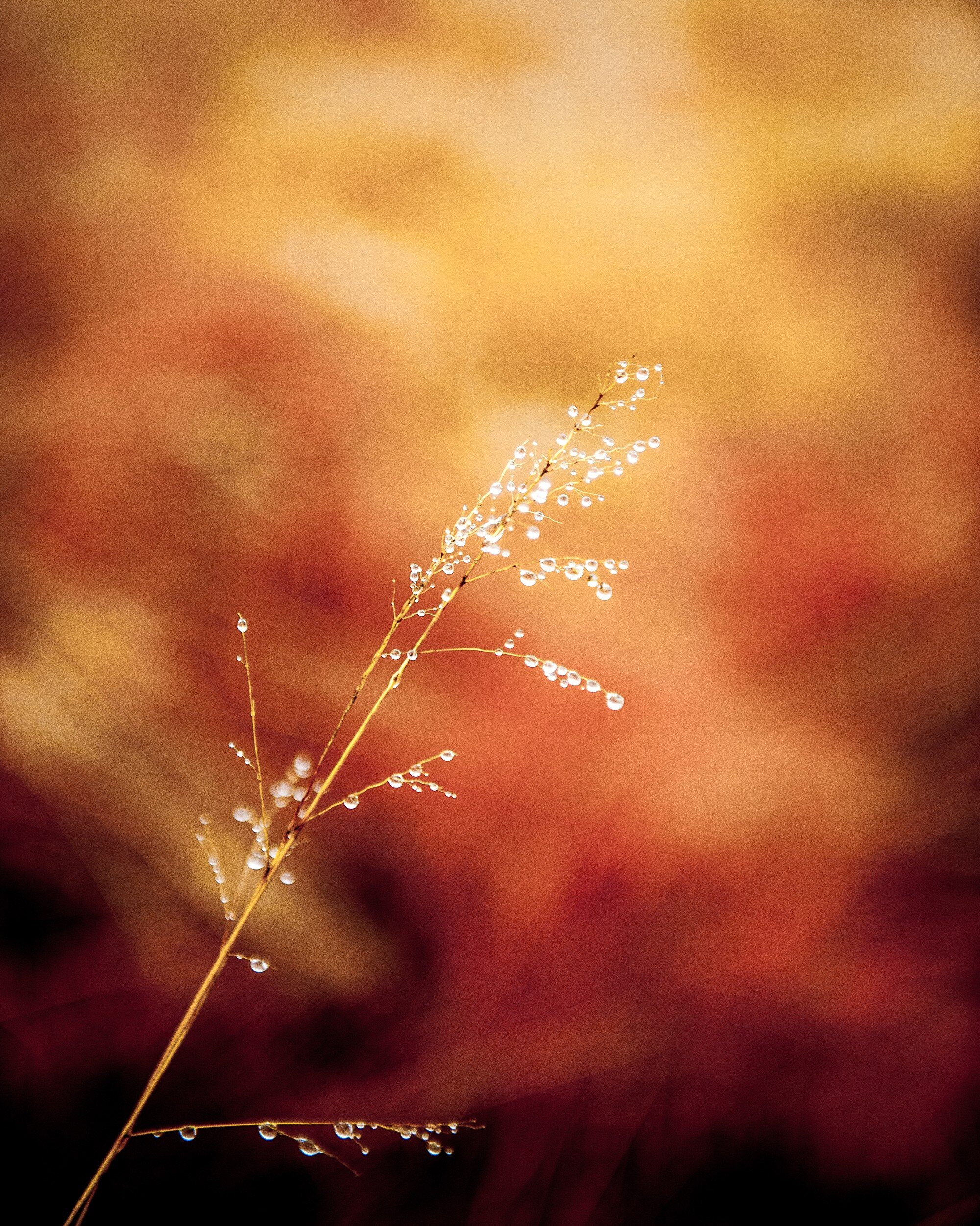
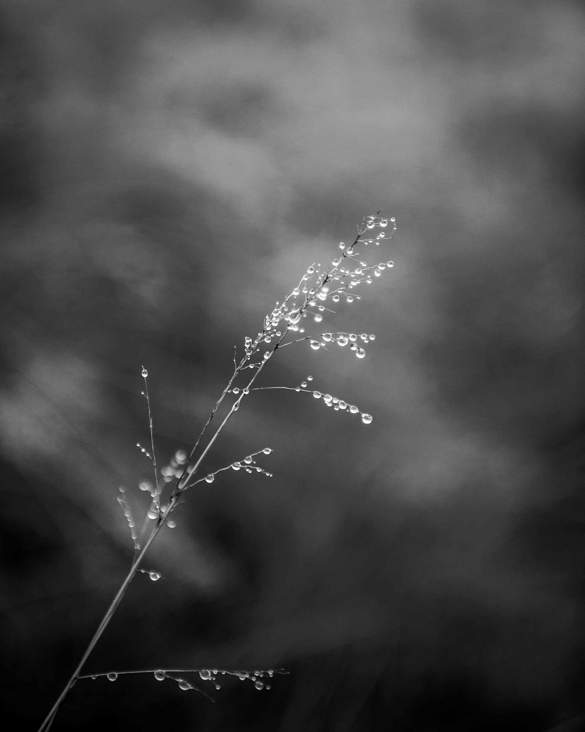
This first example actually is a very interesting one: I can not make a definite choice for a specific rendering of this image. I love how the black and white image brings the grass and water drops to the front and shows the texture of both. The several gray tones behind the grass form an interesting but non-distracting background. In the color image however, the background becomes an important part of the total picture. The reds, oranges, and yellows give the image a dynamic feeling while the grass and droplets still stand out as the main subject of the image.
The choice between these two images definitely needs to be decided depending on how and where it will be displayed.
Stacked Buckets
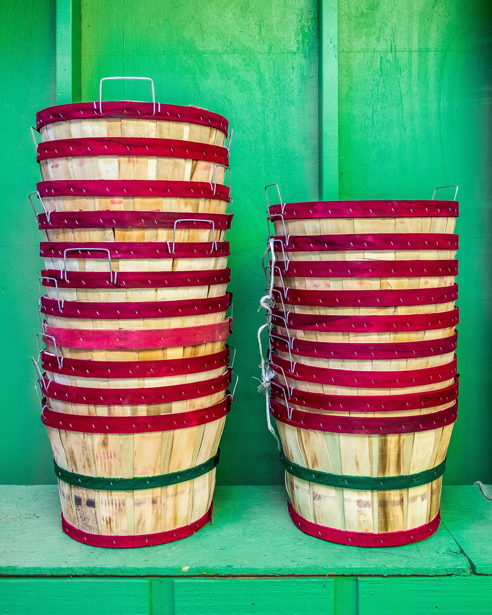
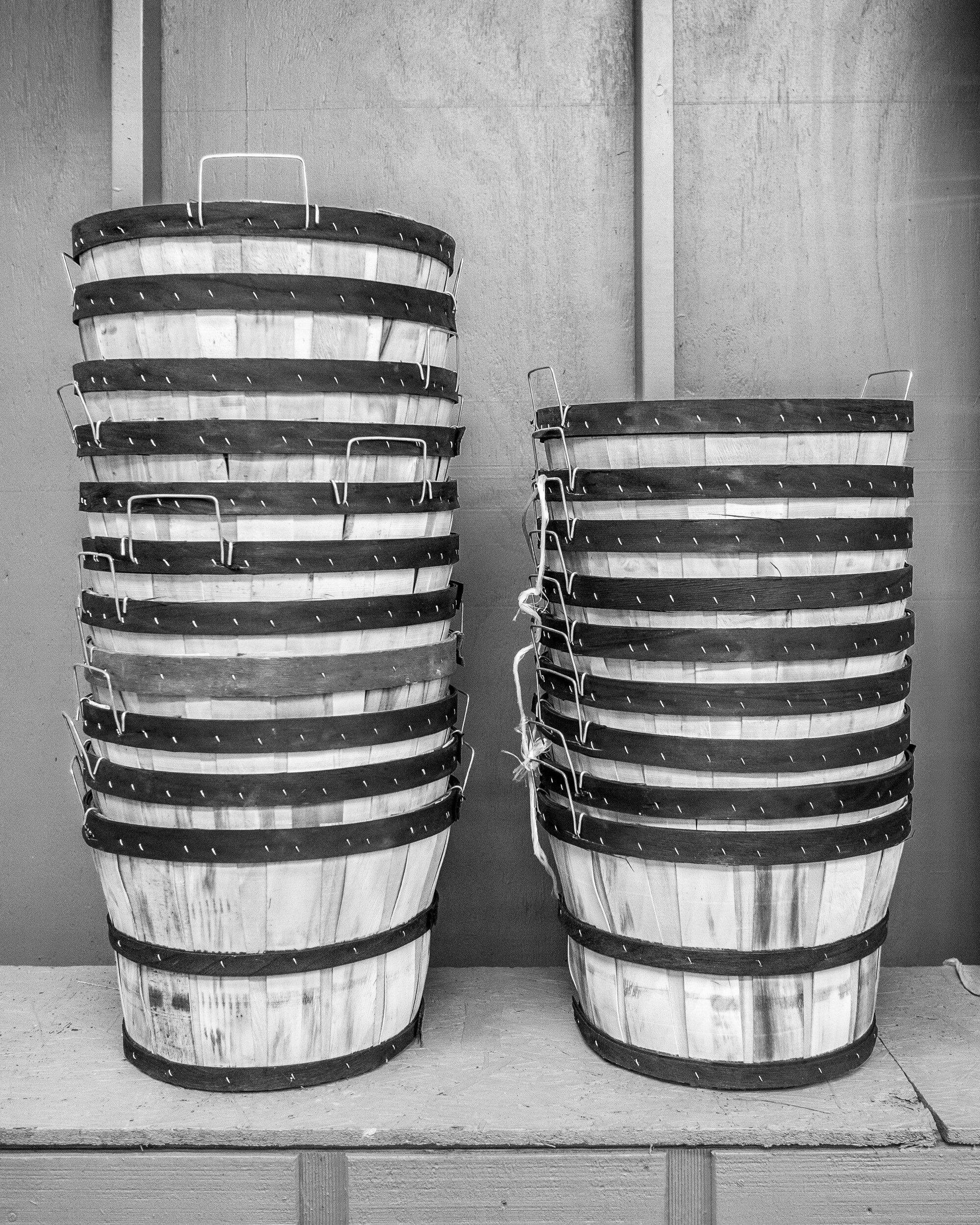
Although the black and white version might work, for this image I definitely would go with color. The contrast between the red on the buckets and the green background really is of the essence for this picture. This is a good example of how complementary colors make an image work.
Boxed
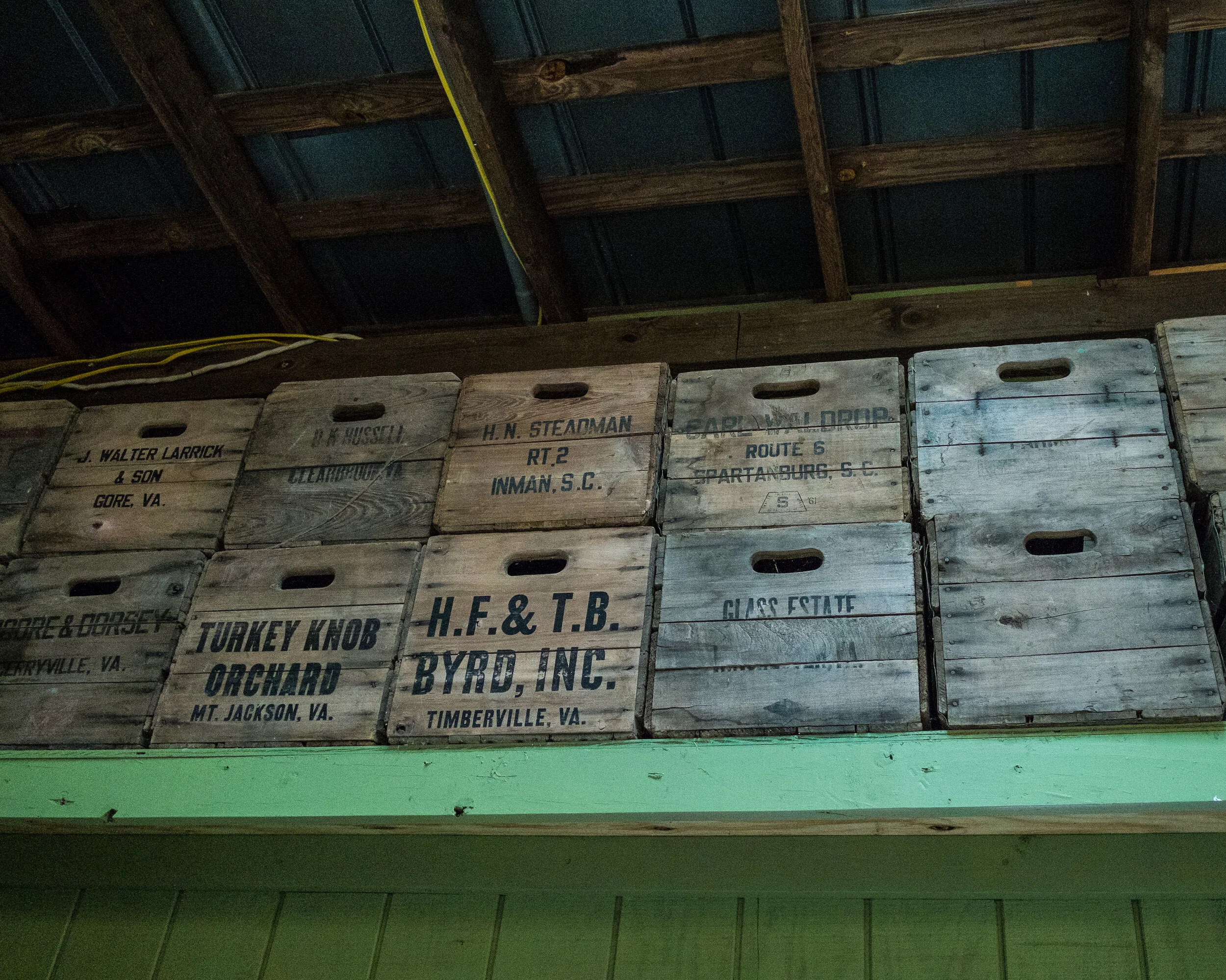
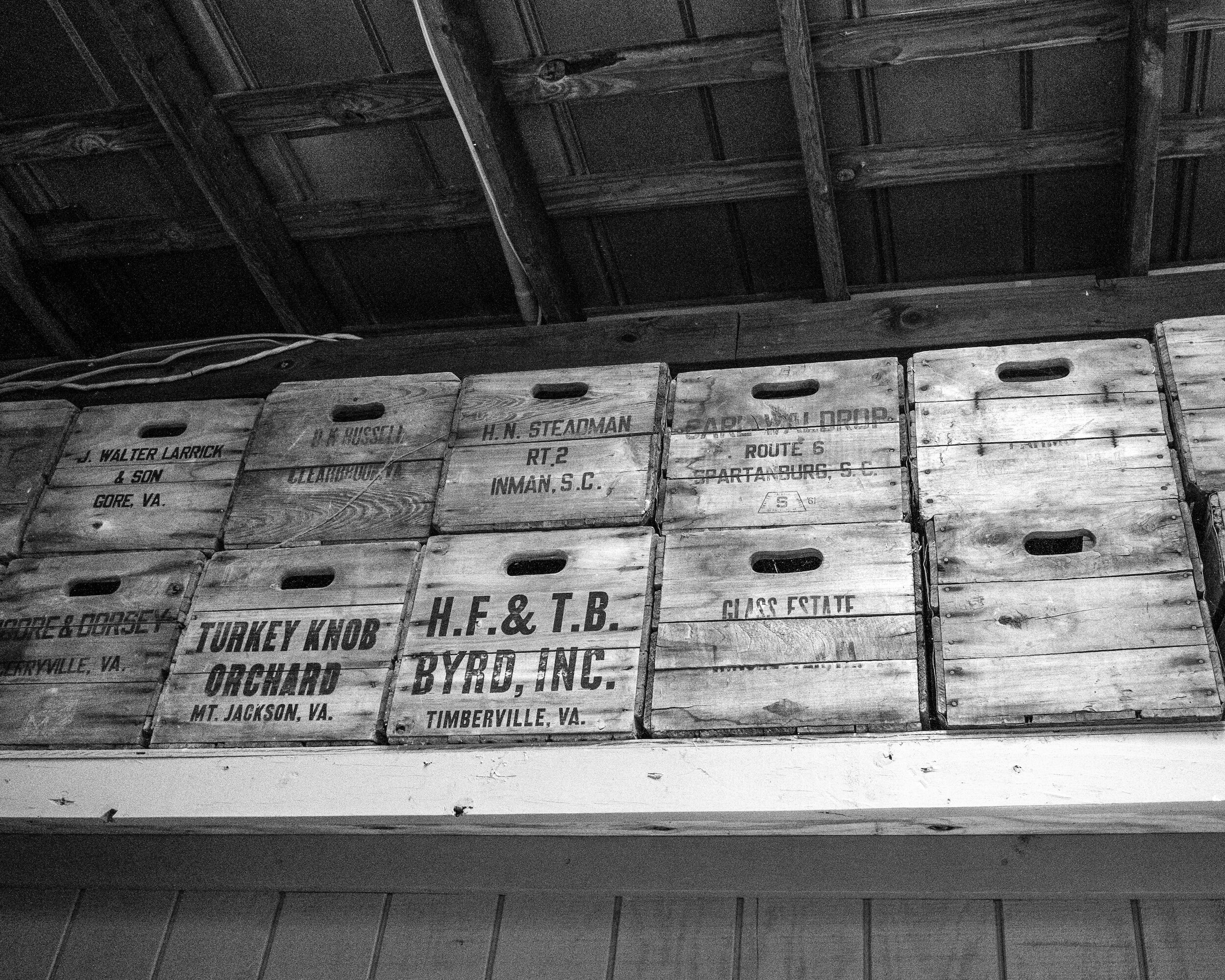
In this case, the black and white version is my favorite. The boxes have subdued colors, and good texture. The colors of the boxes and the green of the shelf don't really add anything of interest to the image. The green actually distracts from the main subject: the boxes. The black and white rendering brings out the grain of the wood and the repeating pattern of the stacked boxes.
Red Roses
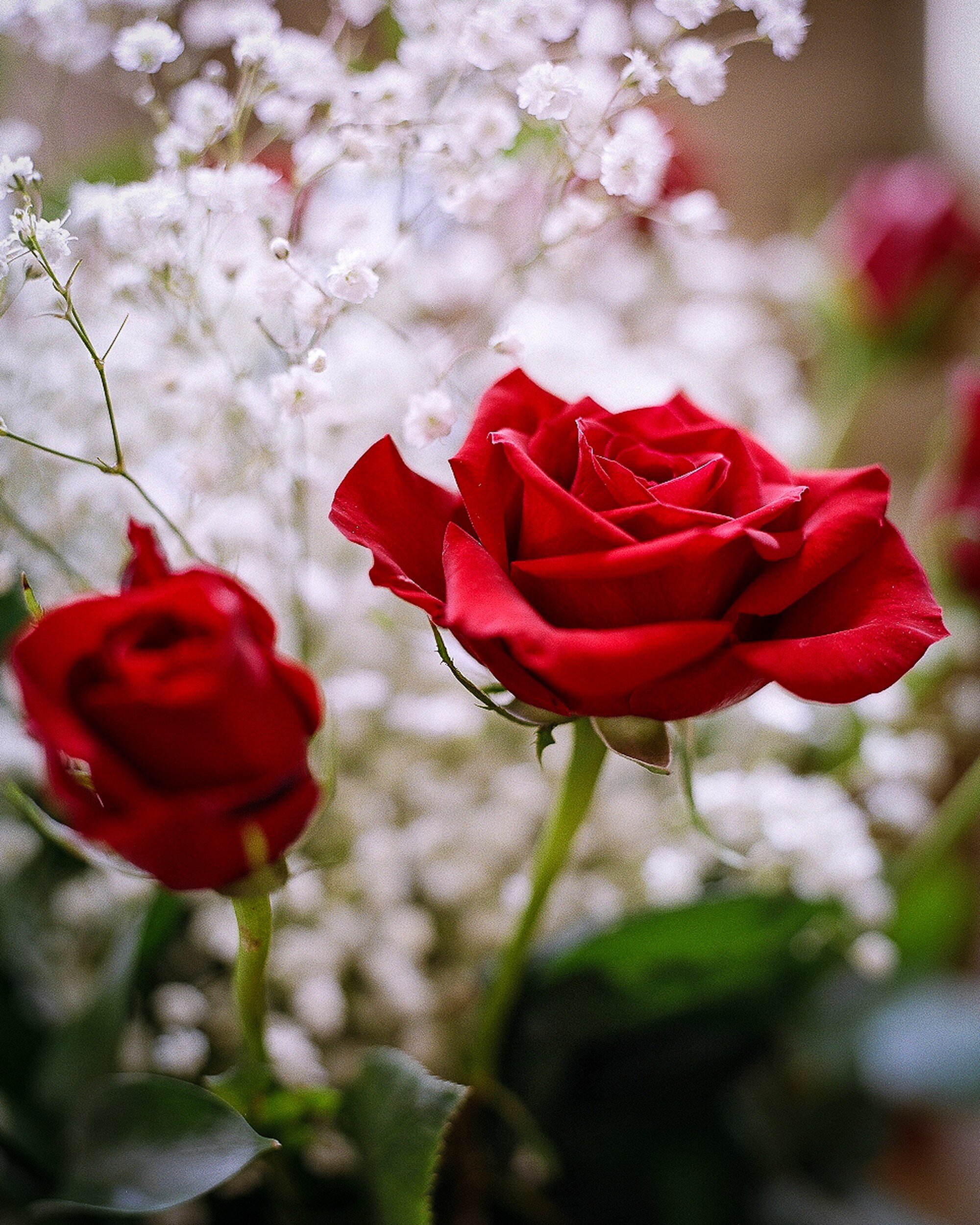
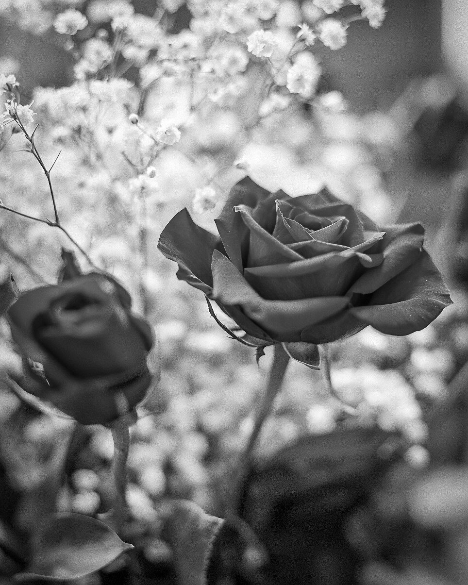
A nice example of photographing flowers. My first inclination would be to say that the color version works best: nice red roses, nice white flowers in the background, color being of essence. However, the longer I looked at this image, the more I started to like the black and white version: printed on a big format, and in the right interior this might actually work very well.
An important lesson learned here is that you need to take sufficient time to look at an image before making a decision on which version to use. While first impressions are important, you really need to digest what you are looking at and how it will work in your interior.
Mushrooms
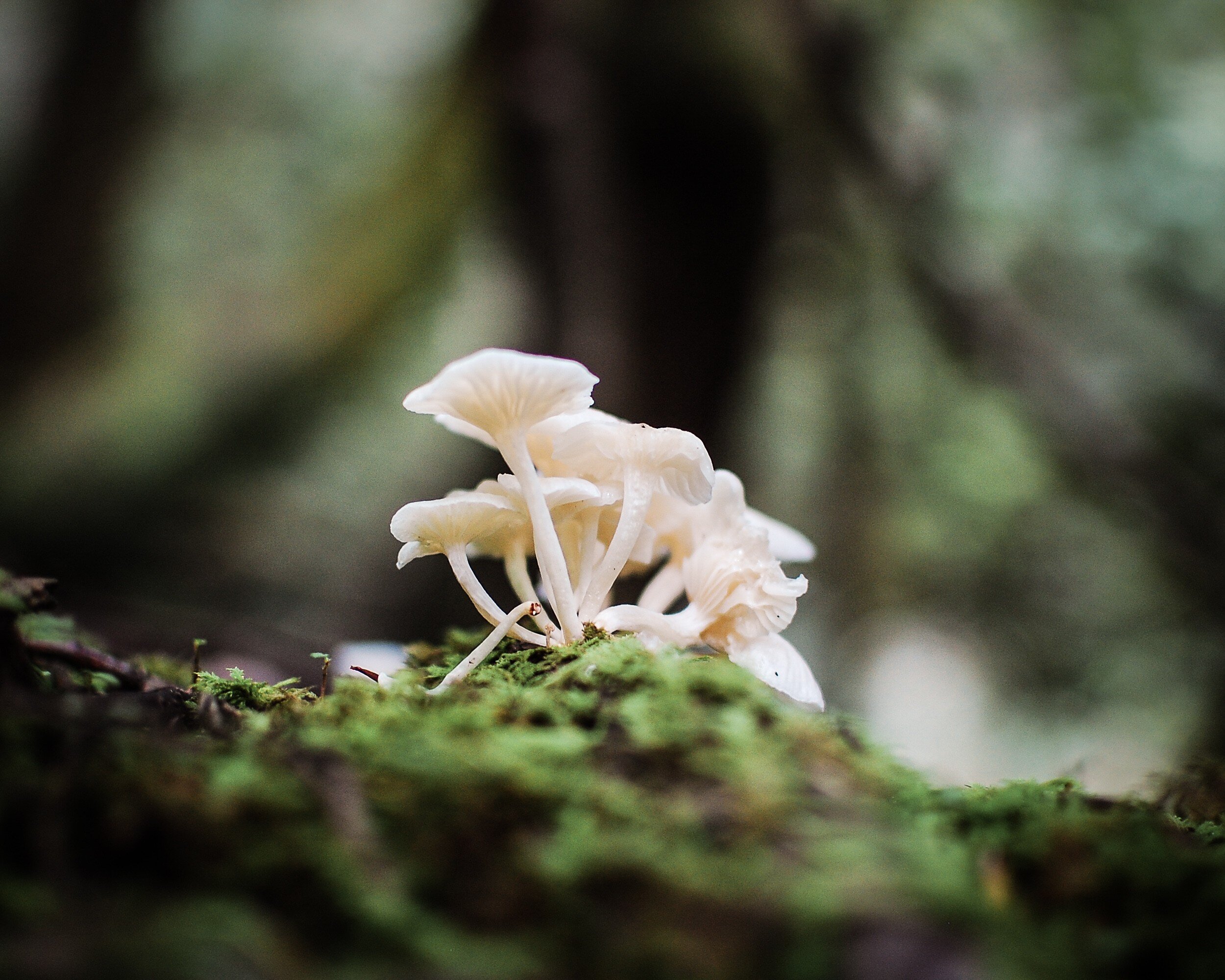
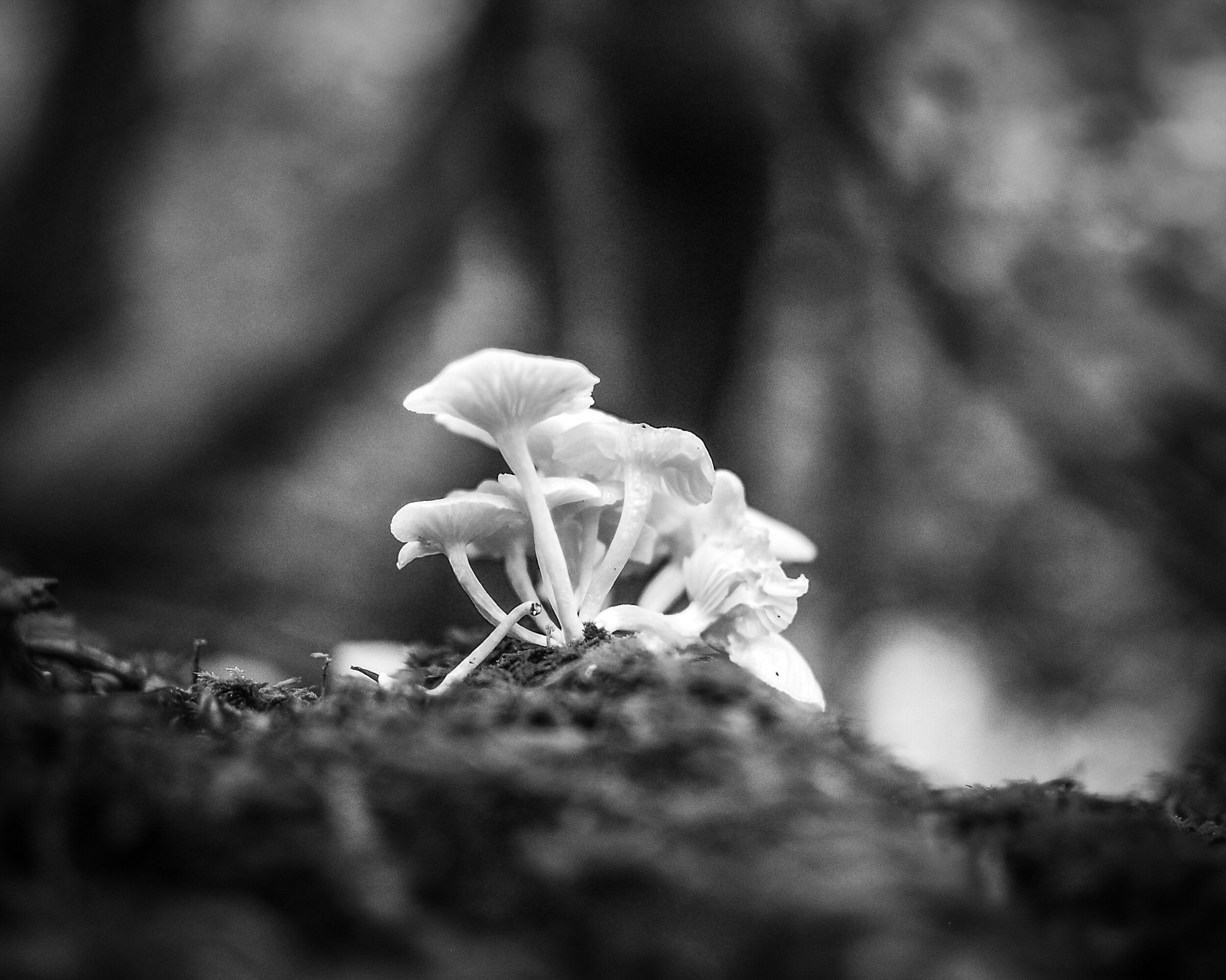
Here I had exactly the reverse experience from the one I had with the Red Roses Image. My preference was immediately for the black and white version: the shallow depth of field makes the mushrooms stand out against the background and the monochrome rendering makes background and foreground blend in and away from the main subject.
However, after looking longer at the color version I noticed how the green in the foreground actually helps to lead the eye towards the mushrooms. The dark vertical (a tree) in the background and the lighter triangles to the left and right of it help to lead the eye upwards; even more, than they do in the black and white version. Another example of taking the time to look and to digest the total image.
San Remo Apartments
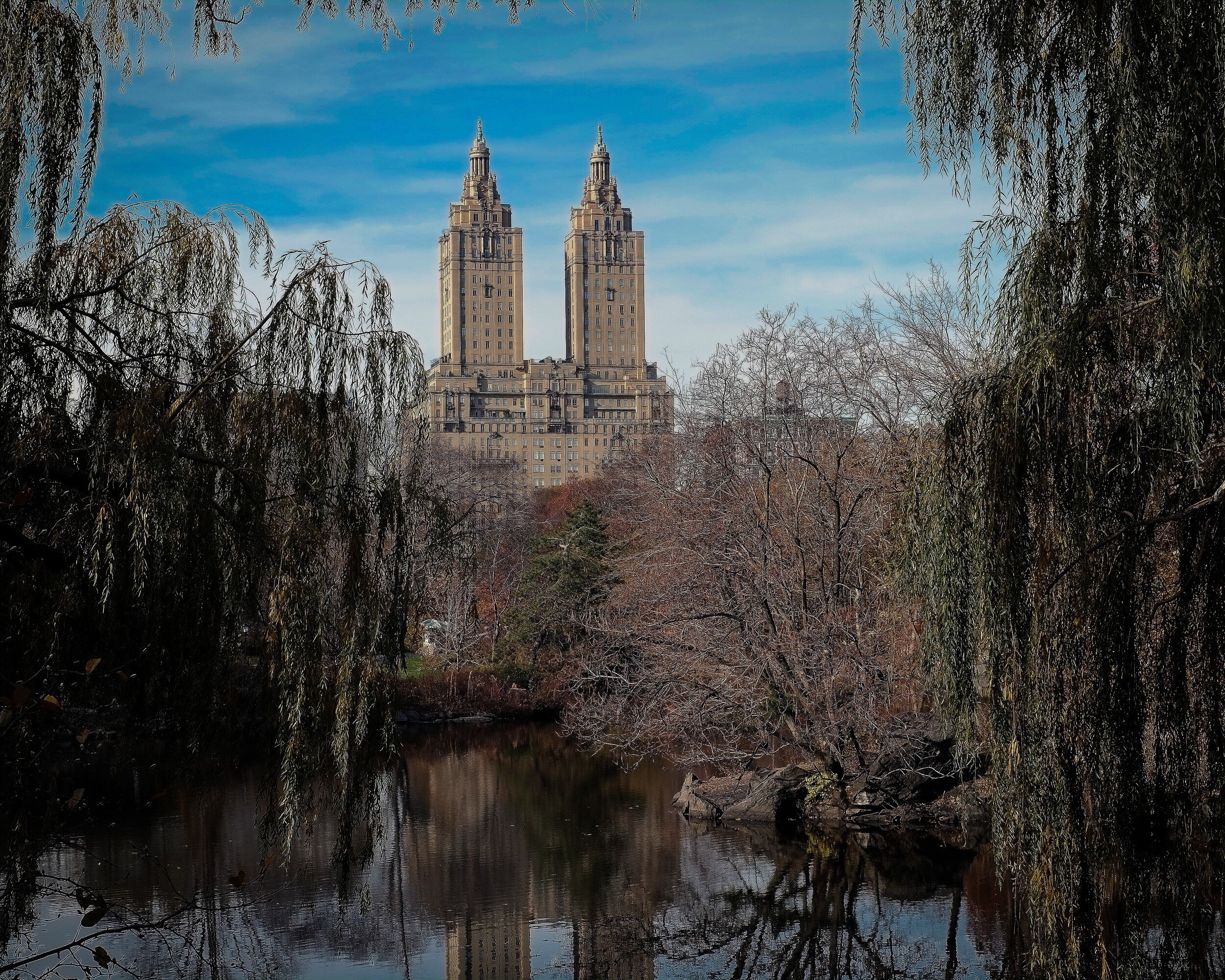
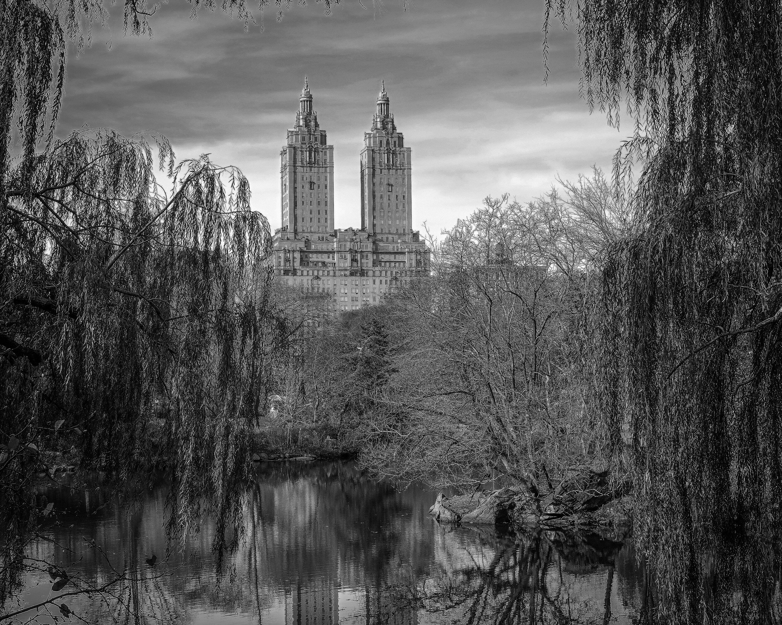
Architecture, so in general rule #1 says: black and white. But no, not really in this instance. Although the apartment building clearly is the main subject of this image (that it is nicely centralized in the image might provide a hint for this) the color of the trees, the pond (with reflection), and the blue sky are to me essential to this image. I don't think the black and white version doesn't work at all, but my preference for this image is color.
Campbell's Covered Bridge
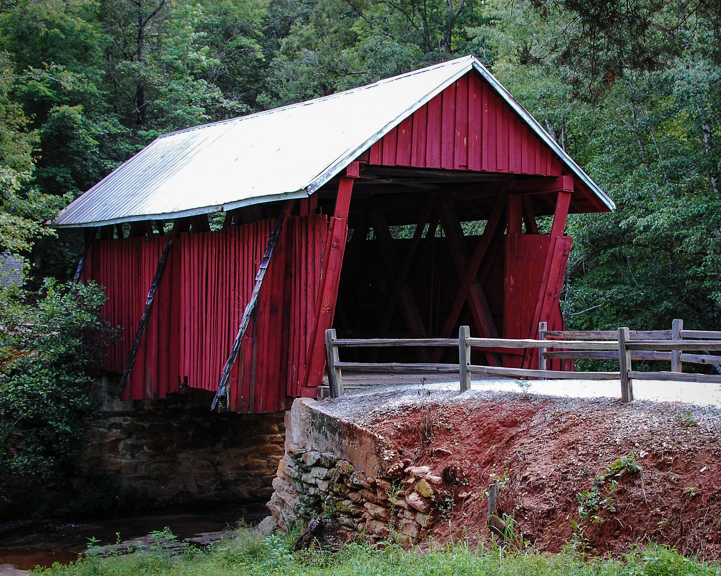
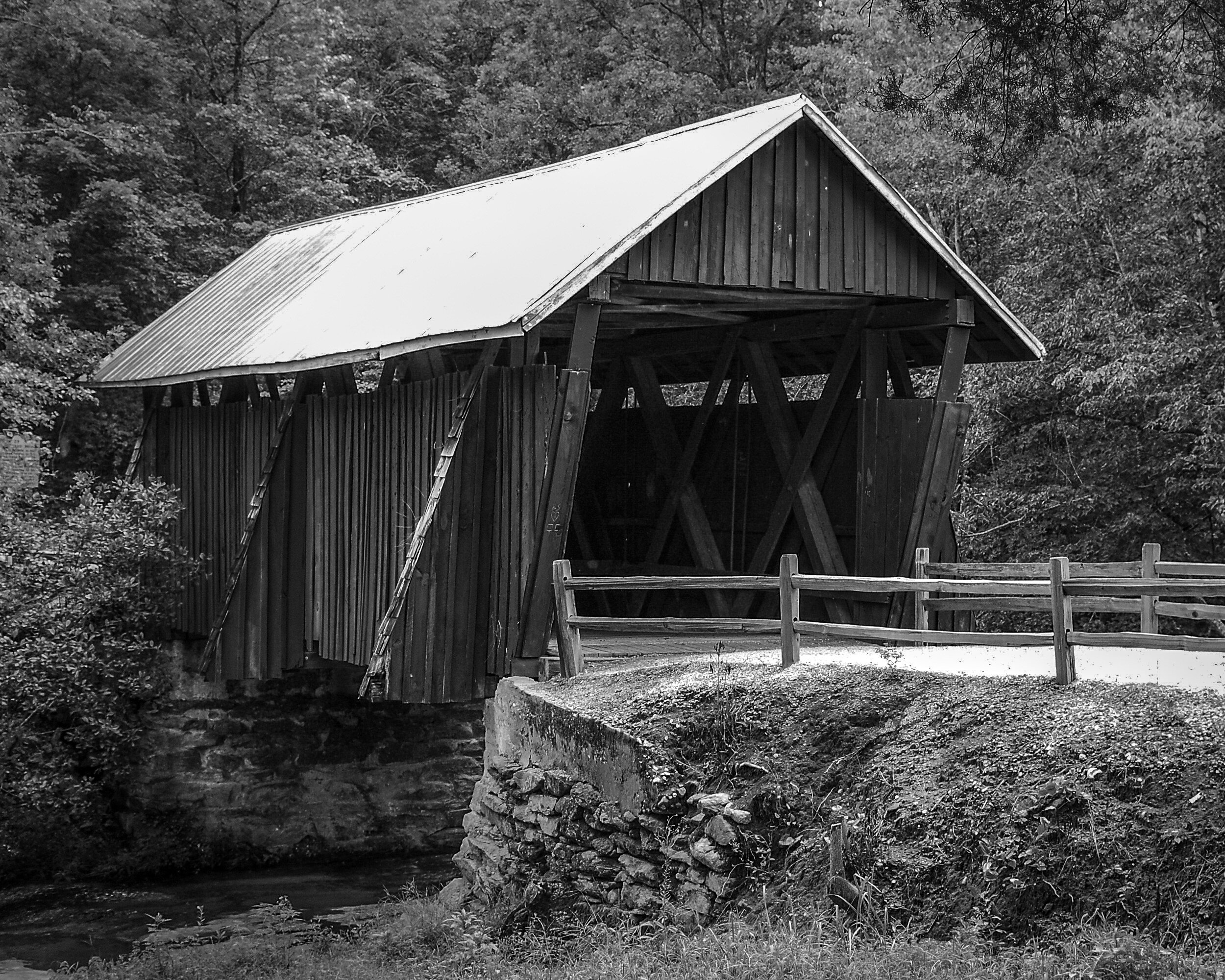
Another example where for me an image of an architectural structure works better in color than in black and white. The red paint is a very distinct feature of the bridge, and the juxtaposition of the red with the green of the trees in the background makes the bridge really stand out. The black and white version in contrast looks quite flat.
Capitol Hill


In this example both images work well for me. The black and white version provides a very clear and clean image of the Capitol and because the building is very light it stands out against the backdrop of the gray sky and the darker trees in the foreground. I like the color image because it shows the natural color of the Capitol's marble while it stands sufficiently out from the blue sky and green foreground.
Washington Monument
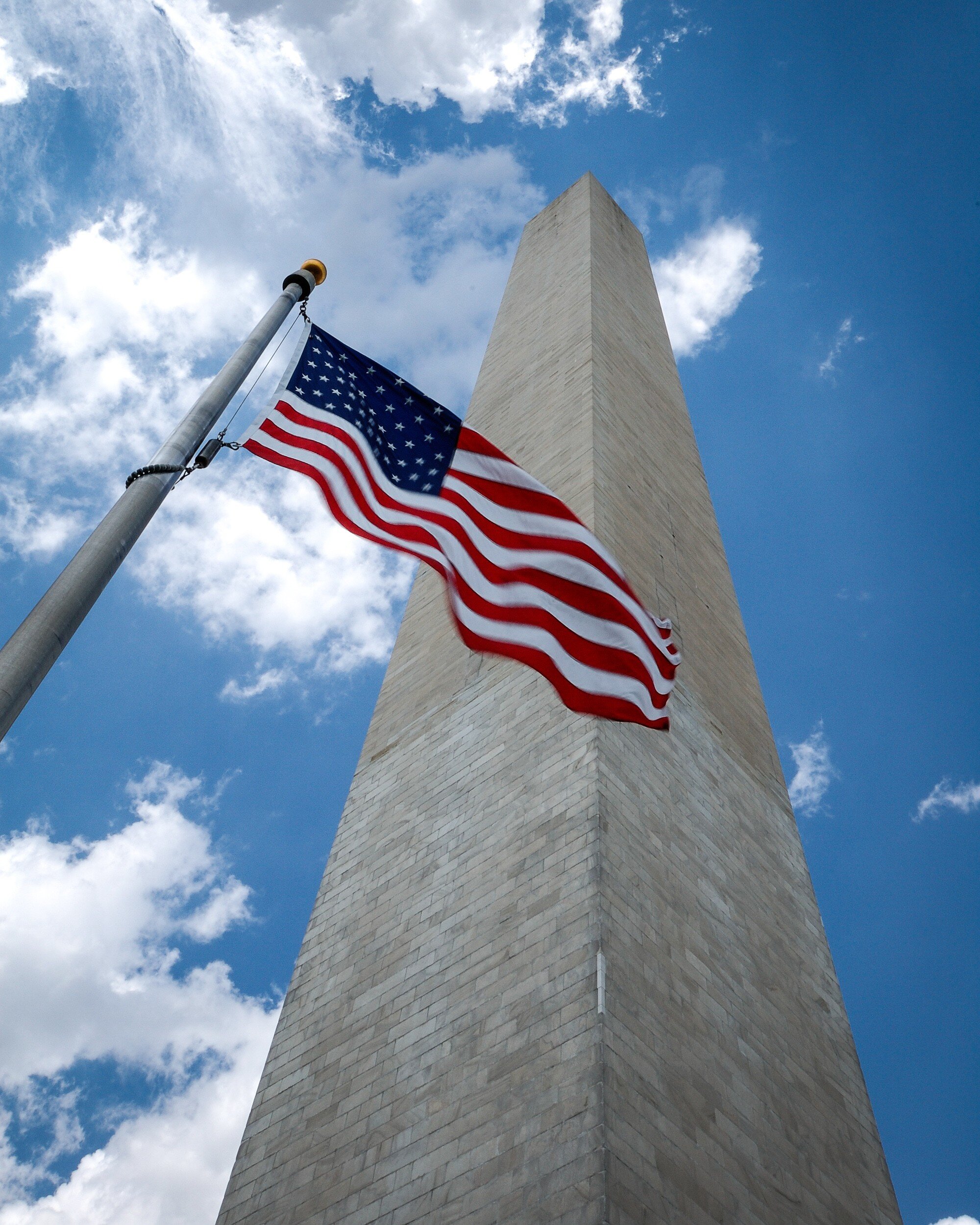
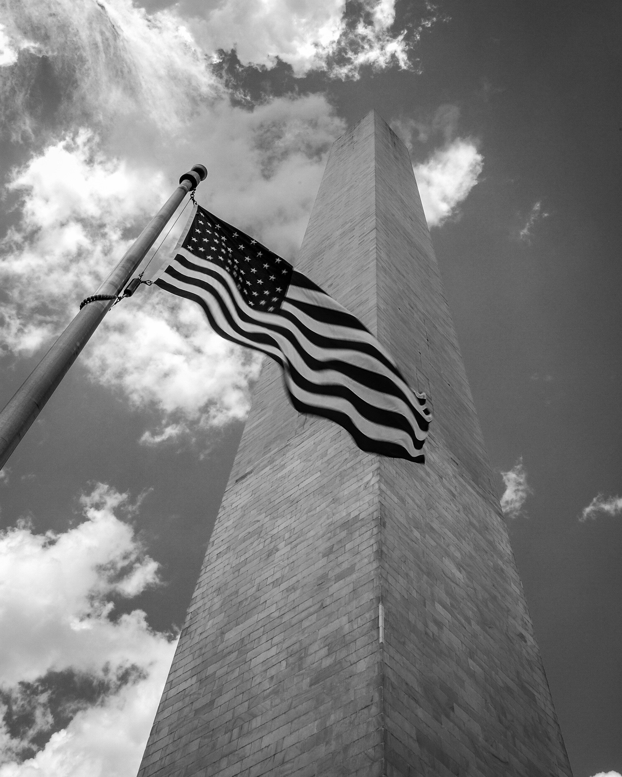
For me this image just needs to be in color. The bright red of the flag stands out; the dark blue of the flag is enhanced by the bright blue of the sky; the grayish color of the monument standing out from the blue and white of the sky directs the viewers eye clearly directed upward and provides depth. This does not happen as much in the black and white version because the gray of the monument blends with the gray of the sky.
Grain in Spain
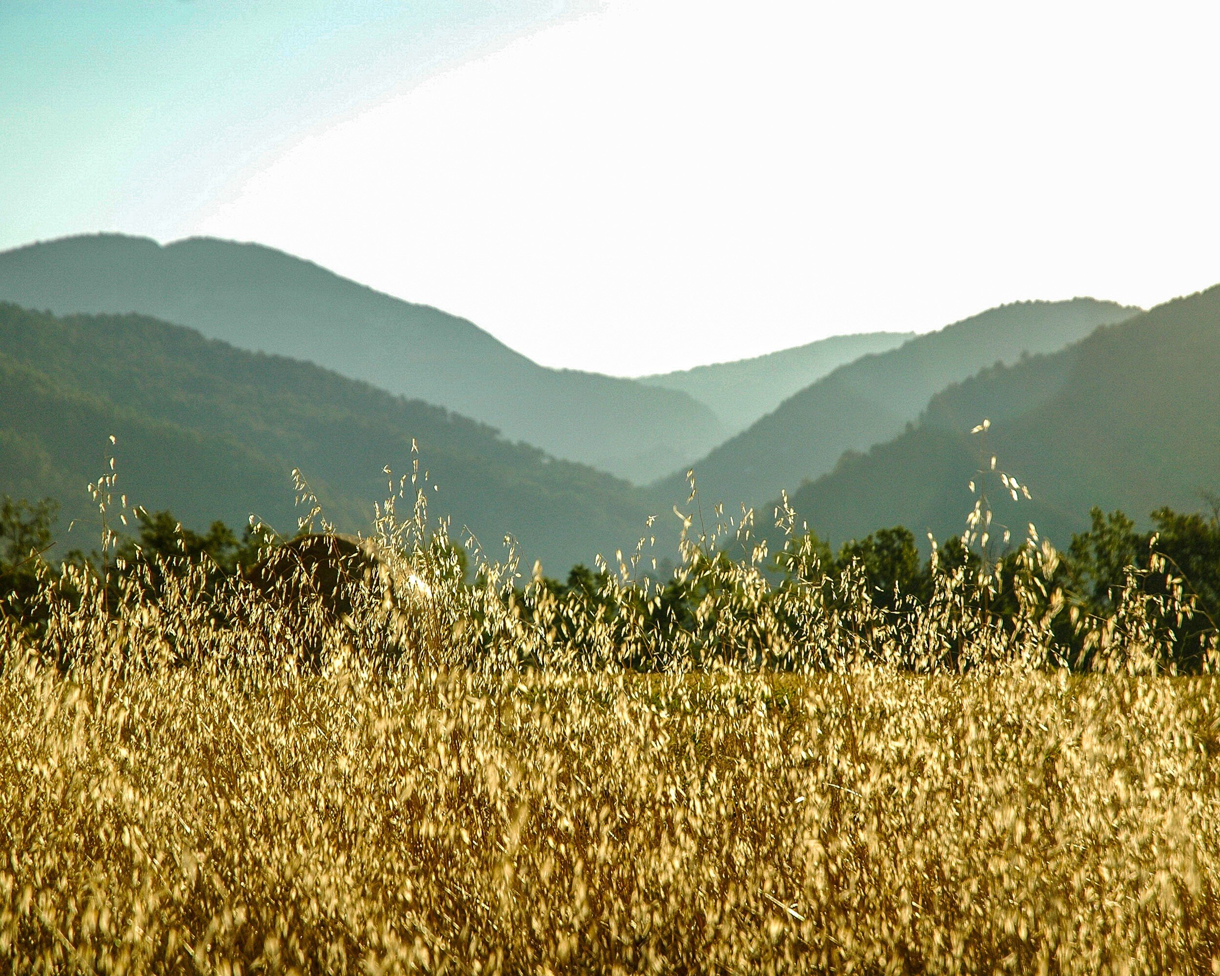
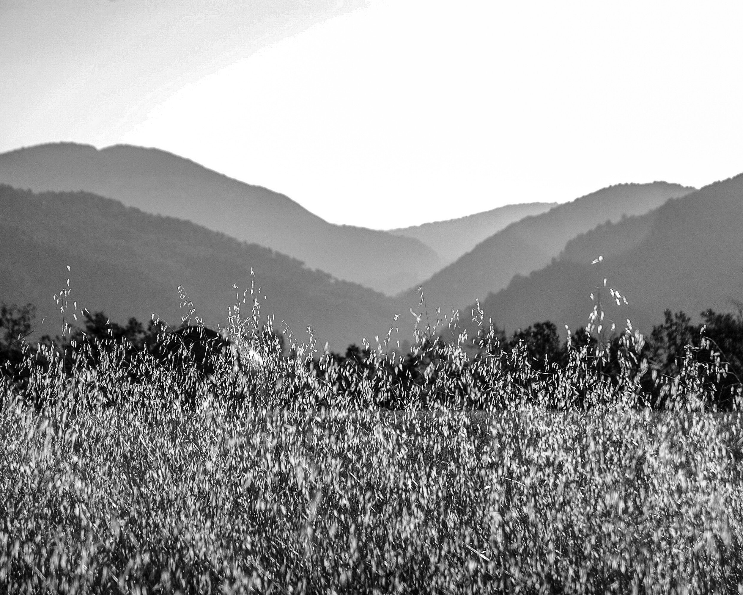
This final example again is an image that works for me in color and in black and white. Because it has several shades of gray, the monochrome works quite well showing the different layers in the picture: from the light grain in the foreground, to the darker and mid-tones in the middle, and then some lighter tones in the background again. The color version works in a similar manner: the bright yellow in the foreground, and then different shades of green from the middle to the back going fro darker to lighter. While the different shades of gray or color lead the eye in bot images, the focus in the color image is more on the yellow grain in the foreground whereas the eye wanders a bit more around in the black and white image, settling more in the middle.
Final Thoughts
While there are five factors to take into consideration to decide whether an image works best in black and white or in color (subject matter, texture and patterns, contrast, color as defining factor, and display) these are only general guidelines. In the end it is your personal taste that should make you decide what you like best for a specific image. Each image is different, and should be looked at individually.
Besides your personal taste, the most important of the five general considerations will be Display: where and how you are going to display the image will have a big impact on how it will work in your interior. The main lesson learned therefore is to take your time when selecting a black and white versus a color image: your view of the image might change after some reflection, and after considering how it will fit in your interior design.
Now how do you look at images and how do you decide on choosing a color or a black and white version for your interior? Share your thoughts in the Comments section below!