
The Best Way To Update Your Interior With The Color Of The Year 2018
Use Images With Ultra Violet, The 2018 Pantone Color of the Year, To Update Your Interior
Earlier this month Pantone unveiled their 2018 Color of the Year: Ultra Violet. This will be a color much used next…
Use Images With Ultra Violet, The 2018 Pantone Color of the Year, To Update Your Interior

Earlier this month Pantone unveiled their 2018 Color of the Year: Ultra Violet. This will be a color much used next year by interior designers, graphic designers, other visual artists, and manufacturers to meet the latest color trends for interiors, furniture, accents, fashion, packaging, and much, much more.
In this article, I will share some tips and tricks on how to update your interior with this color, and how to use images with Ultra Violet as a trendy asset for your home or office.
About Pantone and the Pantone Color of the Year
Who or what is Pantone?
Most people know Pantone from the colorful Pantone Guides: the fans of sheets with color swatches that designers, painters, product developers, and basically any individual who wants to do something with color uses to "color match" specific colors.
Pantone is a wholly-owned subsidiary of X-Rite, Inc., and a provider of professional color language standards and digital solutions. Pantone services clients around the world through three business divisions: Pantone Standards, the Pantone Color Institute, and Pantone Lifestyle.
What is the Color Of The Year?
The Pantone Color Institute annually declares a particular color "Color of the Year" based on color trends, color studies, and the input from color professionals. Each Color of the Year is considered a significant color direction for products. As such, the Color of the Year impacts every industry: luxury brands, furniture, accessories, automotive; basically all fields of art, design, and manufacturing.
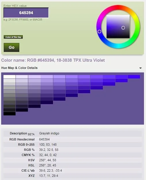
Ultra Violet 18-3838
The Pantone Color of the Year 2018 is Ultra Violet (not to be mixed up with ultraviolet, which is a specific wave length in the light spectrum). Pantone defines Ultra Violet as a dramatically provocative and thoughtful purple shade, communicating originality, ingenuity, and visionary thinking that points us toward the future.
How to match Ultra Violet in RBG, CMYK, and other color models
Pantone Colors are important to artists, designers, and manufacturers because they are part of a standardized color matching system. Each individual color swatch in those nice fans has a unique reference number. As a result, individuals in different locations can reference a Pantone numbered color and be assured that their counterparts understand exactly what colors they are referring to without further explanation or directions needed.
It can be a challenge of course when the artist or designer uses a different program, or works in a different color model than Pantone. Printers for example usually work with the CMYK (Cyan, Magenta, Yellow, Key) model, while photographers and web artists usually work in an RGB (Red, Green, Blue) model. Fortunately there are companies who solved this problem and provide color code conversion tools like this one.
How to use Ultra Violet in interiors
Now that you know what the 2018 Color of the Year is, you can apply several techniques to update your interior with this new color:
Walls:
You can go big and bold, and color your walls Ultra Violet. This will make a dramatic statement and will look great when you for example apply it to one wall. You can achieve this by painting the whole wall, or use stencils or wall paper to apply patterns in Ultra Violet.
Furniture:
A second way to update your interior with the 2018 Color of the Year is to use furniture. A chair, sofa, or cabinet in Ultra Violet definitely will create a focal point in your interior.
Accents:
Finally, and probably less expensive than the other two options, you can work with accents to update your interior with the 2018 Color of the Year. Some strategically placed Ultra Violet cushions and pillows, some ornaments with that color, even some purple flowers will help you create a contemporary styled interior that matches the latest color trend. And of course, after all this is a photography blog, you can use photographs.
Photos with Ultra Violet
When you consider updating your interior with photos and the color Ultra Violet, you have several options available:
Matting and Framing:
Instead of using an image with Ultra Violet in it, you might consider using an Ultra Violet frame. Or use a black (or any other color frame) and place the image in an Ultra Violet matte to achieve the accent color you are looking for. This works great with black and white images, and also can be very well applied when the image used has a color scheme that is complementary to, or contrasting with, Ultra Violet.
Color in photos:
You can use images that have Ultra Violet or a similar color in it (think for example of an image of a purple flower). Or, to create a dramatic effect and focal point, use images that have color palettes contrasting or complementary to Ultra Violet.
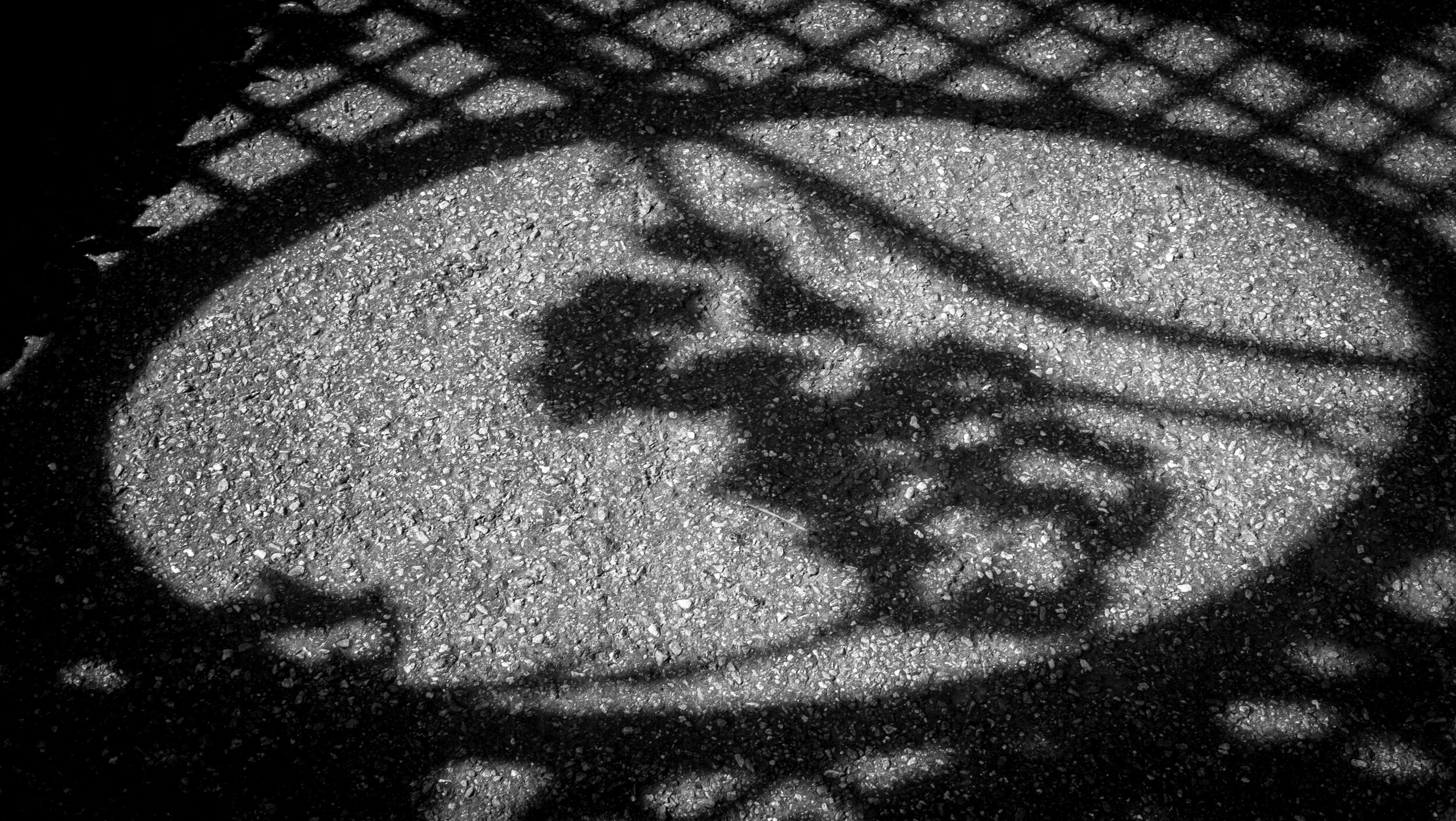
Toned and Split-Toned photos:
A specific way of using images with Ultra Violet is the use of toned and split-tone colored photos. Toned images are created by adding one single color to an image. Split-toning basically is adding two different colors to the highlights and shadows of an image.
The examples below show how this looks when using a black and white image (first image) as basis.


Now go ahead and bring some Ultra Violet in your life
As shown in this article, there are multiple ways to incorporate Ultra Violet in your interior, and I hope it provided you with some good ideas and inspiration to update your interior with the 2018 Color of the Year.
Now go ahead and share in the Comments sections below what you are going to do to bring some more Ultra Violet into your life.
Interior Design's Little Black Dress
Black and White Photography: The Versatile Little Black Dress For Any Interior
Ever since its introduction by Coco Chanel in the 1920's the "Little Black Dress" has been considered an…
Black and White Photography: The Versatile Little Black Dress For Any Interior
Ever since its introduction by Coco Chanel in the 1920's the "Little Black Dress" has been considered an essential element of a woman's wardrobe. The popularity and fashionability of the little black dress lie in its versatility: it can be worn as a cocktail dress, as formal business attire, or dressed up for a festive occasion.

In a similar fashion (pun intended) Black and White photography can be considered the versatile Little Black Dress that fits any interior and works in all designs. It is the traditional format of photographic expression: we are used to it, it feels natural, and like the Little Black Dress it never goes out of style.

Several design considerations are important when selecting images to match and complement an interior:
- Subject matter of the image (does it match the overall style of the room);
- Format (e.g. square, panoramic, landscape or portrait orientation);
- Size;
- Matting and Framing;
- Color or Black and White.
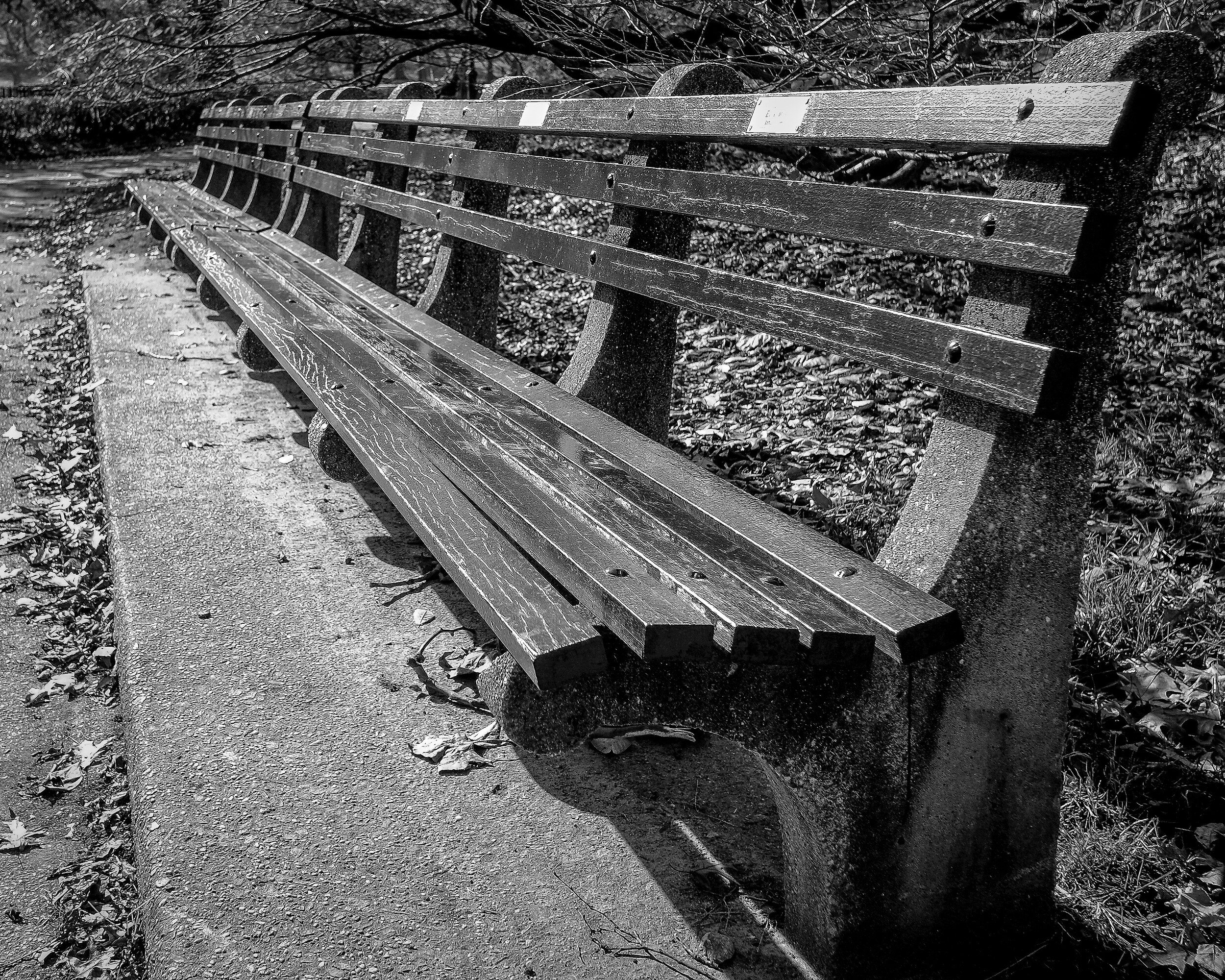
While color as I explained in a previous post can have an important role within an image, a Black and White image transforms a scene to its most abstract format: Black and White creates a focus on shape, form, texture, lines, and patterns. It has a magical quality that you can’t quite put your finger on. Or with the words of photographer Anders Petersen: "in black and white there are more colors than color photography, because you are not blocked by any color so you can use your experience, your knowledge, and your fantasy, to put colors into black and white.
Within a Black and White image, there is no distraction from the photograph's subject matter. And, equally important when creating a design for a specific room, a Black and White image does not distract from other interior design elements. Similar to a Little Black Dress being one of the best ways to showcase fabulous jewelry, Black and White photography provides one of the best ways to showcase your interior: it doesn't overwhelm, it doesn't disturb the room's color scheme, and it actually makes accent colors in the room look more impressive. And it provides dramatic contrast in a room in which the colorfulness of the interior needs to be center stage.
Do you have a Little Black Dress to enhance your interior?
Second Saturdays at SEC4P
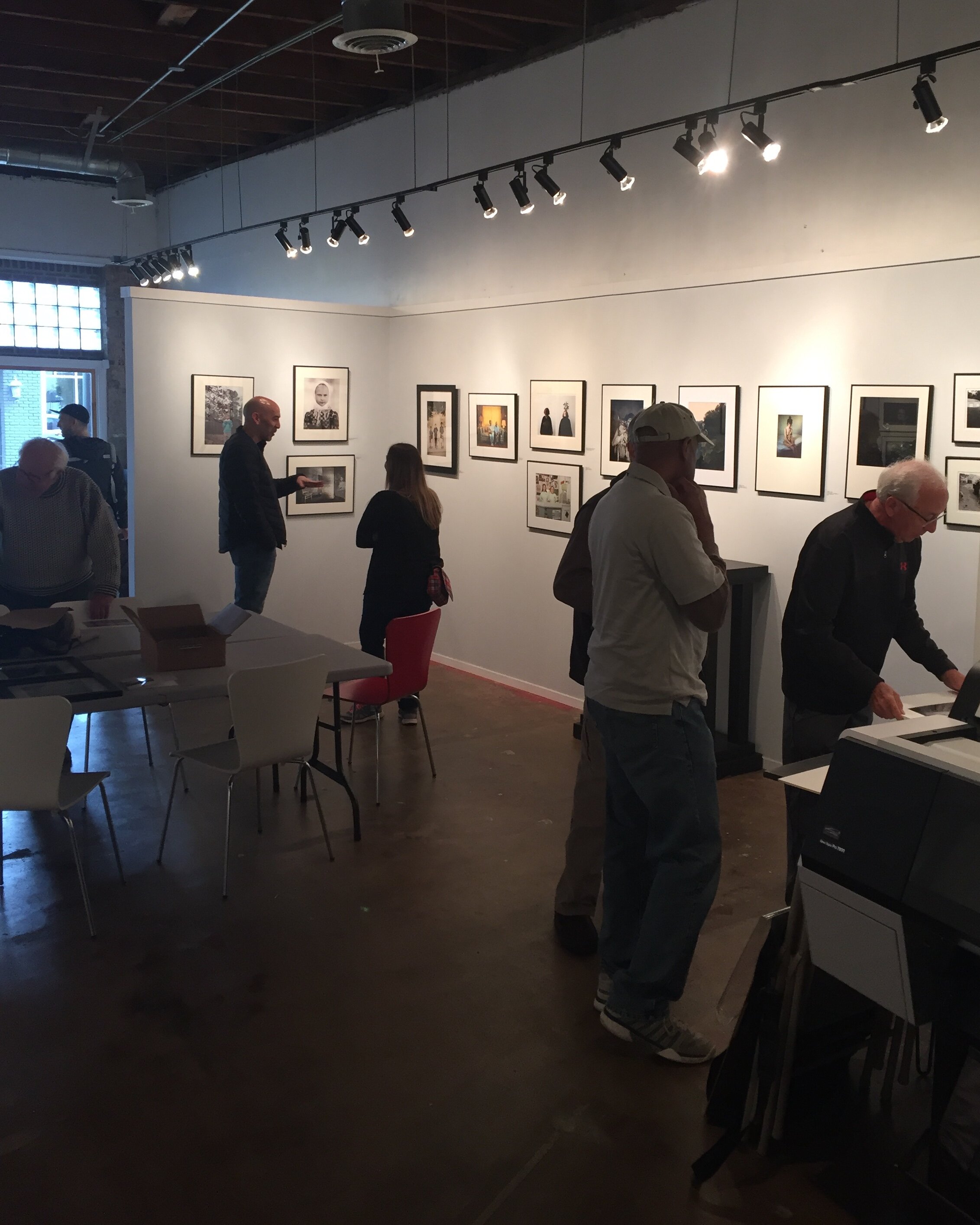
Behind the Scenes: SEC4P Second Saturdays Photographer Meet Up
Whenever possible I attend the Saturday Coffee event at the South East Center for…
Behind the Scenes: SEC4P Second Saturdays Photographer Meet Up
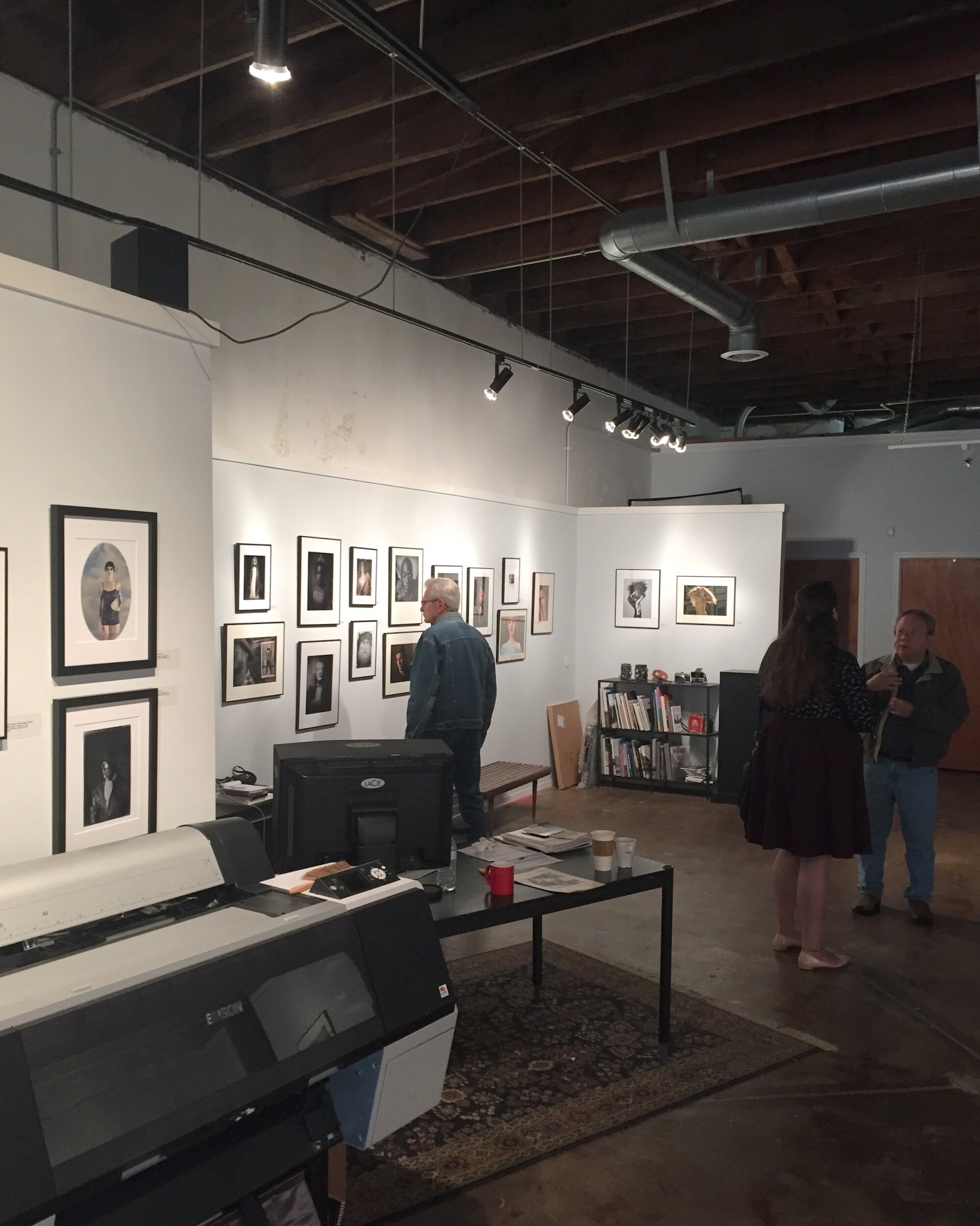
Whenever possible I attend the Saturday Coffee event at the South East Center for Photography: a great opportunity to meet other photographers, see some new and/or unpublished work, get feedback on my own work, and in an informal setting talk about...photography and all things related.
What is it
The Saturday Coffee is an informal gathering of photographers to discuss photography, each other's work, share experiences and tips, and of course, enjoy coffee and donuts.
Where and When
In principle every second Saturday of each month, from 10 am - 1 pm at the South East Center For Photography (SEC4P), downtown Greenville, SC, at 116 E Broad Street (see map below).
Who organizes
SEC4P is an exhibition and education venue promoting the art and enjoyment of fine photography, owned and led by Michael Pannier.

Through monthly juried exhibitions, local, national and international photographers of all skill levels have the opportunity to have their work presented and enjoyed by collectors, curators, enthusiasts, interior designers, and colleagues. In addition, exceptional photographers will be invited to participate in solo or group shows. The workshops and classes cover a wide aspect of photography and challenges, encouraging and inspiring the photographer in all of us.
Who should attend
I encourage all photographers in the Greenville area (and further away) to attend, whether they are professional or amateur, working with digital or creating their images with analog tools. There is so much to see and discuss, and attendees are passionate and enthusiastic photographers who share their work, provide feedback, and are open to ideas from others.
The Saturday Coffee events in my opinion are also great for collectors, art lovers, and everyone else interested in fine art photography. They provide great opportunities to meet photographers in an informal setting, see the works on display in the gallery, have a chance to see some new/unpublished work, and hear the background stories.
Why Attend
First of all, it is lots of fun to meet like-minded people and talk photography. As mentioned, usually some attendees bring some new or unpublished work. And while you are there, take the opportunity to look at the exhibitions on display. Usually there are two exhibitions up at the same time: one displays work form several photographers, submitted for a themed "call for entries"; the other usually displays work from an individual artist.
And did I mention coffee and donuts?
More Information
More information can be found on the SEC4P website, and of course at the gallery itself.
Review: Blurb Square Book With ProLine Uncoated Paper
A review of my new Blurb book
As I mentioned in a previous post, creating a photo book in Blurb directly from Adobe® Lightroom works very well…
A review of my new Blurb book
As I mentioned in a previous post, creating a photo book in Blurb directly from Adobe® Lightroom works very well. Because it had been a while since I published my Old World Charm and New York, New York books I decided to create another book with some of my Haiku.
This time I wanted to try a small (7x7 inches) square format layout and the ProLine Uncoated paper.
In this review I cover:
The book contents 10 Haiku, previously published on this blog and also accessible on my Haiku page, and it is of course available for purchase on Blurb.

Creating The Book
As mentioned above, I already covered the details regarding how to create a Blurb photo book in Lightroom in a previous post. Since it had been some time however since I created my first two books, I had to remember all steps in Lightroom again. What I (re-) learned is that it is important to first select the folder or collection that contains the images you want to use for your book. If you don't, there is a change that you lose your book layout settings. Saving your new layout is also important, and will prevent quite some frustrating moments. Bottom line it is an easy process, as long as you think through what you want to accomplish and the steps needed.
For me Haiku are quite intimate expressions of thoughts and feelings and I therefore wanted the book also to be intimate and small. A small (7x7 inch) square book was the best match to these specifications. In addition to the introductory page, the book has ten spreads with the Haiku on the left page and the accompanying image on the right page. Although not all images are in the square format, I wanted to keep the left, right, and top margins to be similar on all pages. [Back to Top]
Purchase and Shipping
The order process is quite easy: select your book in your Blurb dashboard, order and make your shipping selection. That's it. Since you are the author, the price of the book you pay is without the markup you have set that will be applied to other buyers. Because this is a print on demand service, you need to keep in mind that the book will not ship immediately since it first needs to be printed. Blurb will send you an email when the book is being printed, and another email when the book has been shipped.
I ordered 10 Haiku the evening of October 30 and shipment started November 3, so production of this specific book took three to four working days. Shipment with USPS took five days and I received my book in the mail on November 8. As a result, the total time between ordering and having the book in my hands was nine days. In my opinion this is a reasonable time, just keep in mind that you need to order in time and 'next day' delivery is not possible. [Back to Top]
Cover
Blurb offers a flexible, high-gloss laminated thick paper soft cover for books with a limited number of pages. It is very glossy and the pictures on it really shine. Although it has a good feeling and looks nice, I would have preferred a non-glossy cover, that would have better matched the paper used inside. [Back to Top]
Paper
You can select several paper types for photo books, from Standard 118 GSM paper to several high quality photo papers up to 190 GSM. As per the information on the Blurb website:

I like the Premium Lustre paper I used for Old World Charm and New York, New York. However, based on and intrigued by the review on the Film Photography Blog I wanted to try the ProLine Uncoated paper. And I was not disappointed!
The color of the paper is some type of off-white which really works well with the images (see also below) and for me really helps establish the emotional connection I want to accomplish with Haiku. Although it is uncoated paper it feels like there is some coating, providing a smooth surface with just a bit of a 'touch' to it. This "eggshell" texture works great and really helped me to accomplish the look and feel I wanted to achieve. [Back to Top]
Binding
The soft cover features durable library binding, which is done very well. Although it does not allow for laying the open book flat, I notice that the binding is quite sturdy. I have the other two books I ordered for a couple of months now, and although they have been handled regularly by different people none of the pages have come loose. [Back to Top]
Print quality
The print quality of the cover images and text is good. The images stand out on the glossy paper and even the small text on the back cover is very well printed and readable. The printed text in the book is also very clear and sharp.
And then the images: the print quality is very good, and the ProLine Uncoated paper really helps achieving the image quality and feeling I wanted to create for the Haiku. The color images are clear and crisp, and the colors really shine on this paper. The black and white images, besides also being very clear and crisp, have great tonality. I am really impressed by the paper and the print quality Blurb offers. Proline Uncoated paper definitely will be a choice for me for any future fine-art photo books. I am actually considering re-issueing my other two photo books with this paper. [Back to Top]
Conclusion
Bottom line: creating a Blurb photo book with LightRoom is a great and easy way to have a book published and available for purchase. The only concern I have is that this process will continue with all the changes LightRoom is going through.
The buying and shipping experience is good. However, when purchasing a Blurb book you need to keep in mind that there will be production time involved. Each book is printed 'on-demand' and not directly available for shipping. Shipping duration is depending on the selections you make.
The general quality of the cover and binding is good, although it would be great if Blurb would offer a matte cover version in the future.
The ProLine Uncoated paper is just gorgeous: the thickness, the feeling of it, and combined with the print quality I definitely recommend this as a way to share your fine art images: not only to sell as fine art photo books but also to promote in book format the images you have available as individual prints. [Back to Top]
Behind The Scenes: American Dream
About the image I used for last week's American Dream haiku
I created this image a couple of years ago, when on a business trip to Southern California. I was testing a…
About the image I used for last week's American Dream haiku
I created this image a couple of years ago, when on a business trip to Southern California. I was testing a 1950's FED2 camera that I jut purchased, and I decided to take it on this trip.
The "American Dream" for many people still stands for abundance, shopping, and good living. I remembered taking this picture, and the whole feel of the setting inspired me to use it for last week's blog post. An American flag, some shopping carts, the clear blue sky, and a tree that nicely filled up an area that otherwise would have been too much negative space in the image. And the whole scene nicely framed between the flagmast and the lamppost to the right. It all came together.
There even was a branch of one of the major US banks nearby which I, unfortunately, could not capture in the frame without ruining the composition with the flag and the shopping carts. When I took this picture I was standing on a sidewalk that was about 6 foot lower than the parking area where the flag and shopping carts were. I did some cropping in Lightroom to exclude a wall with the bank and other advertisements, and to ensure the top of the retaining wall is just visible in the bottom of the picture, adding the notion that the American Dream might be a challenge to realize.
It was only after posting last week's blog, that I noticed that the trunk and branches of the tree more or less form the old Soviet hammer and sickle symbol. I don't know if there is any symbolism here, but it seems to be a strange and interesting coincidence.

About the camera and the film
I learned later that the camera I have actually is a FED2b, version PE0395. It is a rangefinder camera built some time between 1956 and 1958 in the former Soviet Union, and it came with a 50mm Industar 26M lens. Some people claim the FED cameras were even better than the Leica it was copied from. If you are interested in FED and other old cameras manufactured in the former Soviet Union, SovietCams.com is a good place to start.

The film stock I used for these test shots was Kodak Portra 400, which has a very nicely balanced contrast and color.
All shots came out quite nice: the combination of this camera and lens, with the Kodak Portra 400 film, resulted in what I would call a good vintage look. And I actually was happily surprised with the quality of the shots in general: color, sharpness, and overall "feel". Remember these have been taken with a camera that is almost 60 years old! Below are some more images from that first roll with the FED, starting with the original image (not cropped) I used for the blog post. You also will notice that I had some flare or a light leak showing in one of the images.
Book Reviews and Comparison: Abandoned America and Autopsy of America
Comparing Two Urban Exploration Photo Books
A couple of weeks ago I purchased two urban exploration photography books: Abandoned America by…
Comparing Two Urban Exploration Photo Books

Introduction
A couple of weeks ago I purchased two urban exploration photography books: Abandoned America by Matthew Christopher and Autopsy of America by Seph Lawless.
Urban exploration (often shortened as urbex, UE, bexing, urbexing and sometimes known as roof-and-tunnel hacking) is the exploration of man-made structures, usually abandoned ruins or not usually seen components of the man-made environment [Definition from Wikipedia]
Both books have been published by Carpet Bombing Culture, a UK-based publishing company who describe themselves as "your counter-cultural publisher par excellence". Their objective is to provide the readers with premium quality art and photography books that contain critical and highly subjective commentary.
Although both books contain essays with great photography of abandoned places and buildings in the USA, it seems that the point of view - and as a result the exploration of the topic - of both photographer-writers is quite different, resulting in different approaches of the same subject matter.
I enjoyed and recommend both books, and will check out other titles by these photographers and from this publisher, in the end however my personal preference goes to Abandoned America. Read through to the conclusion to see why.
Abandoned America - Dismantling The dream

Author: Matthew Christopher
Pages: 240
Cover: hardcover
Size: 254mm x 254mm
ISBN 978-1908211-42-2
Edition: First edition 2016
Photos: 154
Review
From the author's website: "Matthew Christoper is a commercial event, portrait, and architectural photographer who also teaches and tutors in photography and photo editing. He has had an interest in abandoned sites since he was a child, but started documenting them a decade ago while researching the decline of the state hospital system." Christopher also offers urban exploration workshops to the sites he covers in the book. More on Christopher, the book, and the workshops can be found on the Abandoned America website.
In his foreword Don Wildman captures the essence of the book and Christopher's approach: "The haunting beauty of Christopher's images...employs...geographic objectivity, a refreshing and purposeful lack of judgement...delivering the image artfully composed without heavy-handed commentary..."
What specifically struck me in the foreword and reviewing the images is that it is "...surprising...how many of these sullen images seem almost celebratory-again". And how "...images...somehow give a sense of hope, not melancholy". While the essays in the book serve to illustrate situations where (government) policies and decisions led to devastating results, and sometimes maybe might have been better changed, or adapted than dumped, they definitely also show that "...while it's tempting to sigh, swoon, and wistfully fantasize about better days behind us, progress is all that really ever makes sense and it comes from moving forward, drawing from the past lessons we must learn for a better-built future." This is exactly how I read and perceived the essays: beautiful images and important stories that need to be told to share these past lessons.
In his own introduction Christopher explains how he came to love photographing ruins and more importantly what drives him to create these essays. It is the combination of the photographs and the stories that "made these places amazing". He also spends a lot of time in exploring the background of the buildings and the people who lived, worked or studied there, "in order to create something that honors the sites, and those whose lives they were a part of, with the dignity and respect they deserve". He interestingly states that, because he feels he never achieved that goal, it is not easy or even enjoyable for him to photograph these locations and write the stories.
According to Christopher "Perhaps the most gratifying element of all has been seeing how many other people have come to realize they love these places too, that an homage to our past can be at once a shared goal, a eulogy, and at times even a celebration...They [these places] deserve to be looked at neither as some feel-good fantasy where all things wind up for the best, nor only as wraiths foretelling an eventual disintegration that awaits us all......they contain lessons about time, change, and surviving the darkness when it comes...". Christopher's dedication to the places he documents and their possible future, is probably best illustrated by the fact that he through his workshops generated a quite substantial sum ($18,000 by the time of publication) for the preservation of abandoned sites.
The book contains 13 essays. Each documenting in images and words the past and present of the buildings, areas and objects at the focus of each essay. The text of each essay is a mix of Christopher's own perception and feelings for the place, research he did, and interviews with people who lived, worked, or studied there. He also shares how he got to photograph the specific buildings and sites.
As Christopher indicates in his introduction, each essay not only illustrates the decay, and the reason(s) for it, or how things in the past could have been done better. Each also contains a glimpse of hope. In most cases this hope is created by people and organizations who are working - and sometimes fighting - to preserve the sites, bringing them back to their former glory.
Christopher's images have a very distinct appearance, because of composition and color palette. They very much remind me of cinematography stills, with rich colors that give the viewer the impression of really 'being there' with the photographer. The photos are extremely well executed, and combined with the text provide a complete impression of the places pictured: not only as they look now but also providing the viewer/reader with an image of how these places might have looked in their glory years, and how they might look again.
I really liked viewing the images and reading the essays. It gave a feeling of sadness, of what could have been and is not, of what might have gone wrong and could have been done better. But also a sparkle of hope: where individuals and communities are working to restore the buildings and sites.
Autopsy of America - The Death Of A Nation

Author: Seph Lawless
Pages: 198
Cover: hardcover
Size: 251mm x 251mm
ISBN 978-1908211-49-1
Edition: First edition 2017
Photos: 147
Review
Seph Lawless is the pseudonym for an American-based artist, political activist, and photojournalist who has been documenting abandoned sites in the USA since 2005. Although his work is globally recognized and has been broadly covered by major US and international news stations, he has deliberately chosen to conceal his real identity. More on Lawless, his vision, and his other explorations can be found on the Seph Lawless official website.
The foreword/introduction by Michael Goldfarb puts the reader and viewer directly in the direction the book is going. Describing Lawless' work as "Bleak and beautiful shots of ruins..." depicting the "...wreckage of a vanished civilization..." he immediately sets the tone for what is coming. Comparing current big cities with the ghost towns of the past as "places where hopes were crushed by catastrophe...on the scale of war" that "was waged by America's economic system on its own people", this book's intention is clearly to show that "The America that produced these buildings is receding".
Goldfarb asks whether people who live nearby, and probably on a daily basis drive past these ruins of modern civilization are angry. Lawless explained to him that they are, and that this is one of the reasons of the big political upheaval at the end of 2016 when Donald Trump was elected as President of the United States of America. The beautiful images Lawless created according to Goldfarb being the history of the USA in the Age of Trump.
This thread continuous throughout the book: it is not as much a collection of essays about specific places but a collection of images of destruction and despair sometimes almost haphazardly grouped in chapters. The images all have a distinct gloomy appearance. Even those taken in bright sunlight have a feeling of darkness around them. Whereas the images in the first chapters are pretty consistent, the second half of the book appears to be less structured with images of abandoned schools, malls, factories, churches, and train graveyards seemingly randomly mixed.
There is not much accompanying narrative that provides the viewer any insight into what he is looking at. And in some instances the use of text adds to the confusion: in one instance three pages that appear to be title pages of different chapters (An American Horror Story, The Final Curtain, and Hurricane Katrina) follow consecutively without anything in between. In first instance I actually thought that I might have purchased a wrongly assembled copy. Based on the flow of other pages however I think my copy is okay.
As mentioned, the narrative is very limited and where it exists, it is all doom and gloom. From all the examples I could have used, the following in my opinion best reflects the mood of the book: "America is a man falling off the roof of a skyscraper, and as he passes by every floor he says to himself...so far so good."
The combination of the beautiful but moody pictures, and the text focusing on the apocalyptic state of the places photographed and the reason these places are in their current state creates a feeling of disorientation and confusion. If this is what Lawless wanted to achieve, it is a clear case of 'mission accomplished'.
The interesting thing is that I was not able to put the book away. In first instance I didn't know if I was annoyed or upset by what I was viewing and reading. After researching Lawless' website however, and although I definitely do not share his worldview and opinion, I realized that he did a great job in getting his message across. After this revelation I was able to pick up the book again and actually appreciate it's setup and layout.
Summary and Conclusion
Both books are extremely well executed. The quality of the cover, the binding and the paper is very good. Although all pages are heavy weight glossy and smooth, as a result of the printing process several images feel as if they have some structure added. The images by both photographers are great: from a technological perspective and also from an 'feeling' perspective. Both authors in my opinion have succeeded in getting their message across. Abandoned America and Autopsy of America both provide thought provoking insights in the decayed sites and buildings, and the reasons that led to their existence and their current state. Both books also entice to look at other publications by Carpet Bombing Culture: Soviet Ghosts, Ask the Dust, Haikyo, Fukushima, Beauty in Decay I and II, States of Decay, and Abandoned planet.
From a subject matter approach point of view however, I like Abandoned America more.
The first reason being that Christopher provides a lot of background information about the locations he describes. I like to understand what it is we are looking at, why it was created in the first place, why it is in its current state, and what possibly might happen with it in the future. The personal stories of people who lived, worked, and studied in the documented places provide a great human touch, sometimes heart breaking, sometimes providing a glimpse of hope. This background information generally is lacking in Lawless' approach: he focuses on the current state of the places he documents and his opinion on the reasons why they are in their current state.
This is linked to the second reason why I like Abandoned America more. However much we need to be critical about what we are doing to our environments and other humans Autopsy of America has too much a negative bearing for my taste: too much an apocalyptic approach focusing on how capitalism has lead to the destruction of areas, places, and people. Although Abandoned America too shows the results of bad decisions and wrong policy, Christopher has a more neutral approach and includes an effort to show the greatness of these old places, and the hope and even some early indications that betterment is possible.
Similar in execution and very different in approach of the subject matter, I definitely recommend both books to be purchased and become part of your photography essays library.
Help Needed With Portfolio Decision
Should I go Black and White Only, or not?
When reviewing my portfolio it will become clear that I have quite a preference for black and white images: two-thirds of all…
Should I go Black and White Only, or not?
When reviewing my portfolio it will become clear that I have quite a preference for black and white images: two thirds of all images are black and white and just less than one third are in color.
Reflecting on this I found that the main reasons for my preference for black and white images are:
Since there are no distracting patches of color in the image, there is a better focus on the subject matter;
The impact of black and white images is more dependent on the right use of lines, forms, and texture and as a consequence I am (need to be!) more focused on these;
Lately I am leaning towards creating more abstract images, which to my opinion have a bigger impact when in black and white;
For me it is easier to create a moody feeling in black in white;
In general I like the look and feel of black and white images better.
To be honest however, sometimes color just works better. Some subjects need to be viewed in color; sometimes color is key to creating the right emotion and feeling in the image; sometimes color is needed to guide the viewer's attention to the key elements of the image.

Can all color images successfully be converted into black and white? Definitely no. And since I have several color images in my portfolio that I really like, I am not sure yet that I should abandon these.
So here is where I need your help: have a look at the examples below (and if you would like at all pictures in my portfolio) and then let me know what your preference and advice is. Should I go "full black and white" or continue with color images also? Please share your remarks and observations in the comments section at the bottom of this page.


Images Selected for Small Works Juried Show
Artists Guild Gallery of Greenville Small Works Juried Exhibition
Today I have some quite exciting news to share: both entries I submitted for the Artists Guild Gallery of Greenville (AGGG) 6th Annual Small Works Juried Exhibition have been accepted for the show!
Artists Guild Gallery of Greenville Small Works Juried Exhibition
Today I have some quite exciting news to share: both entries I submitted for the Artists Guild Gallery of Greenville (AGGG) 6th Annual Small Works Juried Exhibition have been accepted for the show!
AGGG's gallery is located in the heart of Greenville, South Carolina. It represents more than 20 juried local artists, offering work in a variety of media. The interested visitor and buyer will find works in acrylic, graphite, mixed media, oil, pastel, glass, woodwork, pottery, sculpture, and of course photography.
Both entries are printed in a 7x7 square format with pigment-based ink on Ilford Galerie paper.
The first image is a black and white picture of the entrance stairwell of the Pasadena Museum of California Art. It has a very clear, almost abstract design with curves and nooks creating great shadows. The image was taken with a Fujifilm GS645S medium format camera on Portra 400 film, converted to black and white in Lightroom 4.
The second image is a black and white picture of a bath's faucet. I especially like how the highlights and shadows interact with each other. The picture was taken with a Canonet QL17 on 35mm film.


This year's show opening and artists reception will be 5 August from 6pm to 8pm at AGGG's gallery on 200 N Main Street - Suite 104 Ivey Square, Greenville, South Carolina 29601.
I entered AGGG's Annual Small Works Juried Exhibition for the first time last year with the image below, also taken with the Canonet QL17 on black and white 35mm film. You can imagine that I was very happily surprised it won a Honorable Mention?!

If you are in Greenville on or after 5 August, please take a moment and visit the gallery. Not only to see the entries of the artists who's work will be on display in the Small Works show, but also to appreciate the work of the talented resident artists of the Artists Guild Gallery of Greenville.
Fine Art Defined
What exactly is Fine Art when it relates to photography?
I found a great definition in a post by Steve Johnson on his The Minimalist Photographer site: "It means, simply art that has no purpose other than being art – art that is its own reason for existing… To qualify, the intent would have to…
What exactly is Fine Art when it relates to photography?
I found a great definition in a post by Steve Johnson on his The Minimalist Photographer site: "It means, simply art that has no purpose other than being art – art that is its own reason for existing… To qualify, the intent would have to be to produce something that has no specific purpose outside of itself." Steve's post about fine art photography was an eye-opener for me and it really drives home what I currently try to accomplish with my images:
Capturing the reflection of light off people and objects, in such a manner that it represents the reason why that reflection at the moment of capturing inspired me to capture it on film or digital media at all.

The interesting notion here is that, different from other art forms, photography to be creative needs an already existing creation; be this a man made object, a natural object or a living being. Whereas a painter by using the capturing medium (canvas, paint and whatever else the artists decides to use) can create a picture of a vase without an actual vase in existence, and the potter can create a formerly not existent vase by applying his creative medium, without light bouncing off an actually existing vase a photographic image of a vase is not possible.

I'm probably rambling here and the above can be the topic of a long post on a psychology blog, or maybe initiate some serious psychoanalysis. Te essence, however, is that Steve Johnson's post and his definition of fine art made me realize what I really want to accomplish: creating photographic images that can exist just because they exist. The beauty of this definition also lies in the fact that it detaches the art 'value' of the images from any opinion whether they 'are' fine art: they are because they exist, not because someone (including me) says or agrees they are.
Does that mean that I will be happy if someone says an image of mine is fine art? Sure. Does that mean that I will be offended if someone says that an image of mine is not fine art? Nope. Does that mean that I (eventually) will not start selling images? No. Does that mean that I will be unhappy if anyone wants to buy one of my images? Definitely no!
For now, however, join me in enjoying the images you see on my website. And I will be happy to respond to any questions or comments you might have.