

Tales From The Black Box Photo Book Available
My latest photo book "Tales From The Black Box" is now available for purchase
As mentioned a couple of weeks ago, one of the projects I have been working on lately has been the…
My latest photo book "Tales From The Black Box" is now available for purchase
As mentioned a couple of weeks ago, one of the projects I have been working on lately has been the production of a new photo book.

Why This Book
The regular followers of this blog know that combining images with stories is crucial for me to realize my photographic vision: showing what not clearly can be seen, providing a new narrative to an existing situation.
Although I sometimes use the very specific Haiku format (ten of which have been published in a small booklet) and while I continue to work on larger photo essays, I am at this moment in time most successful communicating my vision through PicTales: connecting images to short stories and poems that guide the viewer towards a reality I perceived while creating the image.
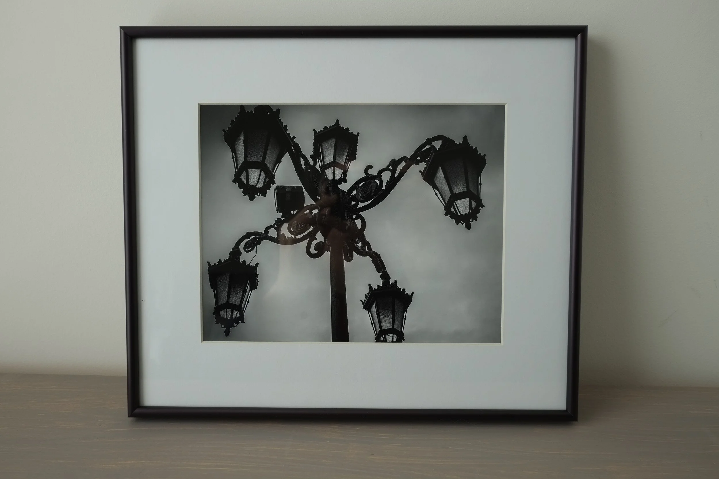
Several months ago I developed the concept to collect several of the PicTales from the blog in a large-format photo book. After carefully selecting those stories that are most aligned with my artistic vision and for consistency reasons focusing on stories with black and white images, I now have published these in my newest book:

From the Foreword:
“For me...the look of an image is far more interesting [than its quality] because it translates directly into emotion...”
Photos are all about emotion.
What did I, the photographer, feel when looking at the scene before, during and after capturing the image.
What emotion do I want the viewer to feel when looking at this image.

The main question I want to answer by combining images and stories is: how can I use stories to make this emotional response as strong as possible while directing it towards the feeling I want to communicate.
“...adding a story to an image allows the photographer to direct and change the viewer’s emotional response.”
Book Details
For this book I again decided to self-publish via Blurb: their tools are very convenient to use, and the materials they use are of excellent quality.
Since I wanted it to be a large-format book, I selected the largest size available: 13 x 11 inches (33 x 28 cm). And because I am not very fond of the matte hardcover image wraps, I designed a glossy dust jacket that protects a straightforward but elegant black linen cover.
The most important decision I had to make was regarding what paper to use. Although most photo books are printed on glossy paper, I fell in love with the ProLine Uncoated paper when designing the 10 Haiku booklet. This is a very nice 100gsm matte paper with a bit of a tooth to it; it has a very subtle structure which makes the words pop and which renders the black and white images in an excellent fine art quality.
My daughter Gwyneth, who is an art student at Winthrop University, helped me select the two fonts: Abril Fatface for the headers, and Didot for the text. Both are very complementary serif fonts providing the right mix of modern and classic design.

After reviewing a proof print and experiencing the excellent execution of the book, I decided to also make a smaller version of 10 x 8 inches (25 x 20 cm) available. This, of course, meant I had to resize the images and the fonts to keep everything within the right proportions to each other.
How To Buy
A photo book is a great way to collect fine art photography. It does not need expensive framing, it does not need wall space, and it provides a great overview of a photographer's work and insight in their vision and use of the medium.
This book is no longer available on Blurb.
And don't forget to visit my Blurb books page for an overview of all my photo books for sale.

Images By The Artist As A Young Man
How Did My Journey Into Photography Start
I started taking pictures with an Agfa Iso Rapid 1-C which I got for Christmas…
How Did My Journey Into Photography Start
I started taking pictures with an Agfa Iso Rapid 1-C which I got for Christmas sometime in the early 1970s. It was a small point-and-shoot camera, that could use flashcubes (who remembers those?) and had a rather special film loading system.
The holder with the new film was placed in one side of the film chamber. The camera automatically guided the protruding film leader in another holder that was placed in the other side of the film chamber. When taking pictures, the film was gradually totally moved from the original holder to the take-up holder.
The cool part of it was that when you accidentally opened the camera the already exposed pictures where protected because they already were moved in the light-tight take-up holder. When a roll of film was fully exposed, you simply took the take-up holder out the camera for development and the original film holder, which was now empty, was moved to the other side of the film chamber to be used as take-up holder for the next roll.
Another interesting feature of this camera was that it took square pictures. If I remember correctly, each negative must have been about 1-inch square. Most of the time I actually used Agfa slide film.
This small gem lasted me until well into my high school years and I literally produced hundreds of slides with it. Of course, this led to far too many slide-show evenings at home, which came to be dreaded by my mom, dad, and little sister. Unfortunately, when my dad passed away in 2010, my mom went through a rigorous house cleaning as part of her grieving process and she threw away most of the slides.
As a graduation present for high school my parents made quite an investment (we are talking 1979) and bought me a Ricoh XR-1 with 35mm and 50mm prime lenses. This was a huge step up for me. The SLR experience opened a whole new world. Seeing through the viewfinder what actually will appear in the picture and working with these lenses learned me quite a lot about composition and depth of field.
I also started selecting different subjects for my photography. Where my main focus with the Iso Rapid was on family pictures I now started looking more at my environment. The town where I lived, buildings, nature, closeups of my airplane and other models. Actually trying to make something that was more that 'just' quick family pics (or 'kiekjes' as they say in Dutch).


Fast forward to college. I sold the Ricoh to my best friend and acquired a used Canon AE-1. A great camera which I took on many vacations with my girlfriend, now my wife. It came with two lenses: a 50mm prime and a 70-210 zoom. While the Ricoh was a nice camera that actually took great pictures, the Canon setup was in a totally different league: more sturdy built, and with excellent mechanics. I traded it in for a Nikon N80 and I actually to this day regret not having it anymore.


So...well...that Nikon. It made nice images, it came with a kit zoom lens, it had autofocus (wow!). But for some reason, it did not really resonate with me. What it did, however, was moving me into the Nikon system and world. And although I eventually parted with it, it showed me how an advanced camera can help to create great images. It also made me stay with Nikon when I purchased my next camera: the Nikon D70 which brought my photography into the digital age and me...., well let's just say I wasn't really a young man anymore.


Image Selected for SEC4P Juried Exhibition
Night Visitor has been selected for the Fauna exhibition at SEC4P
With all the excitement going on last month, I almost forgot to share that one of my entries to the 'Fauna'…
Night Visitor has been selected for the Fauna exhibition at SEC4P
With all the excitement going on last month, I almost forgot to share that one of my entries to the 'Fauna' juried exhibition at the SE Center for Photography (SEC4P) has been accepted for the show!
The image, with the title 'Night Visitor' is an image of a giraffe I encountered during a 2010 nocturnal safari in Kruger Park, South Africa. The animal suddenly appeared from the darkness and I was fortunate to just capture its head, illuminated by flashlights from the park rangers.

The image was taken with a Nikon D700 and I printed the archival quality print with pigment-based ink on Hahnemüle Photo Matt Fibre paper.
All entries were juried and selected by renowned animal photographer Anne Berry, and the exhibition opening and artists reception will be 7 December 2018, from 6 pm to 8 pm at SEC4Ps gallery on 116 E Broad Street, Greenville, South Carolina 29601
If you are in Greenville on or after 7 December, please take a moment and visit the gallery. Not only to see the entries of the artists whose work will be on display in the Fauna exhibition but also to appreciate the work of other photographers on display.
If you are not able to attend the exhibition opening on 7 December, the gallery's general opening times are:
Wednesday through Friday from 10 am until 4:30 pm
Saturday from 10 am until 4 pm
And on the first Friday of every month from 10 am until 9 pm.
The gallery owner also organizes a get-together for photographers and other interested folks on the second Saturday of every month.

Location, Location, Location
Will Moving To Another Country Change My Photography?
It has been a couple of hectic and exciting weeks for my family and me: we recently became US citizens, …
Will Moving To Another Country Change My Photography?
It has been a couple of hectic and exciting weeks for my family and me: we recently became US citizens, and it has been decided that in January I will relocate to South Africa for my day job.
The preparations for these events not only had a direct impact on my blog schedule (you probably noticed that I missed posting a couple of times); my relocation date approaching fast made me realize that moving to another country probably will change the genres and style of my photography and possibly also the content of this blog.
For a start, some of the projects I am currently working on will have to be put on hold until I am permanently back in the US. Furthermore, the type of photography and photographic subjects I will look at will probably be quite different from what I have been doing here in the US.
While a great country to live in, South Africa, unfortunately, has some characteristics that might make taking pictures as I currently do a bit more challenging. Especially from a personal safety perspective. At the same time, however, there will be new opportunities to create great images of cities, people, and the country in general.
So let's have a look at the genres of photography that I possibly can pursue while on assignment.
Wildlife Photography

This genre is probably the first that comes to mind when thinking about photography in a country like South Africa. As you can see from my Wildlife portfolio, I did quite some of this type of photography when I previously lived there. However, since I made a substantial change to the tools I use, and since I am not looking at changing again, I don't think that will be a venue I really will pursue.
Landscape Photography

Also, almost a 'no-brainer' when living in a country as beautiful as South-Africa. And this type of photography actually is quite achievable with the equipment I plan to bring: my trusted Fuji X-Pro1 with at least one wide-angle lens. The catch here, however, is that I don't plan to travel very much this time to places that provide the great landscape opportunities I would be looking for. So probably not.
Travel Photography
This could be an easy one, as it can be considered a combination of a couple of the other types mentioned in this post: wildlife, landscape, architectural, documentary. Maybe a bit more focused on the typical tourist destinations and topics. Maybe throw in some food photography. But to be honest, and although I appreciate the work and effort it takes to create good travel photography: it feels a bit too much of a 'catch-all', a bit 'meh'. From the other side, however, it could align well with my general approach and motivation for photography: to tell stories. So, who knows. \
Street Photography

With South Africa's diverse culture and the great people living there, this definitely is something I would like to do. I am aware that roaming the streets of South African cities and towns with a camera in hand will be more challenging from a safety perspective than it is in other countries. But I have done it before, and I definitely want to give this a try.
Documentary Photography

South Africa is a country that continues to go through a lot of change, of with a lot happening. As with street photography (which I consider to be documentary photography's sister), safety can be an issue here too. I was already looking into this photographic genre for some of the projects I started working on here in the US, and it definitely is an interesting option for South Africa. So let's see what will happen.
Architectural Photography

Johannesburg, Durban, Cape Town, small rural towns. Architecture definitely is present. But to be honest, going through all the images I made when living there I realized I never took any specific images from buildings. Architectural photography is a genre that has my interest, but I need to see how it will play out when back.
Abstract and Still Life Photography

South Africa is a great place to see art and even daily-use objects that have been designed in beautiful ways. Whether they be modern or more traditional. Getting images of abstracts and creating still-life images should be relatively easy, and it will provide a great challenge to photograph these in new ways, playing with light, shadows, and structure.
Choices, choices, choices. While the main focus for this assignment obviously will be on the things I have to accomplish for my day-job, it will provide a lot of exciting opportunities for my photographic endeavors. Have I made a choice about what photography to pursue when overseas? Not yet. I probably will go with whatever opportunity will present itself, and take it from there.
Well then, let's see where this all will lead to. I will keep you all updated through this blog, so don't forget to subscribe to get my adventures directly delivered to your inbox.

Creo, Ergo Sum
Is There A Fundamental Reason To Create Images and Prints?
Why do artists, in general, create images, paintings, sculptures... art at all?
Is There A Fundamental Reason To Create Images and Prints?
Why do artists, in general, create images, paintings, sculptures... art at all?
What is the fundamental reason for someone to work for hours covered in paint or marble dust, or to go out in freezing weather at 5 o’clock in the morning to capture the sunrise?
To do something fun?
To express themselves?
To become famous?
To make art just for the sake of art?
To make money?
To make people think?
To entertain?
To make ART?

Each individual artist has their own motivation to make the art they do. It might be for one or several of the reasons I mentioned above, or it might be for some other reason I could not think of while writing this post (read further below regarding artists and thinking).
Looking at my own portfolio and reading once more through the articles I posted on this blog made me step back and contemplate why I make my images, write Haiku, PicTales, and Essays, and share this all with my readers on this website and blog.
Some of my personal drivers to keep going on are very basic and straightforward: because I like to take photos and I enjoy writing stories. It is just fun to do! In addition, however, I also want to trigger my reader's thoughts, show you something that might not be obvious to you when looking at one of my images for the first time. And of course, if you decide you like my images that much that you want to purchase a print: fabulous!
But let me dig a bit deeper and look at it from a broader point of view.

I asked myself whether there is not a more general and fundamental reason artists create their work and share it with the world. And when I talk about ‘art’ in this context I include art and artists (as I like to think I make, and am) and ART and ARTISTS (think big: Picasso, Vermeer, Warhol, Banksy, and all those others whose work we admire - or not - in galleries and museums).
Andy Warhol allegedly said: "In the future, everyone will be world-famous for 15 minutes".
Taking into consideration he said this in 1968, it can be considered to have been a highly prophetic remark with now Facebook, Instagram, Snapchat, and other social media tools available to everyone to make that come true; although in some cases, unfortunately, ‘infamous’ might be a better word to use.
This quote, however, made me wonder if the ultimate but probably not always consciously recognized objective every artist essentially is trying to achieve is maybe not (only) those 15 minutes of fame, but to actually be recognized and not forgotten. Continuing this line of thought a bit further led me to another famous quote.

The 17th-century French philosopher René Descartes wrote: "Cogito, ergo sum".
When Descartes used this phrase for the first time he actually wrote it in his mother language: French. Being it, however, fashionable for 17th-century philosophers and scientists to write their main works in Latin, the version above became most broadly known and quoted. What it means in plain, contemporary English is: "I think, therefore I am".
Extremely simplified, this philosophical proposition means that the mere fact that I think, and that I recognize that I think, proves that I exist.
While artists are not commonly renowned for their thinking (some even would argue that creating art should not involve any thinking at all and that it is only about feelings and emotions) it seems to me they actually take this thought to a new level, providing it with a new dimension.
I use the term ‘artist’ very liberally in this article. It includes professional artists (those who make their living with their art) and hobbyist artists (I really do not like the term ‘amateur'); it includes artists who make art and those who make ART; and while in this article I use examples of visual art and visual artists, everything I write here is, of course, also applicable to all artists and their art, irrespective of what kind of art they create.
By creating whatever the artists create they not only share their inner thoughts and feelings (!) with the world; they not only communicate their message to the world. Their art also communicates their existence to the world.
Consider the following example. Looking at Michelangelo’s David, I not only admire his work; I am also triggered to ask ‘who created this’, ‘who was this man’. By looking at the work of art I need to recognize that someone made it, that there was an artist. With other words: the work of art itself invites me – forces me –to recognize the existence of the artist, to acknowledge the existence of the maker.
And interestingly, this is not only true for art I admire. It is also true, and maybe even more so, for art I do not like, for art I do not understand. Not infrequently starting with the thought “What idiot made this”, reviewing the artwork usually leads to more research on it, leading to understanding and, if not liking, at least admiring of what has been accomplished and knowing (i.e. recognizing the existence of) the artist.
On a side note: consider the implications of this for the early medieval artists who created their art to illuminate churches and cathedrals. We never find names or signatures on this art because the general idea was that the artist should remain anonymous: the art was made to glorify God, and any reference to the artist might make the viewer focus on the creator of the art and reduce the focus on the Creator of the world. However, for the contemporary viewer the question is still relevant: who made this? Thus, even without any means to know who these artists were, we still are recognizing their existence. But I digress…

Going back to my main line of thought: Michelangelo and his David, of course, are a rather ‘big’ example (no pun intended). But is what I stated above not true for all works of art? Does not every painting, statue, graffiti, installation, or… photographic image and print… trigger these questions: what is it, how was it made, why was it made. WHO made it?
And does that not possibly lead to the most fundamental reason for artists to create their work: for other people to look at it, and ask these questions? For other people to look at it, and wonder who made it? And not only now, not only for 15 minutes of fame but now and in the future? And, as I stipulated above, what else is looking at a work of art and asking the question ‘who made this piece of art’ than recognizing the existence of the artist?
What else then is creating a work of art than shouting to the world: I am here, this is what I made, this I what I think, this is what I want you to look at, this is my message to the world, you can not ignore my existence?
Does not every artist basically say:
I CREATE, THEREFORE I AM

Pantone Color Of The Year 2018 Revisited
Encountering the 2018 Color of the Year on a stroll downtown Greenville
Days are getting shorter (at least here in the northern hemisphere), and it is (finally!) getting cooler in…
Encountering the 2018 Color of the Year on a stroll downtown Greenville
Days are getting shorter (at least here in the northern hemisphere), and it is (finally!) getting cooler in South Carolina.
Can you imagine we already are in October? Almost Halloween, then Thanksgiving, and before we know it it will be December. Amongst all the exciting stuff that happens in December each year is one important event that impacts the art and interior design business: the Pantone Color Of The Year will be announced.
As you will remember, this year's Color of the Year is Ultra Violet, about which I wrote extensively in December 2017. A color I have encountered numerous times past year in art, magazines, furniture, ornaments, accents, and other interior design related areas.
A very nice application of this color I saw a couple of weeks ago, walking downtown Greenville (SC) to take pictures for a project I started working on (a project I will have to postpone for quite some time for reasons I can not disclose yet; but more to come in a future blog post!).
I was taking pictures from a band and the crowd in front of the Hyatt Regency on Noma square when I turned around and saw this amazing light coming through the windows of the hotel front. And of course, I could not resist to capture it. Is the purple actually Pantone Ultra Violet? Probably not. But for sure it looks very much like it. Anyhow, I very much like how the purple and blue lines created by the light interact with the gray metallic lines of the window frames and with the dark areas created by the windows. To add dynamics, I took the image with a Dutch angle (or Dutch tilt).

While we all are in expectation for December's announcement of the Pantone Color of the Year 2019, I thought this was a great reminder of the fantastic color we focused on during 2018.

Medium Format Still Life
Bringing the Mamiya RZ67 Pro II out for some still life shots
Since you never know when inspiration strikes I always keep some film stock ready in the fridge for…
Bringing the Mamiya RZ67 Pro II out for some still life shots
Since you never know when inspiration strikes I always keep some film stock ready in the fridge for immediate use. A couple of weeks ago I noticed that some 120 (medium format) rolls of Ilford Pan F Plus were nearing their expiration date. I therefore brought the Mamiya RZ67 Pro II out, found some grey cloth in my wife's craft room, and created a small table-top setup for a couple of still life images.
The Mamiya RZ67 is a great camera for this type of photography: the bellows focusing mechanism allows for very fine-tuned focusing and the 110mm "standard" lens I used is very sharp and, with it being medium format, gives a very shallow depth of field. Combining this with the Ilford Pan F Plus black and white film created some quite nice still life images with great grey scales. Developing and scanning of the film was (as usual) done by TheFindlab in Utah.
Of course I wanted to show off some cameras, and the Ansco Shur Flash and the Graflex Century Graphic are amongst the nicest I have. Both are actually still in use; in fact, the images from last week's post were made with the Graflex. Don't these two make great models?


Dried palm leaves and seed pods we collected during our trips abroad made also good subjects for still life images with their nice structures .


And what do you think of these tiny reed baskets we purchased when we lived in South Africa? Aren't they just adorable?
But you don't have to go far from home to find objects that are interesting for still life photography: the pieces of wood below I found in our own back yard, and the shells we brought from that same trip that inspired last week's blog post about Ghost Hunting In Savannah.


I thought some kitchen utensils we use on a daily basis would also be great subjects. The garlic jar actually has quite some wabi sabi content.


Especially when they have shiny surfaces.


A New Photo Book Is In The Works
A new coffee table photo book with PicTales to be published soon!
After having created two magazine-type photo books and one square book, I decided to try my hand at a…
A new coffee table photo book with PicTales to be published soon!
After having created two magazine-type photo books and one square book, I decided to try my hand at a more substantial volume.
A photo book is another great way to collect fine art photography. It will not break the bank, no need for framing, no need for wall space, and it provides a great collection of a photographer's work, and insight in his/her vision and approach of the medium.
With 28 PicTales published on the blog as per today, I thought it would be a great opportunity to bundle these in a nice coffee-table type book.
Since creating the other books directly in LightRoom with Blurb worked so well, I will go that path again with this new book:
the LightRoom and Blurb combination is easy to use;
I retain complete creative control over the production;
and the print-on-demand solution Blurb offers doesn't make me need to take out a second mortgage to pre-finance printing.
The PicTales I am going to select for this book are aligned with my vision as photographer: showing what not clearly can be seen, or providing a new narrative to an existing situation.
At this moment it is still early stages, and there are several decisions I need to make during the next two weeks:
what PicTales to include: all would probably be too many. I also need to decide whether to only choose stories that have black and white images, or also include some with color images. This will have an immediate impact on sequencing.
What cover to use: hardbound with image wrap, or hardbound with a sleeve.
What paper to use: I have not made a final decision regarding the paper, but it most likely will be the Proline Uncoated paper I used for the 10 Haiku booklet. It has a very nice rendering of black & white and color images, and it has a very nice feel to it.
What title to use: I have some ideas, but these need to be thought through a bit more.
I aim to have the book ready for purchase before Christmas shopping season starts.
As a sneak peek, below some images that already have been selected for the book (can you find the accompanying PicTales?).


What Aspect Ratios For Fine Art Images
Explaining why I have a preference for the 5:4 aspect ratio
For displaying and printing my images, I have a distinct preference for using the 5:4 aspect ratio. In this…
Explaining why I have a preference for the 5:4 aspect ratio
For displaying and printing my images, I have a distinct preference for using the 5:4 aspect ratio. In this post, I will explain why but first allow me to talk a bit about aspect ratios in general.
The Difference Between Aspect Ratios and Film/Sensor Size
Why I Prefer The 5:4 Aspect Ratio
Challenges Of The 5:4 Aspect Ratio
Aspect Ratios Explained
The Aspect Ratio of an image can be defined as the relationship of the with of the image in relation to its height.
In photography, we have several aspect ratios for images, based on the film negative, the camera sensor, or the print. The most common are:
4:3 Aspect Ratio
This is the aspect ratio used by most point and shoot and other digital cameras aimed at the general consumer market. This aspect ratio actually is based on the standard ratio of computer monitors. This way, the images from the camera would nicely fill the full screen of the monitor. Interestingly, the monitor aspect ratios seem to be influenced by the old cinematic film.

3:2 Aspect Ratio
While this is the aspect ratio most 'pro' DSLRs and some other digital cameras use, it actually originates from the 35mm film that became the standard for most film cameras from the mid-1940's onwards. It was actually developed from the 4:3 aspect ratio cinematic film mentioned above (3:2 is half 4:3). The 3:2 aspect ratio is also the reason why so many "one-hour" film labs produced 6x4 prints as their standards. On a side note: while 'everyone' talks about 35 mm film, the official name actually is 135 film.

1:1 Aspect Ratio
This is, as you might have guessed, square. Images with this aspect ratio were (and still are!) produced by so-called Twin Lens Reflex (TLR) cameras. These are the cameras with two lenses on the front: one to take the image, and one to compose the image. The photographer looks through a screen on top of the camera which shows the image from the top lens. This is a very convenient and inconspicuous way to take pictures. Hasselblad is a famous producer of SLR cameras that also produce 1:1 ratio images.

5:4 Aspect Ratio
This is the aspect ratio most commonly associated with large format cameras: the ones where you see the photographer 'hiding' behind a black cloth while composing the image. Large format for most people means 8x10 inch sheet negatives. But 4x5 inch negatives are also still quite popular, while larger and extremely large negative sheets are in existence. <back to top>

The Difference Between Aspect Ratios and Film/Sensor Size
Aspect ratios should not be confused with film or sensor sizes. While with modern image handling tools like LightRoom any digital (originally digital or scanned film) image can be cropped to any aspect ratio (and more on that later), I would like to point out that film and sensor sizes are something totally different. While sensors in digital cameras will be built according to one of the aspect ratios mentioned above, especially with film the build of the camera will have a direct impact on the size of the negative, and as a consequence, the aspect ratio of the negative.
This is specifically the case for cameras that use 120 film:
Some cameras (e.g. Hasselblad, TLRs) create images 6x6 centimeters in size (1:1 aspect ratio);
Some cameras (e.g. Mamiya RZ67 Pro II, Pentax 67) create images 6x7 centimeters in size (5:4 aspect ratio);
Some cameras (e.g. Fujifilm GS645S) create images 6x4.5 centimeters in size (4:3 aspect ratio);
Some cameras (e.g. Fujifilm 6x9) create images 6x9 centimeters in size (3:2 aspect ratio);
And some cameras create panoramic images, even to 6x17 centimeters in size (3:1 aspect ratio).
Why I Prefer The 5:4 Aspect Ratio
The quick and easy answer is: it is all a matter of taste. I find images with this aspect ratio very pleasing to the eye. For me, 5:4 is the 'perfect' balance of height and width.
But there is actually a bit more to it.
Common print sizes, influenced by large format photography, are 4x5, 8x10, and 16x20 inches. And when I already have a negative that has a 5:4 aspect ratio, there is no need for cropping and throwing away part of the image I created.
Another reason is the fact that the 3:2 aspect ratio from my X-Pro1 and 35mm film cameras is actually quite a 'long' format.


This especially becomes obvious when creating images in portrait orientation. Sometimes the 3:2 aspect ratio results in just too much sky, too much sea, or too much land at the top or bottom of the image to make a good composition. The 5:4 aspect ratio solves this problem in a natural way because it is...shorter. <back to top>
Challenges Of The 5:4 Aspect Ratio
Now that I decided that I want to create and print most of my images in the 5:4 aspect ratio I created quite a challenge for myself. It means that when I am not shooting with a camera that creates images with this aspect ratio, I have to shoot with cropping in mind. Since most of my cameras are either digital with a 3:2 sensor or use 135 film, this is actually most of the time.
While composing the image and looking through my viewfinder, I already need to allow for the cropping needed to create the final image with an aspect ratio of "width: height = 5 : 4". For the image below, for example, I already knew that I would like a composition with three flags better than one with four flags. I however also wanted the Capitol at about one third from the bottom of the image.


Does that mean that all my images are in the 5:4 aspect ratio? No: I also like square images very much (and with those come other, specific composition challenges), and I also like panoramic images once in a while. As you can see in my portfolio. <back to top>
I hope the above has provided some insight into image aspect ratios, and the reasons why I like the 5:4 ratio so much.
Now go ahead, have a look at my portfolio, and let me know what you like most.

What Type Of Photographic Print Did You Buy?
A brief introduction to photographic prints
You decided you want to collect fine art photography and you have bought, framed, and displayed your…
A brief introduction to photographic prints
You decided you want to collect fine art photography and you have bought, framed, and displayed your first print.
You are admiring your purchase, and probably showing it off to your friends. But do you actually know what type of print it is (your friends might ask...)? Ideally, you should have known before you bought the print. Or at least you should have seen it on the certificate of authenticity.
Assuming you want to buy more photographic prints in the future, and to offer a helping hand for making educated decisions, I have listed after the break a brief overview of the most common photography print types you might encounter when searching for your collection.

Contemporary print types
The first group of photographic printing techniques is what I like to call 'contemporary'. Although some of these techniques have been in use since the early 20th century, all are still currently being used by a broad range of photographers. The more modern printing techniques in this section are very commonly used by fine art photographers and are most likely the ones you might encounter at art fairs and even in high-quality galleries.
Gelatin silver print (silver halide print)
This is what most people have in mind when talking about black and white photography. These prints are made in a 'wet process', using chemicals in a darkroom. The printer uses an enlarger to project the image from a negative film onto photographic paper that has been made sensitive to light by adding a gelatin silver layer. Changes to the final print can be made by exposing the photographic paper for a shorter or longer time, sometimes using dodging and/or burning tools to impact certain areas of the image.
After exposing the photographic paper, it is put through several chemical baths to develop and fix the image.
When correctly done, this process delivers beautiful black and white images of a very high archival quality and longevity.
C-Print (Chromogenic print)
This is basically the same technique as for the gelatine silver print but printed from a color negative or slide. It is the most common type of color photographic prints made in the darkroom.
The big difference is the photographic paper used. C-Print paper has different layers, with each layer on the paper sensitized to one of the primary light colors (red, green, and blue). Since color is rendered different on paper than with light, the light-sensitive layers on this paper are composed of cyan, magenta, and yellow.
Whereas the enlarger, photographic paper, and chemicals are different than for gelatin silver prints, the whole darkroom process basically is similar. And this process also creates (color) images of very high archival quality and longevity.
Digital C-Print
Where gelatin silver printing and C-printing has been available since the early and mid 20th century, the Digital C-Print is from a more recent era.
With C-printing the wet part of the developing process is actually the same as with the former two printing techniques (putting exposed photographic paper through several chemical baths). The difference concerns exposing the paper: where for gelatin silver printing and C-printing a traditional negative is used in an enlarger, for Digital C-Printing a digital 'negative' is projected with laser light on the paper.
This means that it is no longer necessary to have actually a negative film available to make darkroom prints: images can be directly used from photo manipulation programs like Lightroom, Photoshop, PhaseOne, etcetera.
Since the actual developing process is similar to gelatin silver and traditional C-printing, the prints created with Digital C-Printing also have a very high archival quality and longevity.
Giclee or archival inkjet prints
With the development of high-quality inkjet printers and pigment-based inks, the giclee or archival inkjet print probably has become the most common printing technique for fine art photography today.
It is important to distinguish the giclee print from regular inkjet prints: it is imperative that pigment-based inks are used to achieve the archival quality and longevity that true giclee prints have. When purchasing a limited edition print this, of course, should be indicated on the certificate of authenticity.
Polaroid
Like other traditional analog (film-based) photography, Polaroid photography has made quite a come back recently. The Polaroid process creates dye diffusion transfer prints, where the chemicals included in the film package create an 'instant' image on the light sensitive paper that also is held within the camera.
This printing process generally creates unique, 'one edition' images. However, when the peel-apart version of instant film is used it is possible to retrieve a negative from the sheet with the chemicals (which usually is thrown away). That negative then can be used for other printing techniques as mentioned above.
The archival quality and longevity of instant prints are not as good as prints created with any of the other processes mentioned in this blog.
Vintage print types
The second group of photographic printing techniques contains processes I like to call 'vintage'. Although some of these processes are still in use by fine art photographers, they are more specialized and less commonly used than those above.
Cibachrome (silver dye bleach print)
Although I placed this process in the Vintage group, it is quite new: being developed in the early 1960's.
Prints created using this technique are recognizable from their high-gloss, plastic-like paper base and the very bold colors. The prints are created through a process where dyes that exist in the photographic paper are selectively dyed, providing one of the most stable and long-lasting of all color prints.
Photogravure
With this process a traditional negative is transferred to a copper plate, which then can be used for making multiple prints. Since this is copper plate printing, there is no use of light sensitive paper or darkroom chemicals. The images sometimes are recognizable by the imprint the copper plate left on the paper.
Albumen print
This is an old technique where images from a negative are printed on paper that has been made light-sensitive with a coat of egg white sensitized with silver salts. The negatives used often were glass plate negatives.
Albumen prints, which were very common during the 19th century, render a very high level of detail.
Cyanotype
Cyanotypes are created using a contact-printing process. Paper is made light-sensitive by brushing iron salts on it. An object, or a negative, is then placed directly on the paper and exposed by light (this can be done with an enlarger or any other light source; even just laying it in the sun will work).
Prints created using this process are easily recognizable by their bright blue tone.
Daguerreotype
This is actually one of the oldest processes for making photographs, and it produces one-of-a-kind type of images. A copper plate is coated with a silver emulsion and then directly exposed in-camera. After further chemical treatment in a darkroom it produces an image directly on the copper plate.
Daguerreotypes are immediately recognizable because of their very shiny surface, almost like a mirror, and the very high level of detail in the image.
These photographs are also extremely fragile and usually are kept within a protective sleeve or presentation frame.
Daguerreotypes were later replaced by Platinum and Palladium prints: whereas the basic technique of creating an image is the same as with the Daguerreotype, they are longer lasting and have a greater tonal range.
I hope the information above provides some helpful starting points for you to make educated decisions regarding building your fine art photography collection.

Am I A Photographer Who Writes, Or A Writer Who Takes Pictures?
Why it is easier for me to create stories to images, than creating images for stories
In my post Why I Combine Photography With Stories, I explained why I use storytelling techniques to…
Why it is easier for me to create stories to images, than creating images for stories

In my post Why I Combine Photography With Stories, I explained why I use storytelling techniques to share my fine art images with the public.
As mentioned in that post: it is my artistic vision, triggered by a quote from Anais Nin, that my role as a photographer is to show and share what we usually do not see.
Reviewing that blog post, however, made me realize that it might not be always clear for my viewers and readers what my main interest and focus is: being a photographer, or being a writer.
I love to observe the world around me and create beautiful images based on the impressions I get.
Most of the time I let these images tell their own stories.
Sometimes, however, I use stories to share what I see in the images I create and to invite the viewer to see the same, to join me on a journey of discovery.
In those cases, it can happen that the moment I push the shutter release button I already know what story I am going to write.
More often, I look at an existing image and see a new or different story emerge.
In some cases, however, I work on projects where I start with the story in mind and then need to create images that support the story. And to be honest: I am often struggling with these projects.
For me, it is easier to see a scene and it’s sometimes hidden message, or to look at an existing photograph and see a new story, than creating images that support a pre-existing story or message.
It is not that I don’t know what I want to tell and share, or that I don’t know what type of images I need to support the written story. The challenge, for me, working this way, is that having the story already in my mind creates restrictions regarding the subject, type, and the number of images to create.
I don’t really know why this is.
Maybe working from a pre-conceived story is too restrictive for my visual mind? Maybe I’m just too lazy to work hard finding scenes and images to an existing story? Maybe I’m too easily bored with an existing story? Maybe in my mind, the story is complete once the words are added to it, and I don’t see a need to then create images to support the story?
Although it is not really clear to me why it is easier for me to create stories to images than creating images for stories, it makes me realize once again why I create images at all: not primarily for the stories, they tell, but just because they are beautiful. And although there is a real danger here to start a ‘chicken or egg’ discussion, I know that for me creating beautiful images is the real reason I make photographs; stories are just the icing on the cake.
Yes, I am a photographer first, and a writer second.

You Bought A Fine Art Photography Print, What Now?
Matting, Framing and Displaying Fine Art Photography Prints
You decided that you wanted to have some art in your house…
Matting, Framing and Displaying Fine Art Photography Prints
You decided that you wanted to have some art in your house.
You decided that you wanted to have photographic art in your house.
Maybe you even decided you wanted to become a collector of fine art photography.
So you bought a fine art photography print.
What now?
To enjoy your print in the best way for years to come you need to have it matted, framed and displayed correctly.
Use the links below to jump to the specific sections after the break:
Matting and Framing fine art photography
Displaying fine art photography
Matting and Framing fine art photography
You just purchased a fine art photography print in a gallery, or at an art fair, and took it home. Or maybe you bought it online and had it just delivered. You are excited, you unwrap it, admire the quality of the print, and are enjoying the colors or the tonality of the monochrome print. And then you realize you want to display it in your home or office.
If the print came matted and framed, I assume it was professionally done and you can go directly to the next step and decide how and where to display your print. If you are not sure, however, about the quality of the mat or frame your print came with, you should have this reviewed by a professional framer who can advise if re-matting or re-framing is needed.
Sometimes, however, prints do not come framed or even matted. And your first step should be to take care of this.
Matting
Each fine art photography print should be matted and framed to protect it from dust, dirt, and light.
The first step in this process is matting: the print is placed between a backboard and a mat. This not only will help to display the print at its best by making it stand out from its surroundings, it also is necessary to prevent the glass of the frame touching the print.
A convenient way to take care of matting and framing is to have it done by an experienced framer. In the USA shops like Hobby Lobby, Michaels, and Frame Warehouse have framing specialists who do a great job at a reasonable price.
If you buy un-matted prints on a regular basis, or if you create your own prints, you might consider investing in a mat cutter and do it yourself. It is relatively easy and inexpensive.
Whatever option you choose, there are some things you need to be aware of.
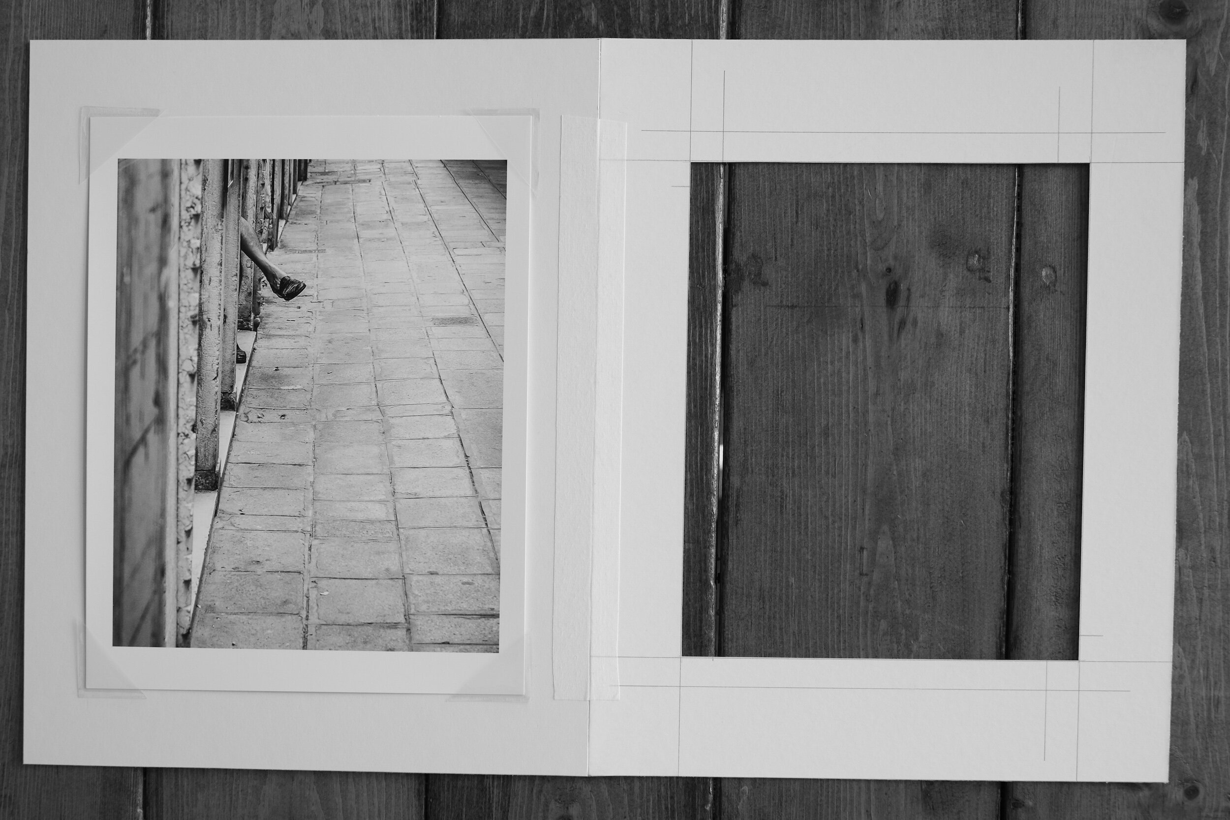
First, you need to decide what size and color mat you want, and what size the mat border and mat window should be.
A lot of this, of course, depends on your taste. Most photographic prints are framed with a white or off-white mat because this provides a nice clean look and the least distraction from the print itself. In some cases, however, it might be appropriate to use a colored mat. Using a color, for example, that matches the color scheme of the print. Or with black-and-white images, a black mat might add drama to the overall effect. It is also possible to use a colored mat with white cutting edges or to use two mats slightly different in size to create depth to the framing. This is an area where a framing shop can advise and show different settings.
With regard to the size of the mat, you should also consider if the mat window will be exactly the size of the print, or slightly bigger. Limited edition, signed prints can have the signature and other information written under the image. It is a matter of preference if you want to show or not show these. If the image is printed on deckle-edged paper (paper with ragged or feathered edges) you might want to have the window of the mat a bit bigger on all four sides to show the paper edges.
If you choose for a mat window that matches the size of the print, you need to keep in mind that the mat window usually will be slightly smaller than the print size (1/16 to 1/8 inches on all four sides) to ensure the print will be fully enclosed by the mat.
You also need to decide on how the print will be mounted to the backboard. The best way is to use photo corners. This allows the print to ‘breathe’: whatever environment you will display your prints in, and irrespective of how closed the frame is, there always will be some impact from humidity. Having the print loosely fitted with photo corners will allow it to expand and extract without creating wrinkles. If needed, the photo corners can be strengthened with mounting or hinging tape (just make sure the tape does not touch the print).
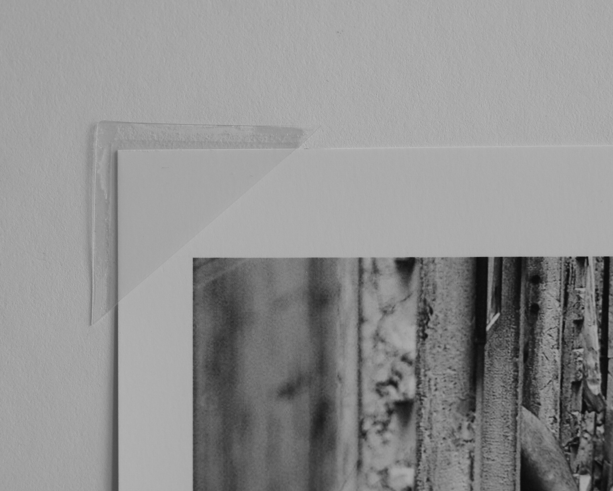
Alternatively, you can mount the print to the backboard with mounting tape. This, however, I do not recommend because you are attaching something to the back of the print that might be difficult to remove, which might impact the value of the print and at the least will make it more difficult in case you want to re-mat the print in the future.

One point of caution: whatever you do, do not dry-mount your print to the backboard!
With dry-mounting, the print is permanently fixed to the backboard. This not only can impact how the print looks (in some instances the structure of the backboard can be visible through the print); dry-mounting is not considered an archival safe way to mount prints and it definitely diminishes the value of your print.
Lastly, and this might be a no-brainer, but don’t forget to always use archival quality (acid-free) materials. The acidity of regular paper and board will impact your print in the long-term and lead to discolorations.
Framing
The next step in preparing your print for display is framing.
The frame serves two purposes. The first is to protect the print from dust, dirt, and light. The second is to display the print in the best possible manner.
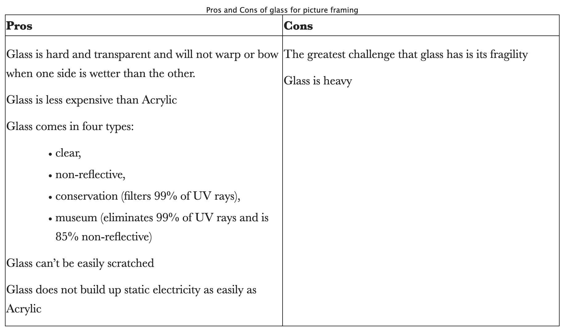
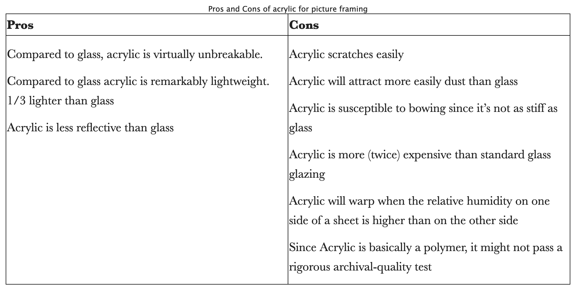
In order to protect the print from light and dust, the frame will be closed at the front with glass or acrylic.
My personal preference is to use conservation or museum quality glass. Acrylic, however, can be considered a good alternative. To help you make the choice that best suits your needs the tables below provide the pros and cons of both.
The front glass and the mounted and matted print will be placed in a frame that holds everything together. The frame will also need to match the print to display it in the best possible manner.
Frames are available in a multitude of materials, colors, and sizes. My preferred frame is a simple, unadorned, black frame that size-wise (width) matches the size of the print and the mat borders. The material of the frame can be wood or metal. This sometimes also is called gallery framing.
Depending on the color scheme of the print, the subject of the image, and of course your personal preference, nothing, however, prevents you from using very broad frames, colored frames, ornamental frames, etcetera. The choices are practically unlimited.
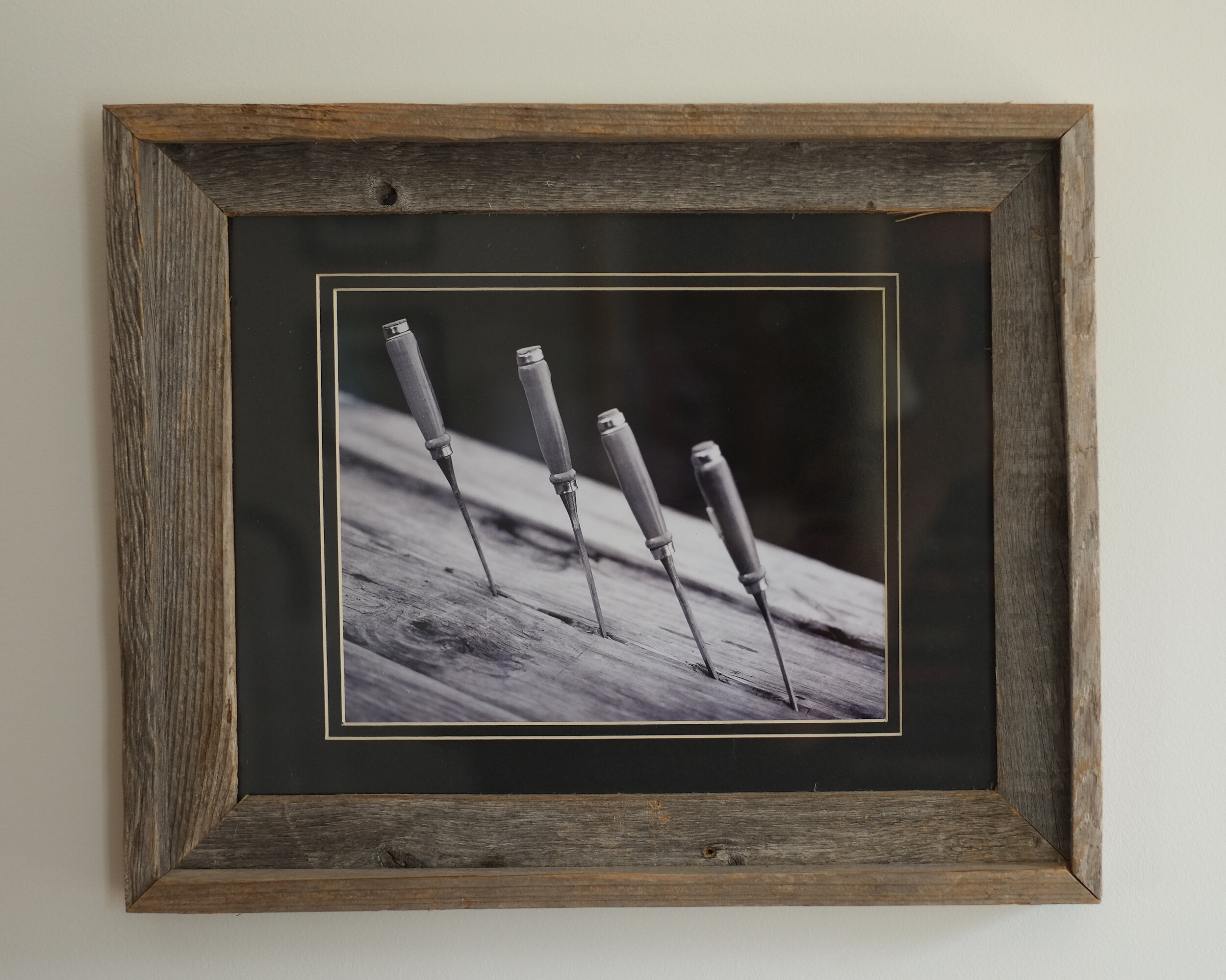
I actually have a couple of black and white prints of chisels mounted in reclaimed wooden frames. The wood of the frames matches and adds to the structure of the wood in the prints, which in this case enhances the impact of the print.
Displaying fine art photography
Now you have a matted and framed photographic print ready for display.
The usual way to display your print would be hanging it on a wall. Depending on the size of the framed print, and whether it is part of a series, you might consider hanging it on its own to create a specific focal point or arrange it within a group of prints.
I have created this Pinterest Interior Design board, to provide some ideas on how to group framed prints.
Another way, however, to display one or more framed prints is to put them on a shelf. Since you don’t need to put any nails in your walls or install expensive rail systems, you might consider this when you want to be more flexible with your displays, for example when you have several prints you want to change on a regular basis.
However you want to display your framed prints, keep in mind that it is always best to avoid direct light, even when you invested in conservation or museum grade glass for framing.

How To Become A Collector Of Fine Art Photography
Anyone with an interest in fine art photography can become a collector
Photography has come a long way since its inception and has established itself as a recognized and…
Anyone with an interest in fine art photography can become a collector
Photography has come a long way since its inception and has established itself as a recognized and appreciated form of art. And although there still is some discussion in certain circles about where precise photography falls in the spectrum of art, it specifically during the last three decades has become an area of focus for art collectors and investors in art.
So how then can you become a collector of fine art photography prints?
Read further after the break.

I have two easy to follow recommendations.
Buy what you like
There is a wide range of photography genres to choose from; street photography, conceptual photography, architectural photography, documentary photography, to name a few. Furthermore, individual photographers, individual artists within each genre of photography have their own style, their own way to express themselves. And although not all genres and photographic styles are called ‘fine art’ per se, the genres and styles do not specifically determine whether photography is worth collecting or not.
This leads to my first recommendation with regard to becoming a collector of (fine art) photography: as with all art, buy photography because you like it and it moves you.
You should buy fine art photography prints, not because someone else thinks it is a great image, or because someone else thinks it is a good investment. If a specific photographic print doesn’t appeal to you personally: don’t buy it.
My second recommendation after the break.
Get educated
Deciding what type of photography you like is of course not possible without knowing what is out there and actually looking at different genres and styles. My second recommendation, therefore, is to get knowledgeable about photography.
Galleries
Start visiting art galleries: to get a good feeling and overview of the different photographic genres, the type of images that appeal to you, and the photographers that create images and prints you like. And visit as many as you can.
When I talk about galleries in this context, I mean actual brick-and-mortar galleries. Not only can gallery staff be helpful guides in your photography art education, there is also a big difference between seeing a print in real life as compared to viewing an image on-screen.
Actually, make sure you subscribe to the mailing list of one or more galleries in order to get invited to their openings and special events. These not only provide great opportunities to get to know the photographers and see their tangible prints, these events also provide opportunities to get in touch with and talk to other (aspiring) collectors of photography.
I am very fortunate to live near Greenville, SC which has a great concentration of galleries. And although all represent great artists, I specifically like the Artists Guild Gallery of Greenville which represents artists who work in several media, including photography, and the SE Center for Photography, which is a gallery specialized in photography only.
While I urge you to visit brick-and-mortar galleries, you certainly also need to visit online galleries. There are several art sites I recommend you check out because of their excellent offerings of fine art photography, or the role they can play in your fine art photography education.
More after the break.
Museums and Art Centers
Other great resources for becoming more knowledgeable about fine art photography and collecting are art museums and (non-profit) art centers. Maybe you have one or more of these in your area displaying photography or offering photography courses. Make sure you visit and join these; sometimes curators give talks about the art of photography, and on collecting art, or they even have specific courses on these subjects available.
Art Fairs
Other opportunities to see photography and meet artists are art fairs and art expos. A great example is the annual Artisphere event here in Greenville, SC where multiple artists – including photographers – have their work on display and for sale, and during which galleries have extended opening times to the public.
Books and Magazines
And of course, there is literature: many books have been written about art and collecting art in general, and about collecting fine art photography specifically. Read them, see what their authors have to say about specific photographic genres, learn how to ‘read’ an image.
And there are the photobooks and magazines: many photographers have produced photobooks about their projects, there are magazines that showcase photographers, and discuss their work.
Take Action
So what is holding you back? Go out, visit galleries, museums, and art fairs. Read books and discover new photography in magazines. Talk to gallery owners and other collectors. And buy your first fine art photography print to start your collection.

Image of the Month: Triumph
Images Of A Vintage Triumph Car To Soothe A Terrible Experience
Last week was a really bad week…
Images Of A Vintage Triumph Car To Soothe A Terrible Experience
Last week was a really bad week.
While stopped at a traffic light with my 2002 Mustang convertible, a car hit me from behind and pushed me into a third car. I was sandwiched, all three cars were terribly damaged, and at the end of the week the Mustang was officially a 'total loss'.
A 2002 Mustang V6 convertible is not a vintage car (yet), but I liked this car very much. It is not really a muscle car like its newer versions, but it felt more like the American version of an MG, or other small sports car. It rattled, made noises, and was quirky.
And now it is gone...
Luckily my oldest daughter finishes her last week of technical college this week, and we are able to shuffle cars until she goes to university in August. My wife now drives my daughter's car, and I drive my wife's Kia Sorento. Not a bad car, but...you know...
To soothe the pain a bit, I went back to some images of a vintage Triumph I created in 2014.

I made these images at the Gallabrae: the Scottish Games that each year are held on the grounds of Furman University. Besides the games, the music, the food, and the Border Collie demonstrations, it also features a British Car show. The smooth lines, shining paint, and gleaming chrome of the vintage British sports cars on display provide great photo opportunities.
The 2014 Gallabrae was the first time I took the Mamiya RZ67 Pro II outside to shoot handheld. Although this is a heavy camera (aka "The Beast") with a mirror slap that equals the recoil of a small rifle, the mass of the camera dampens the mirror slap sufficiently to allow handholding with shutter speeds as slow as 1/60 of a second.
So this month's "Image of the Month" actually is a set of several images.

The film I used that day was Kodak Portra 400. A very versatile color film, which in 120 size and with the Mamiya creates about 6x7 centimers size negatives. I like this format very much, because the 6:7 aspect ratio of the negatives can be resized with almost no cropping to the 4:5 aspect ratio which I prefer for my prints.
But "wait!" you will say, "you mentioned you used a color film, while the images I see here are black and white?!"

That is correct. While most of the images I made that day look great in the colors Portra creates, for the car images the colors in the backgrounds and reflections were too distracting. I converted them to black and white in Lightroom, which resulted in more balanced images focusing on the details of the cars.
I am very pleased with the final results of the images above, and other images of cars I made that day, which are included in my Vintage Cars portfolio.
And looking at them today makes me forget, at least for a moment, the loss of the pony car.
5 Resources Every Collector Of Fine Art Photography Should Know
Pay attention to these sites if you are a collector of fine art photography, or want to become one
Collecting Fine Art Photography is easier today than it ever has been, with a plethora of web-based…
Pay attention to these sites if you are a collector of fine art photography, or want to become one
Collecting Fine Art Photography is easier today than it ever has been, with a plethora of web-based galleries that offer prints from renowned and emerging photographers. Since the early 2000's multiple new internet-only art galleries have emerged, and existing brick-and-mortar galleries are now offering their art collections online too.
While art has become more accessible, and the offering of art (including fine art photographic prints) for sale has become broader this way, this also means that making a selection from this enormous number of online art sites is extremely difficult.
I want to share five art sites I believe you really should follow: because they offer excellent collections of fine art photography, and/or because they offer something else that will help you build and expand your collection of fine art photography prints.
Saatchi Art
Based in Los Angeles, this internet extension of Saatchi art auctioneers is if not the largest, at least one of the world's top five largest online art providers.
Saatchi Art is a typical example of a two-way approach: artists can submit their artworks for sale, providing collectors a huge collection of art to choose from.
Saatchi also provides free art advisory services, with an art curator selecting around 30 works for you to browse through online, based on your needs and preferences.
Why should you follow Saatchi?
the site has a huge collection of photographic art, which provides a large source to select from and the opportunity to see a broad gamut of different styles in one place;
it offers art in a broad price range;
it offers open edition and limited edition prints;
artist participation is not juried or curated, but the site offers curated selections;
the site has great background stories about art and artists;
it offers great art-education articles;
Saatchi Art offers free art advisory to collectors.
Disclaimer: although I am currently not selling any photographic prints through SaatchiArt, I am registered with their program with the intent to sell limited edition prints in the near future.
Blink Art
Another great site for photography collectors is Blink Art. This is a division of and linked with ADC Art Design Consultants, a Cincinnati based art consulting firm.
Blink Art is a marketing tool and sales platform for artists, providing buyers with a broad range of excellent quality artworks. Although it is built on the same concept as Saatchi Art, the threshold for artists to participate is higher because they need to be accepted by Blink Art's jury which consists of art and design professionals and the Blink Art design, production, and marketing team.
Why should you follow Blink Art?
the site offers a large collection of photographic art;
all artwork is curated;
it offers art in a broad price range;
the site is an excellent general source for art and interior design information;
Blink Art offers art consulting through ADC Art Design Consultants.
ARTmine
This site is owned and managed by Agora Gallery in Chelsea (New York City) and as such a typical example of an internet-based art gallery and shop that is an extension of a brick-and-mortar gallery.
As a consequence, the art work on sale through ARTmine is only from artists represented by Agora.
Why should you follow ARTmine?
the limited number of represented artists helps focusing when selecting photography prints;
all artwork is curated, with a high quality threshold for artists to join;
the 'Collectors Corner' blog provides great advise for starting and seasoned collectors;
ARTmine provides a Sketchup plugin, that allows placing and using of artwork in Sketchup models. This might be of interest for collectors who work with interior designers or architects.
Artsy
This site follows a concept quite different from the previous ones. Artsy does not specifically have art from represented artists or from artists who are selling directly through their site.
While showcasing works of art, both Artsy operates as a link between prospective buyers and galleries: each page of a specific artwork displays a form to contact the gallery through which the artwork is for sale. In addition, Artsy provides links to art auctions, galleries, and art fairs.
Why should you follow Artsy?
the site provides an immense collection of photographic art;
it provides direct links to galleries and to 'live' art auctions;
it has great art education articles;
Artsy has developed the Art Genome Project: an unique way to group art according to specifications, supporting the selection tool when browsing for art.
ArtBusiness.com
This is a rather unique site when compared to the other art sites mentioned above. Although ArtBusiness.com, lead by Alan Bamberger, offers art brokering services by commission, unlike the other sources listed above, its main focus and services are not on selling art.
The main objective of ArtBusiness.com is providing advising and consulting services for collectors and artists. The main services for collectors are art appraisals and art consulting and marketing.
Why should you follow ArtBusiness.com?
the site has an excellent and extensive repository of articles for collectors;
because ArtBusiness.com's main objective is not selling art, it can operate as a truly independent art advisor;
it provides good reviews of books and other tools for art collectors.
As mentioned above, these are only five of the gazillion of art sales and advisory sites currently available.
Should you explore other sites? Definitely yes!
Should you only visit online galleries and ignore brick-and-mortar galleries? Definitely not!
The traditional galleries, with their displays and wine-and-cheese openings are an important link within the infrastructure to get art seen by the public, and to get art sold. It is different to see an artwork in real life as compared to online only, and the gallery owners are an invaluable source of knowledge and advise, and I will provide some recommendations in a future post.
For now, have fun exploring the sites I recommended above and start building or expanding your collection of fine art photography prints.

Image of the Month: Alley Leg
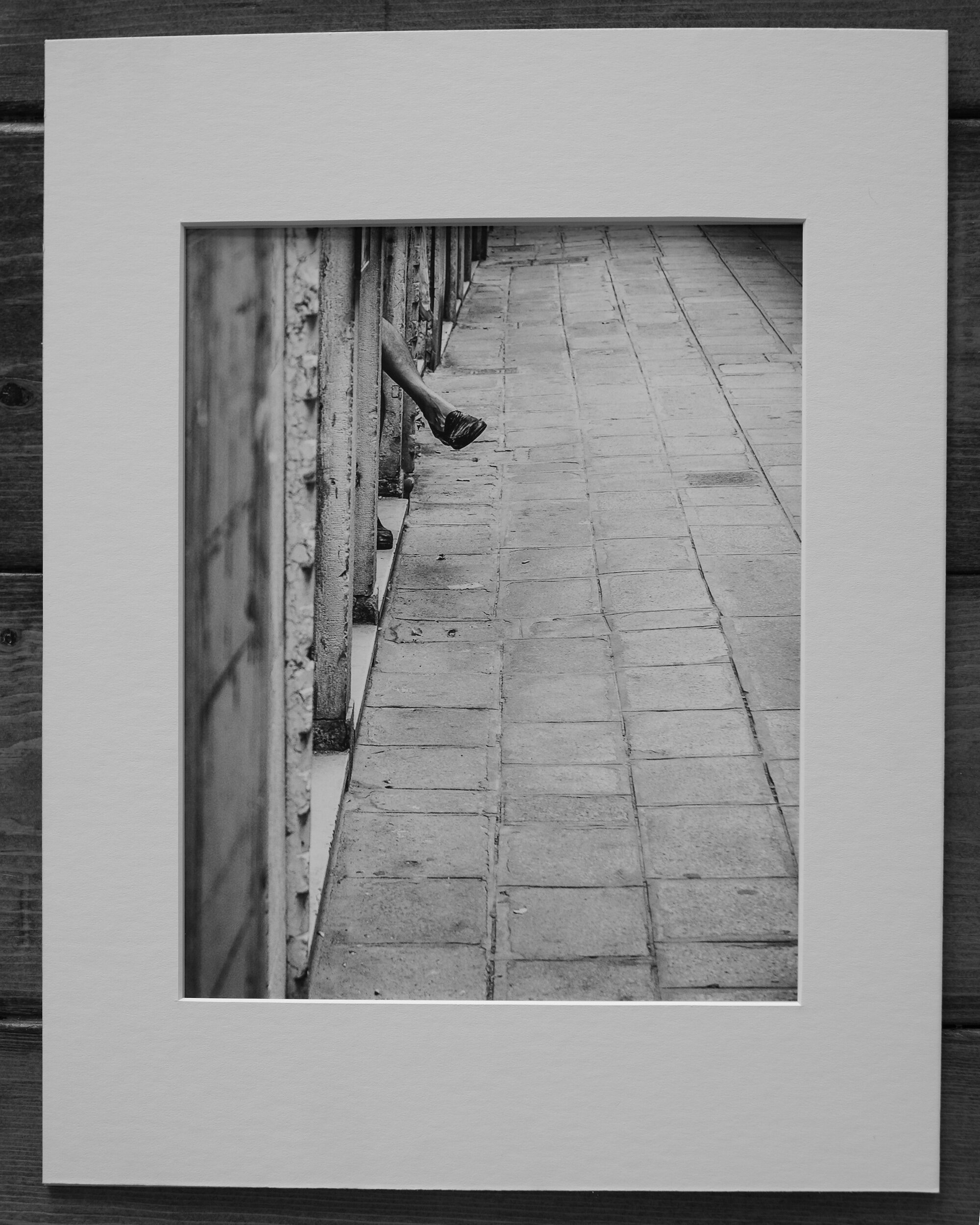
Alley Leg: A Curious Find On Venice's Streets
The picture to create this month's "Image of the Month" was taken in the summer of 2006, in the city of…
Alley Leg: A Curious Find On Venice's Streets
The picture to create this month's "Image of the Month" was taken in the summer of 2006, in the city of Venice, Italy.
At the time we didn't know yet, but the summer of 2006 would be our last summer vacation in Europe; in February 2007 we moved to Spain, and after living in Australia and South Africa we ended up settling in South Carolina, USA.
We wanted to see Rome, and we drove down from the Netherlands to Italy. First staying a couple of days in the lakes area of northern Italy, before spending a week in Rome. Then we drove to the middle of Italy, spending some days there, and finishing our vacation in Venice.
Some of the images I created in Italy are included in the book Old World Charm.
Venice is a great city to explore on foot. And to take pictures of course. The weather was not the best while we were there: it was hot, but most of the time overcast and we had some rain. The rain didn't bother us however - we were used spending most of our summer vacations in England - and the cloudy sky actually provided great, even light to take pictures.
We had been roaming the streets of Venice for a while already, and we had just had some great Italian icecream when I noticed this leg sticking out of the open doors of a taverna. Without thinking I aimed my camera, and shot. As it happened, the leg had an owner who retracted it immediately after I got the picture; there was no second chance.

Back at home, and going through the hundreds of pictures I took during that vacation, the Alley Leg immediately came to mind. I recognized the potential this image had, but wasn't really sure what to do with it. I converted it from color to black and white, which improved it. Unfortunately I did that in an irreversible way, so the color original is lost forever. Something was still missing however, and I didn't know what. As a consequence I never printed or published it. So there it sat for about twelve years...
Until a couple of weeks ago.
Looking through the collection of images I selected for further development, I stumble again on Ally Leg. And then it dawned to me what I needed to do.
The main adjustment I had to make, besides some additional enhancements to the black and white rendering, was cropping the image to get rid of the people in the background and the distracting reflections on the left. As with most other images in my portfolio, the crop I selected was the 4:5 aspect ratio which I find very pleasing to the eye. As a result the lines of the pavement, lead the eye directly to the leg sticking out of the vertical lines of the wall to the left. It creates focus, where I think the focus needs to be.
Below is a side-by-side comparison of the original image and the final result.


The final result: a funny image with an unexpected subject, in a certain way symbolizing the Italian way of life. The Dolce Vita of people relaxing and enjoying life.
- - - - - - -
I hope you enjoyed this background story about the creation of Alley Leg. Don't forget to subscribe, to ensure you will receive new information like this delivered to your email inbox the moment they are published.

Why I Combine Photography With Stories
Creating New Perspectives Through The Lens of Photographic Stories
I am a storyteller. I have always been…
Creating New Perspectives Through The Lens of Photographic Stories
I am a storyteller. I have always been.
From an early age, I enjoyed making up and telling stories to my sister, cousins, nephews, nieces, and later my children. I loved it when I drew them into my fantasy worlds, seeing their eyes growing big with anticipation of what would happen next. And even now, that they are older, I manage to come up with stories and explanations that are unbelievable, but not to them.
Sometimes people ask me why I use storytelling techniques to share my fine art images with the public. It could be far easier to just have a simple portfolio website, or offer my images for purchase on a straightforward art selling website like FineArtAmerica. The question made me think, and go back to the reason why I create photographic images at all.
When I started photographing, years ago, I literally took pictures of everything. I experimented with different points of view, creating images of landscapes and still lifes, photographing scale models, and even tried portrait and model photography with my sister as the model (or maybe better: victim). I literally made hundreds of slides with my first camera, an Agfa Iso Rapid 1-C, which created small, square format slides. And I burned through quite some film with my first slr, a Ricoh. Later when going digital I did a lot of wildlife and nature photography.
And although I think the images were not bad at all, I felt something was missing…
Light Bulb Moment
If you are like me, you like and look for the unexpected, for the deeper meaning or reasons behind what you see.
Call me slow, but it has not been since quite recently, when I looked into starting this blog, that the light bulb went on and that I realized what was missing: I need to combine the images I create with stories.
It was a real eye-opener when I stumbled on this quote from Anais Nin: "The role of a writer is not to say what we all can say, but what we are unable to say".
I realized that I not just want to share the obvious, but what we usually are unable to see. Or to change the quote above a bit: My role as a photographer is not to share what we all can see, but what we are unable to see.
I am very visually oriented. In my office at work I have a huge whiteboard that I use to draw pictures and diagrams to explain my thoughts and ideas to others, and to myself. Images and visualization are key to my thinking process. There are many ways to share my vision: one way is through images, another way is through words. I combine both to create a stronger message. Images enhance and strengthen the story, and vice-versa.
When starting this blog, and having discovered the Anais Nin quote, I realized what I needed to do with my images to create something that resonates with my feelings: use stories to share what I see in these images and to invite the viewer to see the same, to be on the same journey of exploration with me. Using images and words to help me to understand, appreciate, and share the world as it presents itself to me.
You see a car, for example, but I see the family driver who has a long history with the car and the family. Who remembers big family events as part of his history with the car.

You see a parking garage, but I see the attendant, who is always there, being helpful, and providing service. Day in, day out, and always friendly.

You see a field of flowers. I see and feel the crisp early spring wind, which reminds me that these flowers are very vulnerable and will be gone within a couple of days.

The Story Formats
The best way for me to tell these stories, and to communicate my thoughts and feelings about my images, is through Haiku, PicTales, and Photo Essays.
Haiku and PicTales are short emotional connections to images: they represent my immediate thoughts and feelings reflecting on the images.
Essays are the results of long-term projects, more in-depth explorations of the world around me, and my feelings and thoughts about this world. They usually are also more image-focused than word-focused.
These different story formats help me to understand what I see, looking beyond the obvious, and to share these new perspectives with my audience. To share my vision of the world, to teach people, to entertain, to make people think. When we look at things from a different perspective we learn not only about the object or topic, but also about ourselves. Although different in nature, each of these formats allows me to express my observations about the natural and built environments, and the importance and impact of human interaction with their environments and with each other; helping me to understand why we are as we are.
Looking only at the images, some can be called landscape, abstract, wildlife, or street photography. For me, however, the subject is only the trigger for the story. And although each image has its merit on its own, the image complemented with the story makes it for me what it is: a reflection of my deepest thoughts.
The main story can be told with words (Haiku, PicTales) or mostly with pictures (Essays). In both instances, it is the combination that makes my stories unique.
I am a storyteller. I have always been.

Image of the Month: St Michael's Mount
St Michael's Mount: Island of Monks, Barons, and Fairy Tales
When we lived in the Netherlands, my wife and I developed a special fondness for the landscapes and history of…
St Michael's Mount: Island of Monks, Barons, and Fairy Tales
When we lived in the Netherlands, my wife and I developed a special fondness for the landscapes and history of Great Britain and we regularly - that is, basically every year - spend our summer holidays there. First only the two of us, and later with our daughters. We have some great memories from these trips, although most of these memories involve rain; summer in England can be challenging for campers.
One of the parts of Great Britain we kept going back to is Cornwall: for a long time one of the areas where the Celtic culture and language have been kept alive. Unlike Wales and Scotland, Cornwall is now a part of England, but it still has preserved that magical feeling of Arthurian legends and fairy tales.

St Michael's Mount is an island off the Cornish south coast, and it shares a name, history, and a unique feature with its sister island Mont Saint-Michel off the coast of Normandy, France. This unique feature both islands share is related to their accessibility: at low tide, you can walk over a causeway to the island. At high tide, however, this pathway is covered by the sea.
St Michael's Mount has a long history, going back to prehistoric times. The first recorded inhabitants were monks; the same that owned and built up Mont Saint-Michel. From the later Middle Ages into the 17th century, the island and its castle have been the site of numerous fights between warring parties. It eventually became the property of the St Aubyn family, who still own it today.
St Michael's Mount's history includes many legends and fairy tales. Probably best known is the tale of Jack the Giant Killer. The story goes that after slaying the giant Cormoran, Jack buried his heart in the pathway that leads up from the island's harbor to the castle. During our visit my, then eight-year-old, oldest daughter was keen to find it and point it out to me. And indeed, embedded between the cobblestones is a clearly distinguishable heart-shaped stone.
I wanted to create an image that shows the uniqueness of the island while at the same time conveying the brooding atmosphere of the fairy tale.
To achieve this I converted the original image into black-and-white and increased contrast. Although the island is rendered quite dark, it stands out very well against the lighter backdrop of the distant sky and sandwiched between the natural vignette formed by the dark-gray sea and clouds.


I like how the start of the causeway is just visible. Disappearing into the sea, telling the story of the unreachable and calling world of fairy tales. By cropping the image from its original 2:3 aspect ratio to the 4:5 aspect ratio I created more focus on the impact of the line of the causeway pointing towards the island.
The final result, with the brooding sky and the dark lump of the island: scary and at the same time calling.
- - - - - - -
I hope you enjoyed this background story about the creation of St Michael's Mount. Don't forget to subscribe, to ensure you will receive new information like this.

Photo Book Review: On Ground
Photo Book "On Ground" by Simon Gabriel
A couple of weeks ago I purchased and received On Ground by Simon Gabriel, a self-published photo book…
Photo Book "On Ground" by Simon Gabriel


Introduction
A couple of weeks ago I purchased and received On Ground by Simon Gabriel, a self-published photo book featuring 100 selected 35mm images created between 2014 and 2016.
I really enjoyed this book and although the first-run edition of 50 has already sold out, I recommend watching Simon's website to check if a new run will be published.
Review
To start with: I really love the images!
They are a collection of color film (35mm) images taken in the USA and Great Britain, and - as far as I can see - one from somewhere in China, and one from the inside of an airplane.
The colors are great and show the photographed subjects at their best. Simon's selection of subjects resounds very well with my artistic vision of "wanting to share not the obvious but what we usually are unable to see." To me, the images in this photo book show how day-to-day stuff, sometimes banalities can have beauty.
The book provides no explanations or background regarding the images or the photographer. The website only states: "Featuring 100 chosen archive 35mm images from 2014-2016, On Ground is a self-published photobook".
Although the images for this book have been "chosen", I do not really see specific grouped or themed subjects. It actually seems as if the images have been arranged as casual encounters, i.e. not arranged at all but sequenced as you might stumble onto the locations in real life.
In fact, these images almost remind me of Robert Frank's "The Americans". But without (almost) any Americans in the frame. And in color. They are a collection of real, everyday places in the USA and the UK. The images in the book share the stories about where people live, and ask the question "what do these environments tell us about the people who live, love, and work there?" Can we from these images tell anything true about the inhabitants, or do the images expose the environment as a stage that only reaffirms stereotyping?
The cover, binding, and paper quality of the book are very good. It has a very nice matte, laminated soft cover, and the 200 gsm silk paper renders the images really well. As mentioned above, it contains 100 color images, and the book size is 21.0 x 21.0 centimeters (about 8.3 x 8.3 inches).
Is there anything I do not like about this publication?
Hmmm....let's see...not really...but...
Who is Simon Gabriel?
The book does not provide any clues at all.
Or maybe one: One of the images actually contains a Vivian-Mayeresque self-portrait.
His Instagram profile only says "Film Photographer and Pedestrian, from Merseyside" (England, UK). Yes, it is the area The Beatles are from, but other than that...
To start with, I would really love to read some background about the photographer. And why did he select these specific images? I'm always interested learning what vision other photographers have for their work.
With regard to the images, I would like to have seen the US and UK ones separated. And I do not really see why Simon has included the odd China one and the one in the airplane (which is definitely not "on ground"...). The image of the airplane seat actually could have been used as a "divider image" between the US and UK images. Another reason why I would like to have some more background information about the photographer's vision for these images and the book.
Conclusion and Recommendation
"On Ground" is a well-executed book, with beautiful and thought-provoking images of places in the USA and Great Britain. Although the first run edition, unfortunately, is sold out already, the content and quality of this book definitely justify another edition. Whenever available, I highly recommend purchasing a copy. Check the book's website for more info and some insight into the book. Simon also has great images on Instagram and Flickr.
Simon Gabriel is definitely someone to watch and follow!!
Image Of The Month: Grass With Water Drops
Grass With Water Drops' Behind The Scenes
The image I am going to discuss today was taken in July 2010, and final changes for publication were made in 2017.
'Grass With Water Drops' Behind The Scenes
Taking the Picture
The image I am going to discuss today was taken July 2010, and final changes for publication were made in 2017.
In 2010 my family and I lived in South-Africa, and my wife's sister with her husband and two kids visited us from the Netherlands for their summer vacation. Although our initial plan was to rent an eight-person Landrover (but that is a story for another time), we rented the ubiquitous Toyota Hiace van and made a round trip from the Johannesburg area where we lived to Durban, stopping at a couple of safari parks and staying at camp sites and lodges.
One of our overnight stops was at Didima resort, located in the Cathedral Peak valley of the u Khahlamba Drakensberg park, approximately halfway between Johannesburg and Durban. The resort has several cottages with great facilities, and we rented two cottages for my and our sister in law's families. The area surrounding the resort is great for hiking, and it was during one of our hikes when I noticed some nice high grass with early morning dew drops clinging to it.
At that time I still had my Nikon D700 camera (read a previous post to learn why I sold this gem), and I used the 24.0-70.0 mm/f2.8 lens to capture it. The D700 is a full frame sensor camera, and for this image I shot it at 70mm focal length. Since I wanted the grass and water drops stand out against the background, I created a very shallow depth of field by selecting the f2.8 ("wide open") aperture. This led to a shutter speed of 1/320 second.
Creating the Image
Since I only started this website in 2013 with real activity only starting in 2017, this image like too many others had been living on my computer's hard drive without seeing any action.
The Nikon D700 has a sensor that produces images with an 2:3 aspect ratio, my preference however is for images with 4:5 and 1:1 aspect ratios. I therefore had to crop the original image to create versions with these aspect ratios for publication and printing. In addition, I wanted a 1:2 aspect ratio version because that was the format more easily accepted by Twitter.
Furthermore, although the original image as created in-camera was not unsatisfactory (see below), I wanted a more dramatic and abstract view. In other words: there was work to do.
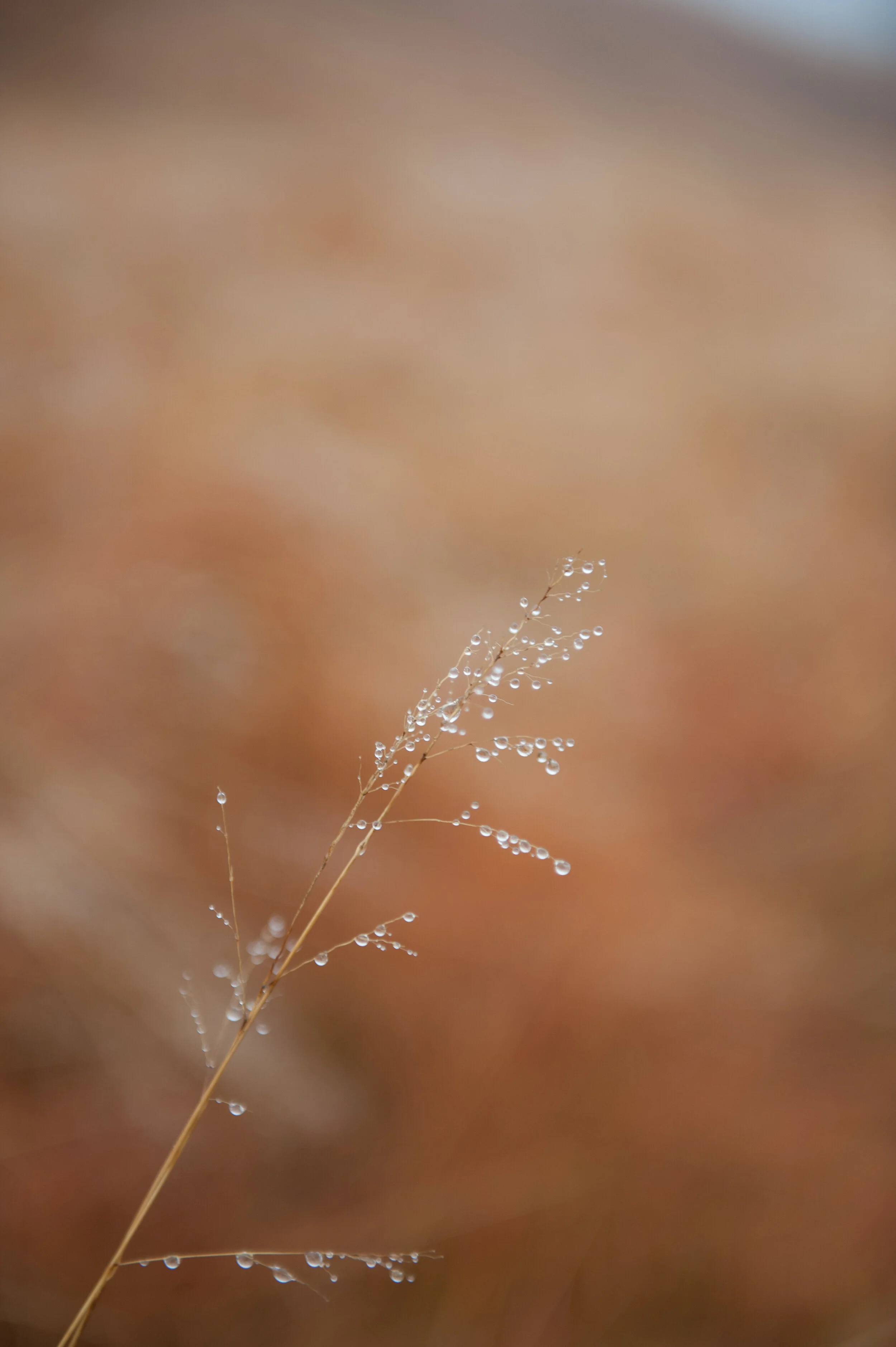
The image as created in-camera / 2:3 aspect ratio
Adobe's Lightroom provides me with all the tools I need for what I want to do and accomplish with my images, and I try to use as less of its tools as possible to achieve the final results I have in mind applying all tools from top to bottom as they appear in the Develop menu: Basic, Tone Curve, HSL/Color/B & W, Split Toning, Detail, Lens Corrections, Transform Effects, and Camera Calibration.
Color Versions
For the color version I adjusted the Basic, HSL, and Detail sliders as shown below.

Although the saturation changes for the Red, Orange, and Yellow colors are very important to create the effect I desired in the color versions, the most important changes I made were in the Basic section by reducing the Highlights and Blacks to the maximum, increasing Shadows to the maximum, and increasing the Whites to 76% of maximum.
This means that any Highlights in the image have been reduced to almost zero, and the Black areas in the image have been made as black as possible. The shadows have been made as light as possible and any white areas have been made almost extremely white. I also added some sharpening and noise reduction.
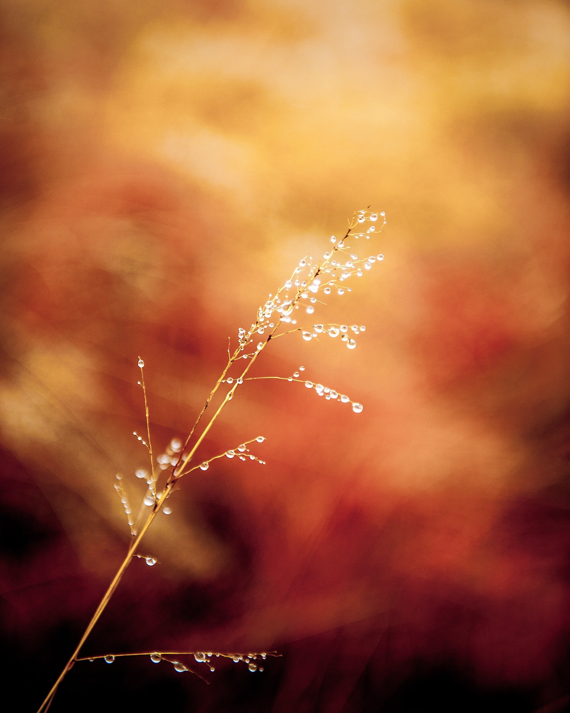
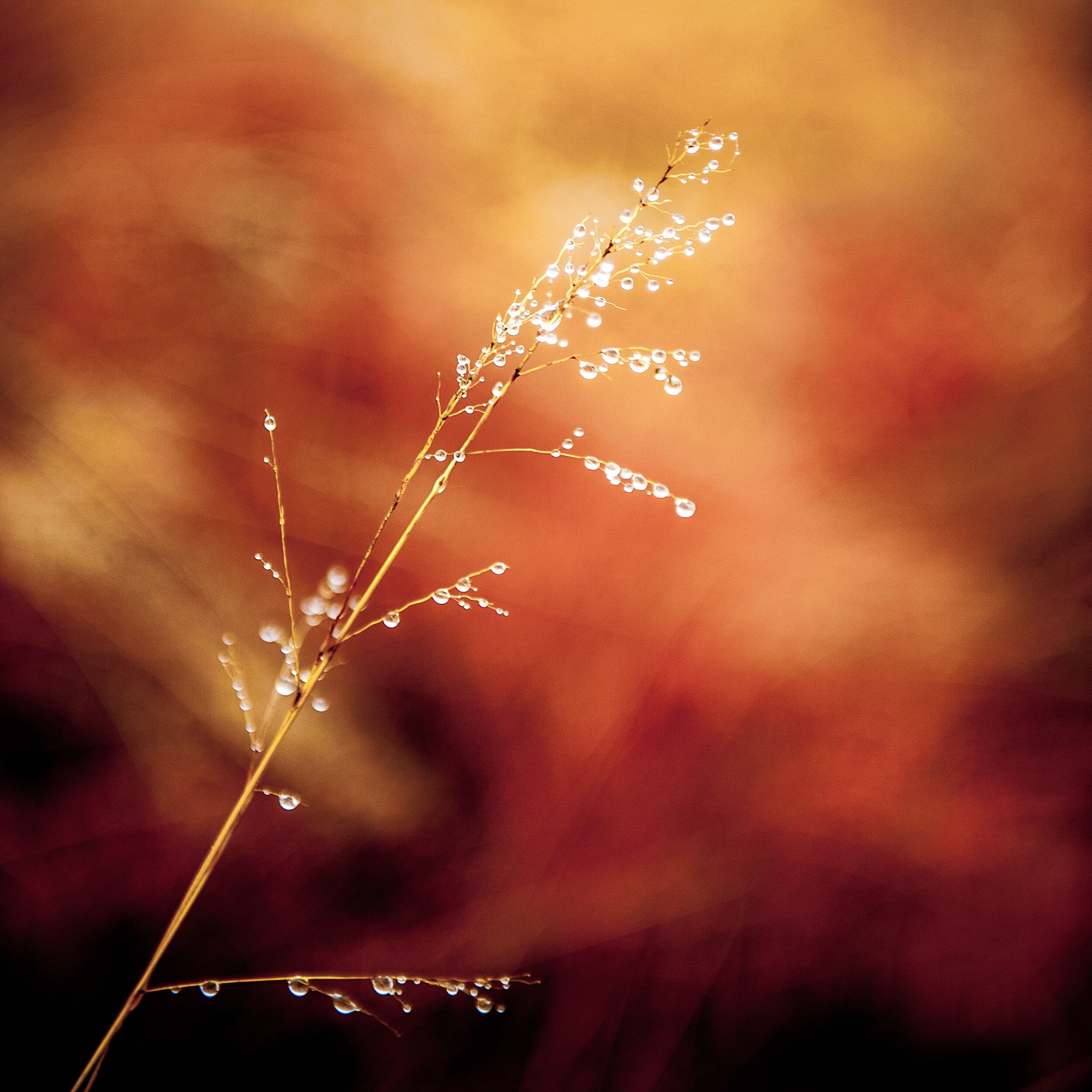
Since I wanted to have an additional color copy in 1:2 aspect ratio to use on Twitter, I had to crop again. This horizontal 1:2 crop was quite a challenge since the main object in the image has a vertical structure. In the end I decided to keep the top of the grass in the image, creating the result below.

Black and White Versions
For the black and white copies I kept most Lightroom settings the same as for the color ones. However, to accomplish the best effect in black and white, I needed to play around a bit more with the color settings in the HSL/Color/B&W panel.
Resulting in the following result (after cropping to 4:5 and 1:1 aspect ratios respectively.
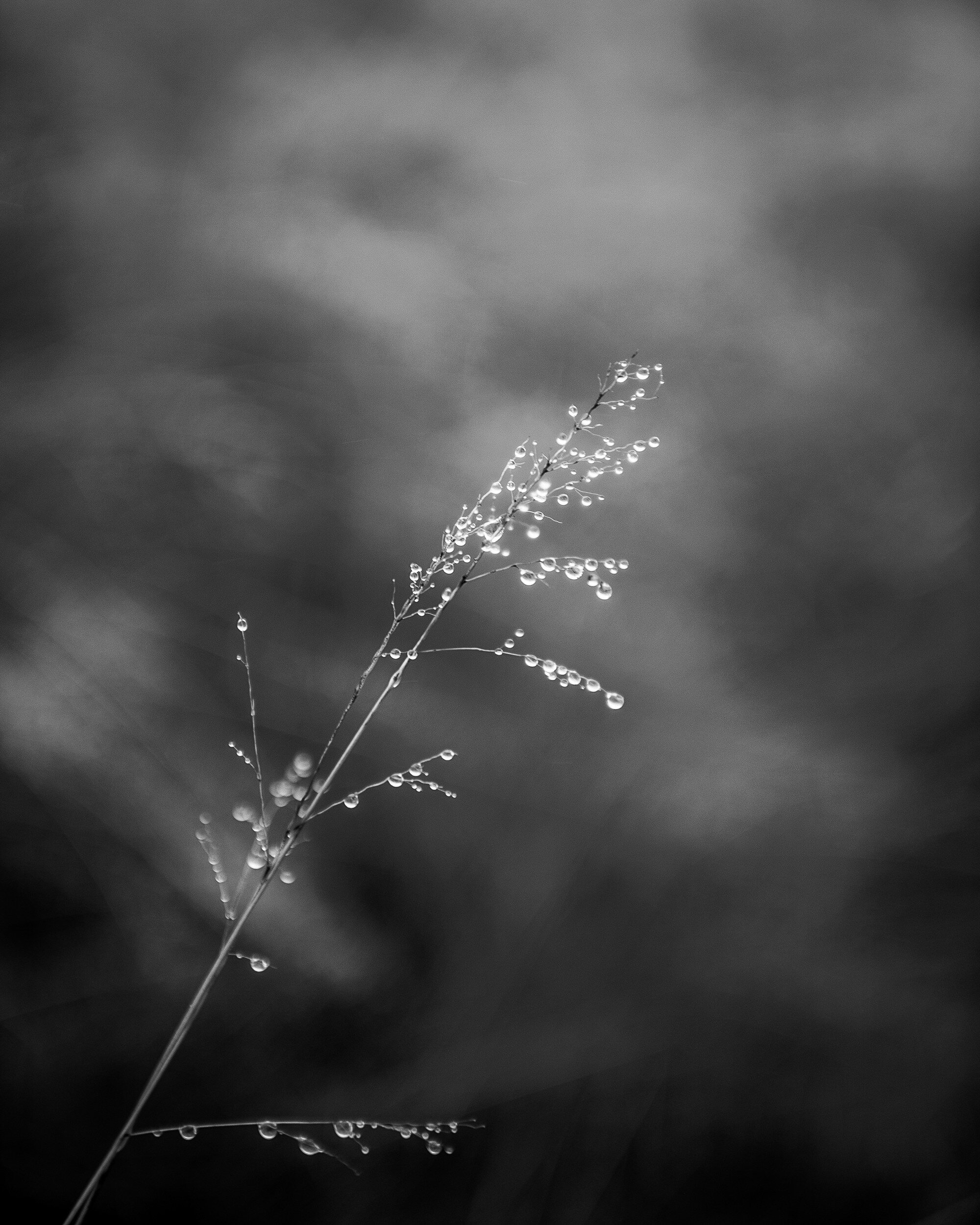
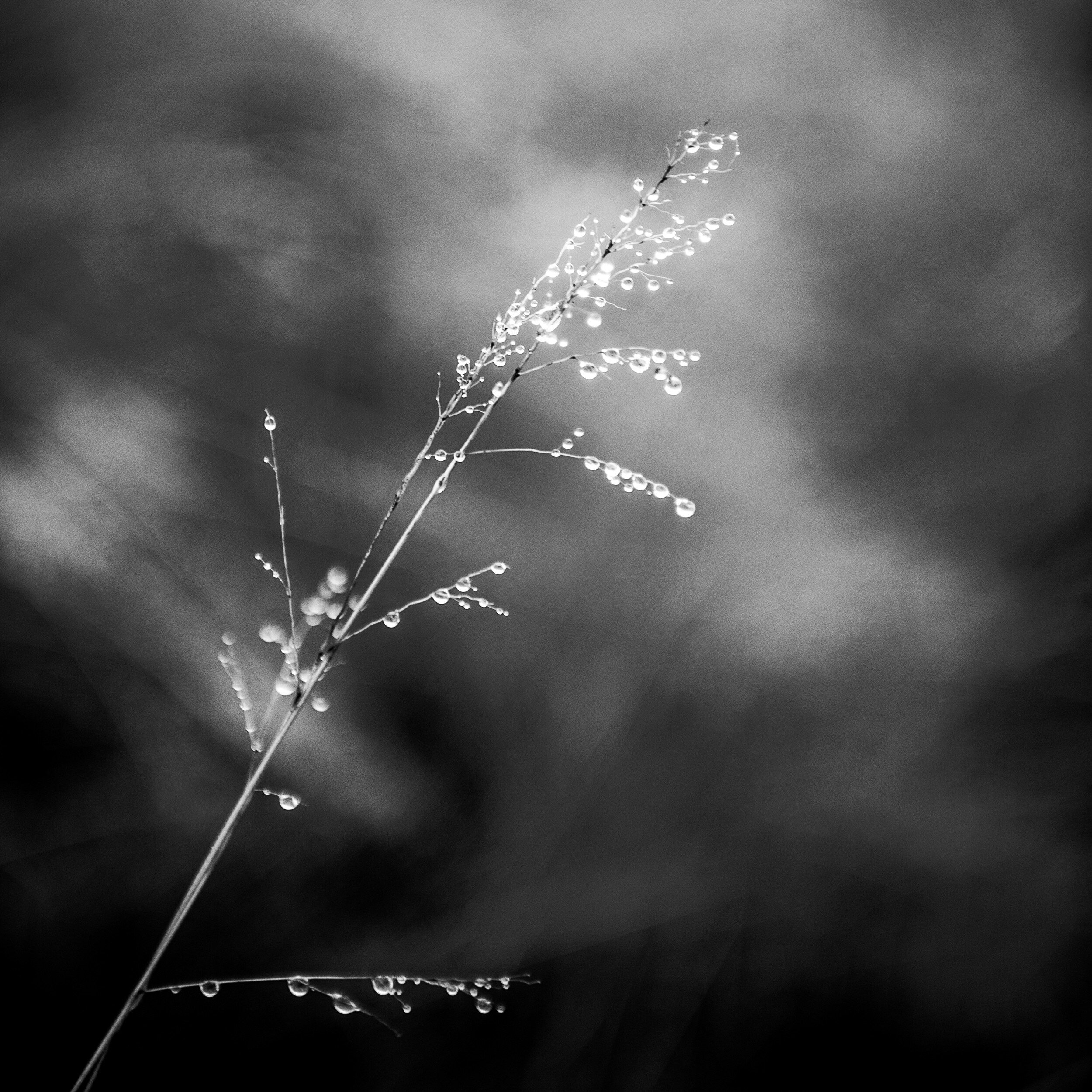
Final Thoughts
I am quite pleased with the final results.
In both the color and black and white versions the shallow depth of field separates the main subject very well from the background. This effect has been enhanced by the adjustments I made in Lightroom, with quite a dramatic effect in the color versions.
The original composition works very well after cropping to the 4:5 and the 1:1 aspect ratios. In the 4:5 version, the direction of the grass follows almost exactly the diagonal of the image rectangle. Although the 1:2 version was predominantly created to comply with Twitter image requirements, it actually produced a very balanced composition with more focus on the detail at the top of the grass.
- - - - - - -
I hope you enjoyed this background story about the creation of the Grass With Water Drops images. Don't forget to subscribe to ensure you will receive new information like this, and Haiku, PicTales, and other stories delivered to your email inbox the moment they are published.