

Lili Waiting
Walking downtown
Wooden soldiers…
Walking downtown
Wooden soldiers
Reminded her
Urged her
To stop
Semper Fi, they promised
Ignoring other suitors
Like a modern Penelope
An old song
Reminded her
Of his true love


A New Location, A New X
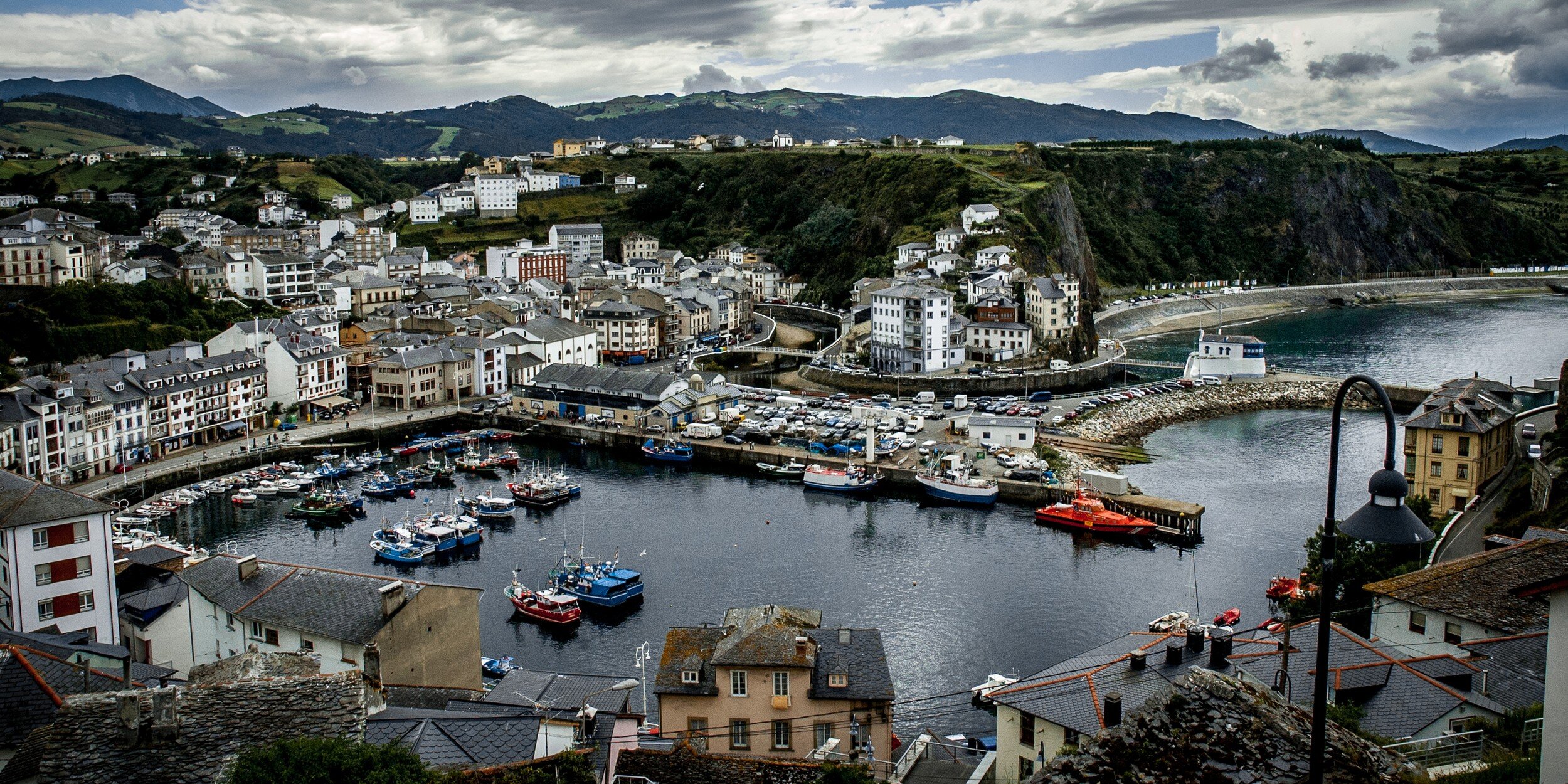
South Africa With the Fujifilm X100F
It has been quiet on this blog…
South Africa With The Fujifilm X100F
It has been quiet on this blog.
It has been very quiet on this blog!
It has been too quiet on this blog!!!
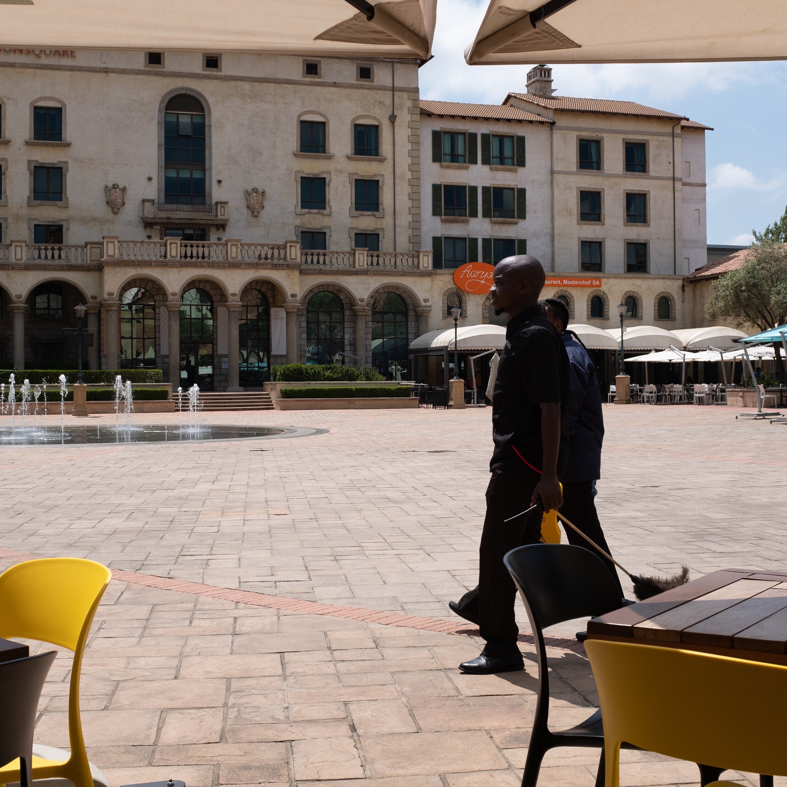
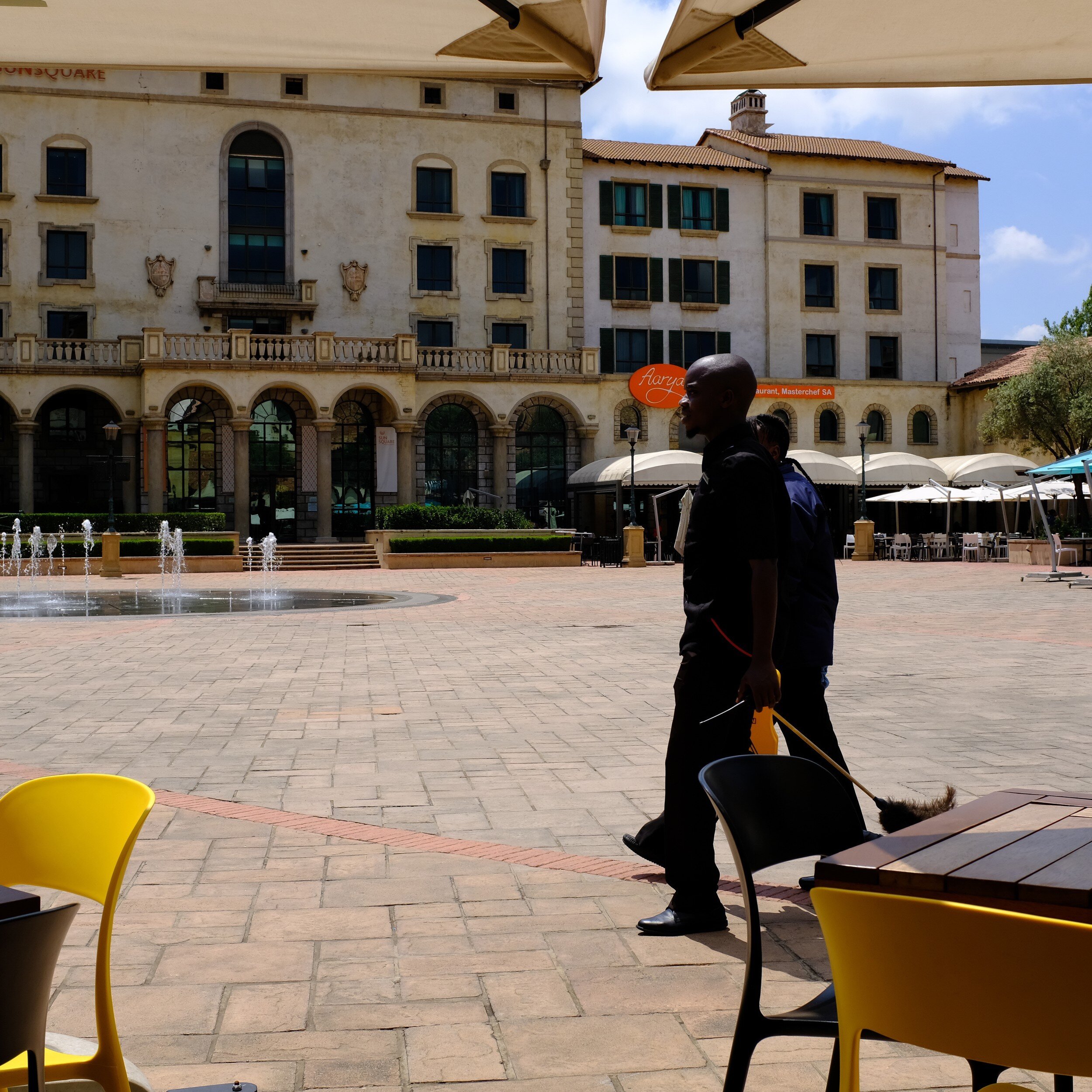
As I mentioned a couple of weeks ago, I will soon start a new assignment in South Africa for my day job. And the preparations for that, including already going on a business trip to Johannesburg for about two weeks, was not good for the progress of this blog. Preparing for visa application, traveling, intensively talking with the local team, takes time. A lot of time. And to be honest, during the evenings I was too tired to spend any time on the blog. Overcoming jet-lag from a 14-hour direct flight from Atlanta to Johannesburg is challenging for me.
Going on assignment this time around will be with a new approach: the family and dogs stay at home in the US, and no plans for safaris or other 'vacation' trips in-country. It also will mean a new challenge for my photography: my intent is to move more towards street and documentary photography, which I then will use as a basis for my Haiku, PicTales, and Essays.
A new challenge, which - of course - asks for a new tool (Noooo, this has nothing to do with GAS...).
Although I still love my Fujifilm X-Pro1, I wanted something even more compact. At the same time, I love the OVF/EVF combination of the X-Pro1 and wanted to have something similar in my new camera.
This more or less automatically led me to the Fujifilm X100F.

Although this fourth iteration of Fujifilm's X100 camera is already two years on the market, it still is a great camera that for me ticks all the boxes:
it has a reasonably compact body (slightly smaller than the X-Pro cameras, and the pancake-like lens really makes a difference);
it has the OVF/EVF combo (and some more);
it has Fujifilm's magic sensor, with great film simulation modes (including the very popular Acros black and white film simulation);
it is a great unobtrusive camera for street and documentary photography.
The camera has a fixed 23mm (35mm full frame equivalent) lens. This could be considered a restriction but truth said, I only have two lenses for the X-Pro1 (the 18mm and 35mm) and I am pretty well used to shoot with only one focal length for a prolonged time. It actually will mean that I really need to work on my composition, which is a benefit from a learning and improvement point of view.
The fact that the X100F does not have interchangeable lenses makes it actually easier: no choice to make. And traveling light by design!
Since this camera has been on the market since 2017, there are already numerous reviews available, like those from Shark & Palm, Frederik Trovatten, and Samuel L. Streetlife. These reviews actually are triggering the thought that I maybe could start using JPEGs straight out of the camera.
Below are some first shots I made after purchasing the camera (side-by-side comparisons of the raw files and straight-out-of-camera jpegs), which made me very happy.
This is going to be fun!

The Photo Book And Body Of Work
What Tales From The Black Box Learned Me About My Body Of Work
In December 2018 I finished my photo book Tales From The Black Box. It contains eighteen PicTales with…
What Tales From The Black Box Learned Me About My Body Of Work
In December 2018 I finished my photo book Tales From The Black Box. It contains eighteen PicTales with accompanying images that previously have been published on this blog.
While honestly in the first instance not deliberately done (I basically just wanted to produce a nice photo book with some of my PicTales) I realized that the selected images are actually quite consistent in approach and execution, and can be considered to represent a good overview of my body of work.
In this post, I will explore:

What is a Body Of Work
An artist's 'body of work' can usually be defined by a collection of artwork which demonstrates an overall consistency and signature style. Although an artist's style can change over time, which also changes their body of work, it usually can be said that there are a certain consistency and cohesion in the work produced.
This consistency and cohesion can be accomplished through:
style;
subject matter;
execution of the work;
the intent of the work.

Tales From The Black Box as Body Of Work
After finishing Tales From The Black Box and reviewing the result, it dawned on me that the images and stories actually represent what I really want to accomplish with my photography and that it actually is a quite cohesive group of work. By selecting the PicTales for this book, I more or less accidentally curated my own body of work.
Style:
Although they probably not can be categorized as 'street' or 'documentary' photography, all images capture aspects of life and objects that can be encountered while 'walking around'. There is no studio work involved, no use of models, and no orchestrated set up of scenes.
Subject matter:
Most of the images tell stories about people, without actually showing people. Although present in some images, people while key to the story are more used as props than as the immediate subject matter. It is the accompanying story that explains how the image relates to people.
Execution:
All images are executed in black and white, and with 4:5 or 1:1 aspect ratios. Depending on the storyline the PicTales have only one image or a series of images. The main consistent factor, of course, is that all PicTales are images combined with stories
Intent:
All image-story combinations are intended to trigger thoughts and ideas, as mentioned in my artist's statement, and explained in the Foreword of the book:
Any photo camera is basically just a black box.
From the most simple pinhole camera to the most sophisticated digital camera: nothing more than a black box with a hole on one side to allow light to enter, and a medium on the other side to capture this light and create an image.
Of course, the technical sophistication of the camera and the medium used have a big influence on the look of the image. And with the current state of image processing technology, that look can be even more altered afterward.
I specifically use the word 'look' of the image, and not 'quality'. When we talk about quality, we are conducting a technical assessment of the image. For me, however, the look of an image is far more interesting because it translates directly into emotion: the emotional response from the viewer to the image.
The role of the photographer is to show what we can not see: to show a different point of view, to share a specific feeling with the viewer, to extract a specific response from the viewer.
While it is possible to enjoy photographic images based on their look only, adding a story to an image allows the photographer to direct and change the viewer's emotional response. Image and story then become mutually dependent: the story will be stronger because of the image, the emotional impact of the image will change because of the story.

Consequences for my images, this website, and blog
Looking at the consistency of the images selected for Tales From The Black Box and that realizing they can be considered to represent a good overview of my body of work, I am now seeing that I am actually developing a photographic style I like and want to refine.
As I mentioned in last week's article I want to use the limitations on equipment and time available as they will be set by my relocation to South Africa, to focus on specific subjects and types of photography, and learn, learn, learn.
Now, with the insights obtained from Tales From The Black Box, I also know what photography style, subject matter, execution, and intent I want to develop further and learn more about.
This also will have an impact on this website and blog.
I need to review all images on the site and decide whether they fit into my preferred style, whether they are a consistent part of my body of work. This might result in deleting some of the current images, and possibly regrouping other.
It also will mean that I definitely need to continue writing PicTales, Haiku, and Essays in order to maintain the consistency in intent. As a consequence, the content of the blog will grow in these areas while more general art and photography articles will get less focus.
I hope you enjoyed this insight in my thoughts regarding my body of work, and how this will impact my future photography, learning, website content, and blog articles.
Subscribe to this blog to learn more and stay updated on new PicTales, Essays, Haiku, and other articles by clicking the link below.

2018 Year End Review And Looking Forward To 2019
Accomplishments In 2018 And What To Expect For 2019
2018 has been an interesting year. Personally, for this site, and for the blog. In this article, I want to look…
Accomplishments In 2018 And What To Expect For 2019
2018 has been an interesting year. Personally, for this site, and for the blog. In this article, I want to look back with you on what I accomplished, and look forward to what I will be focusing on in 2019.

First, however, I want to thank all subscribers to the blog, and all followers on Instagram, Facebook, and Twitter. It is great to have an audience and to connect with you all, and getting feedback on my images and blog posts. You really are the reason I push myself, and continue to publish. Even when it is challenging to come up with new ideas and images, and when I need to drag myself to my laptop and start writing.
2018 Review and Accomplishments
As I mentioned during my 2017 end-of-year-review, developing and maintaining this website and blog helps me to focus on the quality of my images and finding my artistic voice and style.
This was the second year that I really committed to the site and blog, and publishing an article or story every week has been proven to be even more challenging than in 2017. And I have to admit: I missed a couple of times last year. Some instances of no-blog-this-week were the result of things that happened on my day job, but other instances, unfortunately, were just me dropping the ball.
At the closing of 2017, I set some goals for 2018. Let's have a look of what came true, and what not.
Digital Photography
I said I wanted to continue to be a mixed medium photographer, and I created quite some digital images. A quick check of my Lightroom catalog shows that I kept a total of 1,035 images during 2018, of which 846 (about 82%) are digital.
The majority of these were taken with the Fujifilm X-Pro1, which continues to be my trusted digital companion. While some digital images have been captured by my iPhone I still do not feel comfortable using a phone as a 'regular' camera. Does that show my age?
Film Photography
I wanted to expand my film photography and start my own developing, which only partially came true.
189 of the images I created during 2018 were film-based, and below you can see a break down per camera used.

Unfortunately, I have not been able to start my own developing. This is partially because I did not have (or...made) the time to build a darkroom, and partially because we have a septic tank and after reading up on septics and film developers I was not really sure if I wanted to build a darkroom.
Now with my move, starting mid-January, to South Africa, a darkroom is totally out of the picture (no pun intended), and even using film cameras at all might be in jeopardy.
More New Work For Blog Posts
I have to admit that I still am a bit struggling here: of the 1035 images produced during 2018, only 47 have been published. This in some cases is due to the fact that the images taken were for personal use only to start with. However, quite some images didn't make the cut or didn't find an appropriate story yet.
Which brings me to the next topic
PicTales, Haiku, and Essays/Editorial
About 35% of 2018's blog posts were PicTales and Haiku (11 PicTales and 7 Haiku of a total of 45 blog posts). Essays definitely fell between the cracks, with only 2 published. The biggest surprise for me actually was that I produced 25 articles with 'other' content (that is 56% of all posts).
Except for one survey, 11 of these 'other' posts were about Art Information (how to use art, art resources, the background of art) and 13 articles were about Photography Information (background info to my images and info about photography in general).
I have not done a detailed analysis of 'hits' per article yet (maybe something to share in the future), but the first glance over all blog posts show that this other content is quite popular by my subscribers and followers, and others who are looking for information on art or photography.
Calls For Entries and Contests
In my expectations for 2018, I indicated that I wanted to submit on a regular basis to Calls For Entries (CFEs) and Photo Contests, with the expectation to learn from the feedback on the quality of the images and to get a better feeling about the marketability of my prints.
In reality, I submitted five, eight, and three images respectively to a whopping number of three calls for entries/contests. One CFE got canceled and one did not result in anything (not even some feedback on the images). For one CFE, however, one of my images actually was selected for the show!

So in conclusion not as much shows as I thought I would submit to, a reasonable number of images submitted per show, and actually one image accepted (which I consider success!).
Selling Prints
I looked into it, thought about it, and eventually postponed any action other than making my prints available as open editions on the website, and setting a sales price for the one image that was in the SEC4P Fauna show. Going forward, I probably will maintain the Zenfolio sales opportunity but no further action yet regarding other sales venues.
Photography Projects
Ah, photography projects.
I actually started three specific projects. Two of these are essays related to the area where I live. Unfortunately, I have to put these on hold because of my move abroad. But definitely something I want to pick up again when I'm back. The third project was to produce a photo book based on my PicTales.
After having reviewed and selected the ones I liked best and keeping it focused on PicTales with black and white images only, I just at the end of 2018 published my book Tales From The Black Box.

My Goals For 2019
This year probably will be challenging for both my photography in general and this blog in particular.
First of all, my assignment abroad will bring a lot of work for my day job, as a result of which photography probably needs to be put on the backburner more often.
Secondly, I will not be able to take too much 'stuff' (including photography equipment) with me. So in the first instance, I will only take my trusted X-Pro1 and two prime lenses. Will I be able to take a film camera, or to even find film in South Africa? No clue yet.

However, keeping spirits up, I still expect to be able to go out and make (a lot of) pictures, submit to CFEs/Contests, write PicTales, Haiku, Essays, and other art and photography related articles, and maybe work on one or two photography projects.
Based on the limitations on equipment, I envision that most of my photography will be documentary and/or street photography. And reading posts of other photographers these limitations actually might be a blessing: helping to focus on working with one camera, one type of photography, one subject area. Who knows where this will lead to?!
2019 Goals:
Continue with digital photography
Do film photography if and whenever possible, looking at it as a bonus
Continue to publish PicTales, Haiku, Essays, and general art and photography articles
Continue to offer open edition prints for sales through this website
Continue to submit to Calls For Entries and Contests
Work on two new photography projects
Use the limitations set on equipment and time available to focus on specific subjects and types of photography, and learn, learn, learn.
In summary, 2019 probably will be a year of consolidation, focusing, and learning, and I am actually quite looking forward to the challenges that have been set.
And I hope of course that you also will continue to follow me on my journey, wishing you all a great, exciting, and successful 2019!
Eric

Tales From The Black Box Photo Book Available
My latest photo book "Tales From The Black Box" is now available for purchase
As mentioned a couple of weeks ago, one of the projects I have been working on lately has been the…
My latest photo book "Tales From The Black Box" is now available for purchase
As mentioned a couple of weeks ago, one of the projects I have been working on lately has been the production of a new photo book.
Why This Book
The regular followers of this blog know that combining images with stories is crucial for me to realize my photographic vision: showing what not clearly can be seen, providing a new narrative to an existing situation.
Although I sometimes use the very specific Haiku format (ten of which have been published in a small booklet) and while I continue to work on larger photo essays, I am at this moment in time most successful communicating my vision through PicTales: connecting images to short stories and poems that guide the viewer towards a reality I perceived while creating the image.
Several months ago I developed the concept to collect several of the PicTales from the blog in a large-format photo book. After carefully selecting those stories that are most aligned with my artistic vision and for consistency reasons focusing on stories with black and white images, I now have published these in my newest book:

From the Foreword:
“For me...the look of an image is far more interesting [than its quality] because it translates directly into emotion...”
Photos are all about emotion.
What did I, the photographer, feel when looking at the scene before, during and after capturing the image.
What emotion do I want the viewer to feel when looking at this image.

The main question I want to answer by combining images and stories is: how can I use stories to make this emotional response as strong as possible while directing it towards the feeling I want to communicate.
“...adding a story to an image allows the photographer to direct and change the viewer’s emotional response.”
Book Details
For this book I again decided to self-publish via Blurb: their tools are very convenient to use, and the materials they use are of excellent quality.
Since I wanted it to be a large-format book, I selected the largest size available: 13 x 11 inches (33 x 28 cm). And because I am not very fond of the matte hardcover image wraps, I designed a glossy dust jacket that protects a straightforward but elegant black linen cover.
The most important decision I had to make was regarding what paper to use. Although most photo books are printed on glossy paper, I fell in love with the ProLine Uncoated paper when designing the 10 Haiku booklet. This is a very nice 100gsm matte paper with a bit of a tooth to it; it has a very subtle structure which makes the words pop and which renders the black and white images in an excellent fine art quality.
My daughter Gwyneth, who is an art student at Winthrop University, helped me select the two fonts: Abril Fatface for the headers, and Didot for the text. Both are very complementary serif fonts providing the right mix of modern and classic design.

After reviewing a proof print and experiencing the excellent execution of the book, I decided to also make a smaller version of 10 x 8 inches (25 x 20 cm) available. This, of course, meant I had to resize the images and the fonts to keep everything within the right proportions to each other.
How To Buy
A photo book is a great way to collect fine art photography. It does not need expensive framing, it does not need wall space, and it provides a great overview of a photographer's work and insight in their vision and use of the medium.
This book is no longer available on Blurb.
And don't forget to visit my Blurb books page for an overview of all my photo books for sale.

Images By The Artist As A Young Man
How Did My Journey Into Photography Start
I started taking pictures with an Agfa Iso Rapid 1-C which I got for Christmas…
How Did My Journey Into Photography Start
I started taking pictures with an Agfa Iso Rapid 1-C which I got for Christmas sometime in the early 1970s. It was a small point-and-shoot camera, that could use flashcubes (who remembers those?) and had a rather special film loading system.
The holder with the new film was placed in one side of the film chamber. The camera automatically guided the protruding film leader in another holder that was placed in the other side of the film chamber. When taking pictures, the film was gradually totally moved from the original holder to the take-up holder.
The cool part of it was that when you accidentally opened the camera the already exposed pictures where protected because they already were moved in the light-tight take-up holder. When a roll of film was fully exposed, you simply took the take-up holder out the camera for development and the original film holder, which was now empty, was moved to the other side of the film chamber to be used as take-up holder for the next roll.
Another interesting feature of this camera was that it took square pictures. If I remember correctly, each negative must have been about 1-inch square. Most of the time I actually used Agfa slide film.
This small gem lasted me until well into my high school years and I literally produced hundreds of slides with it. Of course, this led to far too many slide-show evenings at home, which came to be dreaded by my mom, dad, and little sister. Unfortunately, when my dad passed away in 2010, my mom went through a rigorous house cleaning as part of her grieving process and she threw away most of the slides.
As a graduation present for high school my parents made quite an investment (we are talking 1979) and bought me a Ricoh XR-1 with 35mm and 50mm prime lenses. This was a huge step up for me. The SLR experience opened a whole new world. Seeing through the viewfinder what actually will appear in the picture and working with these lenses learned me quite a lot about composition and depth of field.
I also started selecting different subjects for my photography. Where my main focus with the Iso Rapid was on family pictures I now started looking more at my environment. The town where I lived, buildings, nature, closeups of my airplane and other models. Actually trying to make something that was more that 'just' quick family pics (or 'kiekjes' as they say in Dutch).


Fast forward to college. I sold the Ricoh to my best friend and acquired a used Canon AE-1. A great camera which I took on many vacations with my girlfriend, now my wife. It came with two lenses: a 50mm prime and a 70-210 zoom. While the Ricoh was a nice camera that actually took great pictures, the Canon setup was in a totally different league: more sturdy built, and with excellent mechanics. I traded it in for a Nikon N80 and I actually to this day regret not having it anymore.


So...well...that Nikon. It made nice images, it came with a kit zoom lens, it had autofocus (wow!). But for some reason, it did not really resonate with me. What it did, however, was moving me into the Nikon system and world. And although I eventually parted with it, it showed me how an advanced camera can help to create great images. It also made me stay with Nikon when I purchased my next camera: the Nikon D70 which brought my photography into the digital age and me...., well let's just say I wasn't really a young man anymore.


Image Selected for SEC4P Juried Exhibition
Night Visitor has been selected for the Fauna exhibition at SEC4P
With all the excitement going on last month, I almost forgot to share that one of my entries to the 'Fauna'…
Night Visitor has been selected for the Fauna exhibition at SEC4P
With all the excitement going on last month, I almost forgot to share that one of my entries to the 'Fauna' juried exhibition at the SE Center for Photography (SEC4P) has been accepted for the show!
The image, with the title 'Night Visitor' is an image of a giraffe I encountered during a 2010 nocturnal safari in Kruger Park, South Africa. The animal suddenly appeared from the darkness and I was fortunate to just capture its head, illuminated by flashlights from the park rangers.
The image was taken with a Nikon D700 and I printed the archival quality print with pigment-based ink on Hahnemüle Photo Matt Fibre paper.
All entries were juried and selected by renowned animal photographer Anne Berry, and the exhibition opening and artists reception will be 7 December 2018, from 6 pm to 8 pm at SEC4Ps gallery on 116 E Broad Street, Greenville, South Carolina 29601
If you are in Greenville on or after 7 December, please take a moment and visit the gallery. Not only to see the entries of the artists whose work will be on display in the Fauna exhibition but also to appreciate the work of other photographers on display.
If you are not able to attend the exhibition opening on 7 December, the gallery's general opening times are:
Wednesday through Friday from 10 am until 4:30 pm
Saturday from 10 am until 4 pm
And on the first Friday of every month from 10 am until 9 pm.
The gallery owner also organizes a get-together for photographers and other interested folks on the second Saturday of every month.

Cornucopia
Give Thanks
Give Thanks for your life…
Give Thanks
Give Thanks for your life
Give Thanks for your family
Give Thanks for your friends
Give Thanks for being here
Give Thanks for the food on your table
Give Thanks


Location, Location, Location
Will Moving To Another Country Change My Photography?
It has been a couple of hectic and exciting weeks for my family and me: we recently became US citizens, …
Will Moving To Another Country Change My Photography?
It has been a couple of hectic and exciting weeks for my family and me: we recently became US citizens, and it has been decided that in January I will relocate to South Africa for my day job.
The preparations for these events not only had a direct impact on my blog schedule (you probably noticed that I missed posting a couple of times); my relocation date approaching fast made me realize that moving to another country probably will change the genres and style of my photography and possibly also the content of this blog.
For a start, some of the projects I am currently working on will have to be put on hold until I am permanently back in the US. Furthermore, the type of photography and photographic subjects I will look at will probably be quite different from what I have been doing here in the US.
While a great country to live in, South Africa, unfortunately, has some characteristics that might make taking pictures as I currently do a bit more challenging. Especially from a personal safety perspective. At the same time, however, there will be new opportunities to create great images of cities, people, and the country in general.
So let's have a look at the genres of photography that I possibly can pursue while on assignment.
Wildlife Photography

This genre is probably the first that comes to mind when thinking about photography in a country like South Africa. As you can see from my Wildlife portfolio, I did quite some of this type of photography when I previously lived there. However, since I made a substantial change to the tools I use, and since I am not looking at changing again, I don't think that will be a venue I really will pursue.
Landscape Photography

Also, almost a 'no-brainer' when living in a country as beautiful as South-Africa. And this type of photography actually is quite achievable with the equipment I plan to bring: my trusted Fuji X-Pro1 with at least one wide-angle lens. The catch here, however, is that I don't plan to travel very much this time to places that provide the great landscape opportunities I would be looking for. So probably not.
Travel Photography
This could be an easy one, as it can be considered a combination of a couple of the other types mentioned in this post: wildlife, landscape, architectural, documentary. Maybe a bit more focused on the typical tourist destinations and topics. Maybe throw in some food photography. But to be honest, and although I appreciate the work and effort it takes to create good travel photography: it feels a bit too much of a 'catch-all', a bit 'meh'. From the other side, however, it could align well with my general approach and motivation for photography: to tell stories. So, who knows. \
Street Photography

With South Africa's diverse culture and the great people living there, this definitely is something I would like to do. I am aware that roaming the streets of South African cities and towns with a camera in hand will be more challenging from a safety perspective than it is in other countries. But I have done it before, and I definitely want to give this a try.
Documentary Photography

South Africa is a country that continues to go through a lot of change, of with a lot happening. As with street photography (which I consider to be documentary photography's sister), safety can be an issue here too. I was already looking into this photographic genre for some of the projects I started working on here in the US, and it definitely is an interesting option for South Africa. So let's see what will happen.
Architectural Photography

Johannesburg, Durban, Cape Town, small rural towns. Architecture definitely is present. But to be honest, going through all the images I made when living there I realized I never took any specific images from buildings. Architectural photography is a genre that has my interest, but I need to see how it will play out when back.
Abstract and Still Life Photography

South Africa is a great place to see art and even daily-use objects that have been designed in beautiful ways. Whether they be modern or more traditional. Getting images of abstracts and creating still-life images should be relatively easy, and it will provide a great challenge to photograph these in new ways, playing with light, shadows, and structure.
Choices, choices, choices. While the main focus for this assignment obviously will be on the things I have to accomplish for my day-job, it will provide a lot of exciting opportunities for my photographic endeavors. Have I made a choice about what photography to pursue when overseas? Not yet. I probably will go with whatever opportunity will present itself, and take it from there.
Well then, let's see where this all will lead to. I will keep you all updated through this blog, so don't forget to subscribe to get my adventures directly delivered to your inbox.

Why You Really Should Print Your Pictures
Print your pictures: not only for sharing but also to preserve them
We are being flooded with images…
Print your pictures: not only for sharing but also to preserve them
We are being flooded with images.
Today 'everyone' has a smartphone to take and share images. And it is easy and convenient to do: click-it and share-it. And 'everyone' does it. On Facebook, Twitter, Instagram, Pinterest, Flickr, and all those other social media that are out there

Now close any of your social media pages for just one minute and open it again. And then see how many new posts or messages have been submitted during that one minute.
Post something on your Instagram or Twitter account and expectantly see it appearing on top of your feed, only to disappear immediately and being replaced with numerous other messages that have been submitted at the same time.
And probably each of these messages has an image attached to it; because that is what we learned to do, to attract the attention of everyone else who is using these social media.
Images attract people, attract followers.
Saving your images in digital format seems to be the easy and smart thing to do.
Why then would you go the 'old-fashioned baby boomer' way and print your pictures? And is printing pictures something that still can be done at all?
There are actually a couple of compelling reasons to print your images.
First of all, as I explained in a previous post on this blog, you should print pictures not for you. Have them printed for your kids, your grand-kids, your family. Sitting with your children, browsing through a family photo album will trigger memories, it will have them asking about their family's histories, and it will bring back memories of loved ones.

And there is more!
Looking back at last week's post, in which I discussed the possibly most fundamental reason artists create their work, I realized that there is an additional reason for printing your images.
A lot of photographers (and with this I include everyone who makes pictures: whether for professional reasons, as a hobbyist, or just to capture moments of their and their families' lives) only save their images in digital format. This can be on their computer's hard drive, a phone, a website. And hopefully backed-up somehow in the cloud.
But think for a moment about what can happen to these bits and bytes:
Social media might change or disappear (do you remember what social media were in use before Facebook?);
Social media might change their rules and decide that some types of images are not acceptable anymore (and just delete them);
Tangible digital carriers might decompose or corrupt and the data on it might not be recoverable (how long do data on dvd's last?);
Carriers are no longer supported (who still uses floppy discs? Or had you ever images transferred to a VHS tape, or maybe even Betamax?);
And sometimes it even is our operating system that throws a wrench in the works (did you update to Windows 10?).
Bottom line: digital media can get corrupted, data can get corrupted, digital formats can be abandoned.
Now consider this: a print of a picture printed in a traditional darkroom or on a high-quality printer is a tangible product of archival quality. This means it basically will last 'forever'.
You or your parents probably have somewhere some old photo albums lying around with pictures from the 80ies, 70ies, 60ies, 50ies... do I need to go on? Have you ever been to a flea market and browsed through old photographs? Some of those prints are old. Let me repeat that: some of those prints are OLD.

So, if you are taking pictures to shout out your existence to the world: make sure you have tangible prints, which will last for future generations to see.
So, if you are taking pictures for your family: make sure you have tangible prints, which will last for future generations to see.
And yes, there are still several ways to get your images printed.
Print at home, as I do, using a high-quality printer and archival ink;
Have small prints made (which in the US can be done easily at for example Costco or CVS);
Have big prints made (there are some very good professional printing services available);
Create a photo book.
Print your pictures or have them printed: not only to share but to preserve them for the future.

Creo, Ergo Sum
Is There A Fundamental Reason To Create Images and Prints?
Why do artists, in general, create images, paintings, sculptures... art at all?
Is There A Fundamental Reason To Create Images and Prints?
Why do artists, in general, create images, paintings, sculptures... art at all?
What is the fundamental reason for someone to work for hours covered in paint or marble dust, or to go out in freezing weather at 5 o’clock in the morning to capture the sunrise?
To do something fun?
To express themselves?
To become famous?
To make art just for the sake of art?
To make money?
To make people think?
To entertain?
To make ART?

Each individual artist has their own motivation to make the art they do. It might be for one or several of the reasons I mentioned above, or it might be for some other reason I could not think of while writing this post (read further below regarding artists and thinking).
Looking at my own portfolio and reading once more through the articles I posted on this blog made me step back and contemplate why I make my images, write Haiku, PicTales, and Essays, and share this all with my readers on this website and blog.
Some of my personal drivers to keep going on are very basic and straightforward: because I like to take photos and I enjoy writing stories. It is just fun to do! In addition, however, I also want to trigger my reader's thoughts, show you something that might not be obvious to you when looking at one of my images for the first time. And of course, if you decide you like my images that much that you want to purchase a print: fabulous!
But let me dig a bit deeper and look at it from a broader point of view.

I asked myself whether there is not a more general and fundamental reason artists create their work and share it with the world. And when I talk about ‘art’ in this context I include art and artists (as I like to think I make, and am) and ART and ARTISTS (think big: Picasso, Vermeer, Warhol, Banksy, and all those others whose work we admire - or not - in galleries and museums).
Andy Warhol allegedly said: "In the future, everyone will be world-famous for 15 minutes".
Taking into consideration he said this in 1968, it can be considered to have been a highly prophetic remark with now Facebook, Instagram, Snapchat, and other social media tools available to everyone to make that come true; although in some cases, unfortunately, ‘infamous’ might be a better word to use.
This quote, however, made me wonder if the ultimate but probably not always consciously recognized objective every artist essentially is trying to achieve is maybe not (only) those 15 minutes of fame, but to actually be recognized and not forgotten. Continuing this line of thought a bit further led me to another famous quote.

The 17th-century French philosopher René Descartes wrote: "Cogito, ergo sum".
When Descartes used this phrase for the first time he actually wrote it in his mother language: French. Being it, however, fashionable for 17th-century philosophers and scientists to write their main works in Latin, the version above became most broadly known and quoted. What it means in plain, contemporary English is: "I think, therefore I am".
Extremely simplified, this philosophical proposition means that the mere fact that I think, and that I recognize that I think, proves that I exist.
While artists are not commonly renowned for their thinking (some even would argue that creating art should not involve any thinking at all and that it is only about feelings and emotions) it seems to me they actually take this thought to a new level, providing it with a new dimension.
I use the term ‘artist’ very liberally in this article. It includes professional artists (those who make their living with their art) and hobbyist artists (I really do not like the term ‘amateur'); it includes artists who make art and those who make ART; and while in this article I use examples of visual art and visual artists, everything I write here is, of course, also applicable to all artists and their art, irrespective of what kind of art they create.
By creating whatever the artists create they not only share their inner thoughts and feelings (!) with the world; they not only communicate their message to the world. Their art also communicates their existence to the world.
Consider the following example. Looking at Michelangelo’s David, I not only admire his work; I am also triggered to ask ‘who created this’, ‘who was this man’. By looking at the work of art I need to recognize that someone made it, that there was an artist. With other words: the work of art itself invites me – forces me –to recognize the existence of the artist, to acknowledge the existence of the maker.
And interestingly, this is not only true for art I admire. It is also true, and maybe even more so, for art I do not like, for art I do not understand. Not infrequently starting with the thought “What idiot made this”, reviewing the artwork usually leads to more research on it, leading to understanding and, if not liking, at least admiring of what has been accomplished and knowing (i.e. recognizing the existence of) the artist.
On a side note: consider the implications of this for the early medieval artists who created their art to illuminate churches and cathedrals. We never find names or signatures on this art because the general idea was that the artist should remain anonymous: the art was made to glorify God, and any reference to the artist might make the viewer focus on the creator of the art and reduce the focus on the Creator of the world. However, for the contemporary viewer the question is still relevant: who made this? Thus, even without any means to know who these artists were, we still are recognizing their existence. But I digress…

Going back to my main line of thought: Michelangelo and his David, of course, are a rather ‘big’ example (no pun intended). But is what I stated above not true for all works of art? Does not every painting, statue, graffiti, installation, or… photographic image and print… trigger these questions: what is it, how was it made, why was it made. WHO made it?
And does that not possibly lead to the most fundamental reason for artists to create their work: for other people to look at it, and ask these questions? For other people to look at it, and wonder who made it? And not only now, not only for 15 minutes of fame but now and in the future? And, as I stipulated above, what else is looking at a work of art and asking the question ‘who made this piece of art’ than recognizing the existence of the artist?
What else then is creating a work of art than shouting to the world: I am here, this is what I made, this I what I think, this is what I want you to look at, this is my message to the world, you can not ignore my existence?
Does not every artist basically say:
I CREATE, THEREFORE I AM

Pantone Color Of The Year 2018 Revisited
Encountering the 2018 Color of the Year on a stroll downtown Greenville
Days are getting shorter (at least here in the northern hemisphere), and it is (finally!) getting cooler in…
Encountering the 2018 Color of the Year on a stroll downtown Greenville
Days are getting shorter (at least here in the northern hemisphere), and it is (finally!) getting cooler in South Carolina.
Can you imagine we already are in October? Almost Halloween, then Thanksgiving, and before we know it it will be December. Amongst all the exciting stuff that happens in December each year is one important event that impacts the art and interior design business: the Pantone Color Of The Year will be announced.
As you will remember, this year's Color of the Year is Ultra Violet, about which I wrote extensively in December 2017. A color I have encountered numerous times past year in art, magazines, furniture, ornaments, accents, and other interior design related areas.
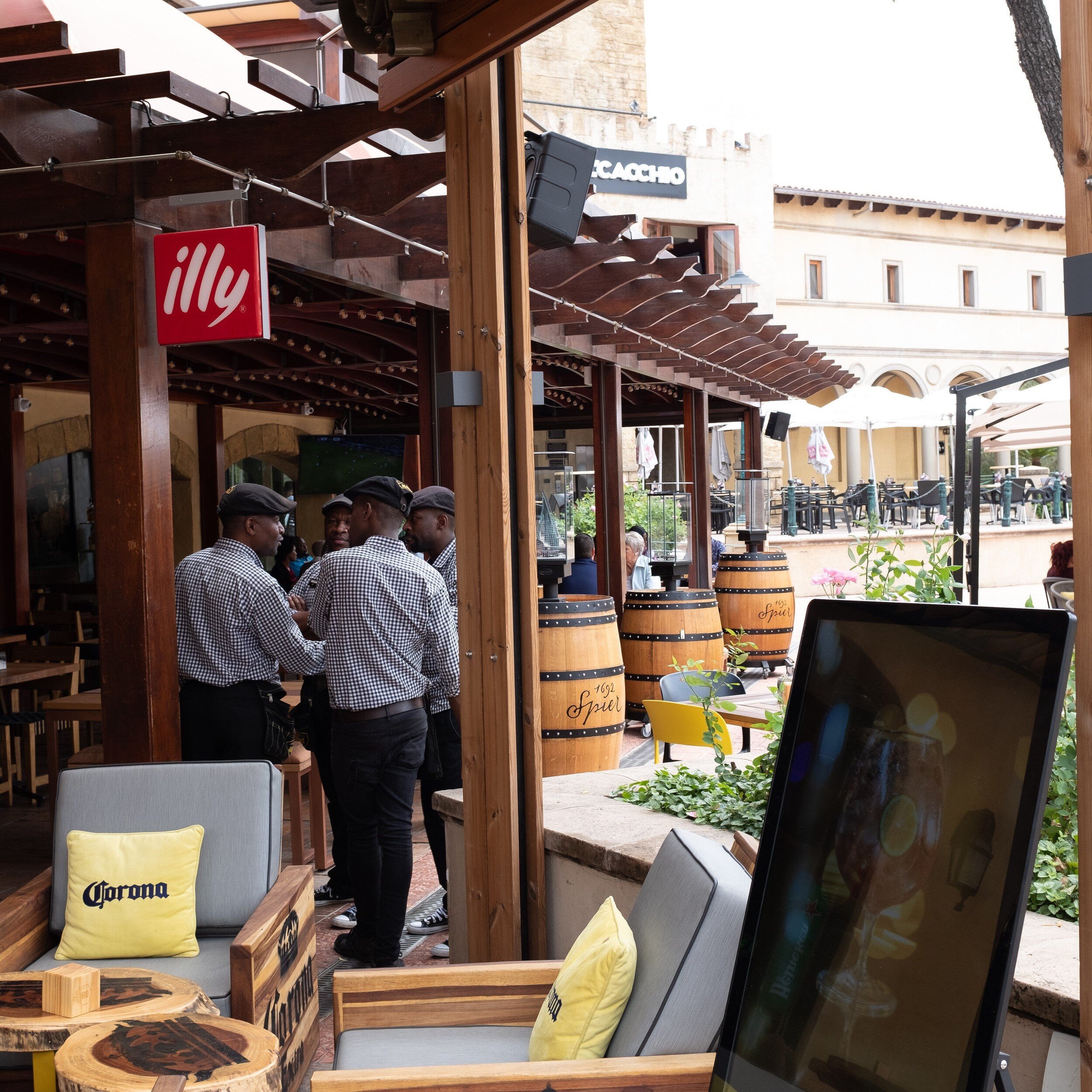
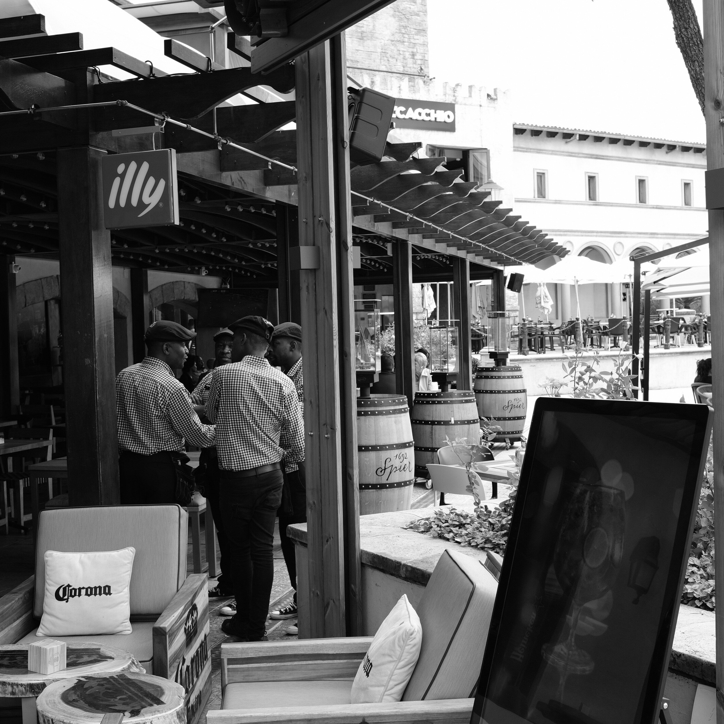
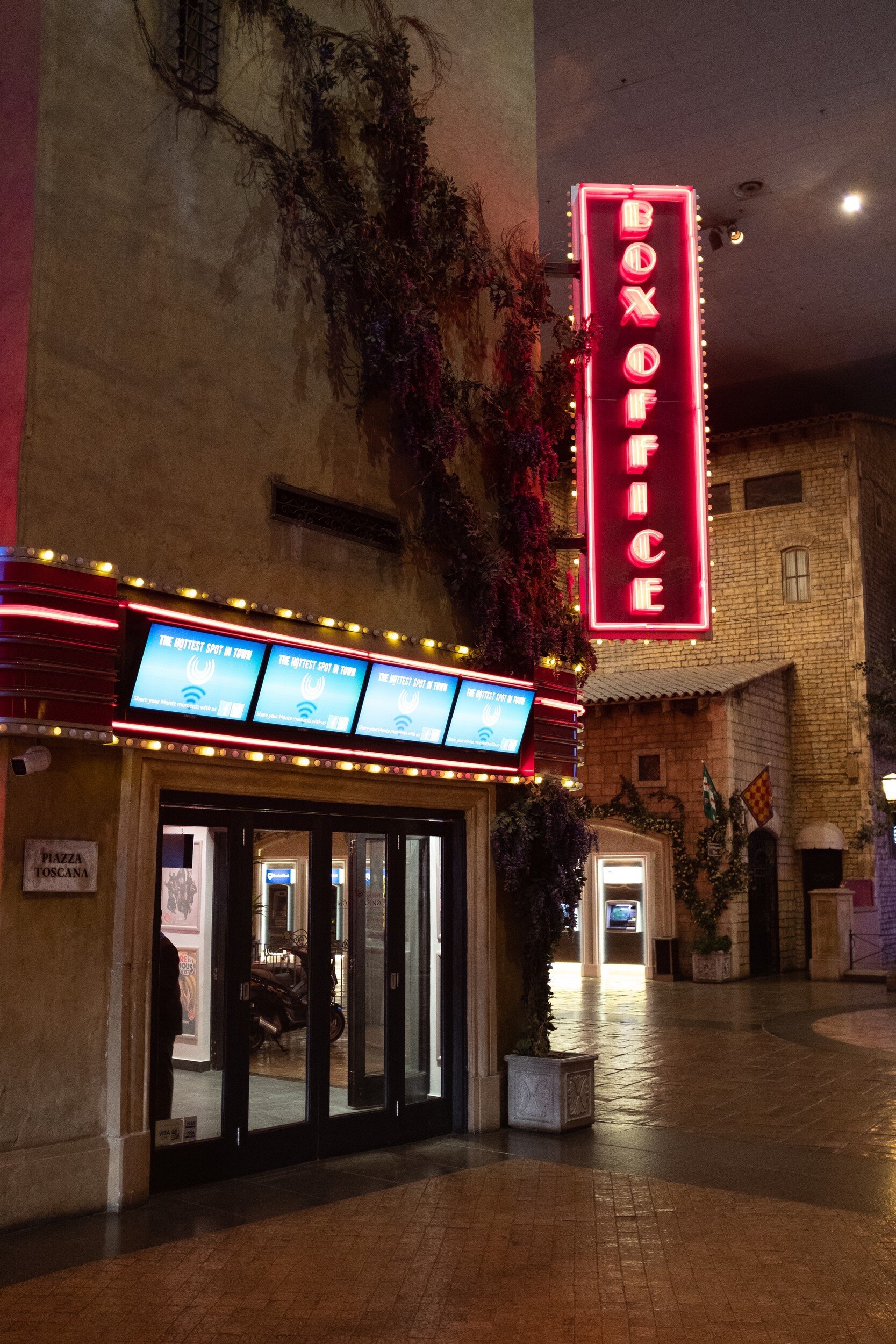
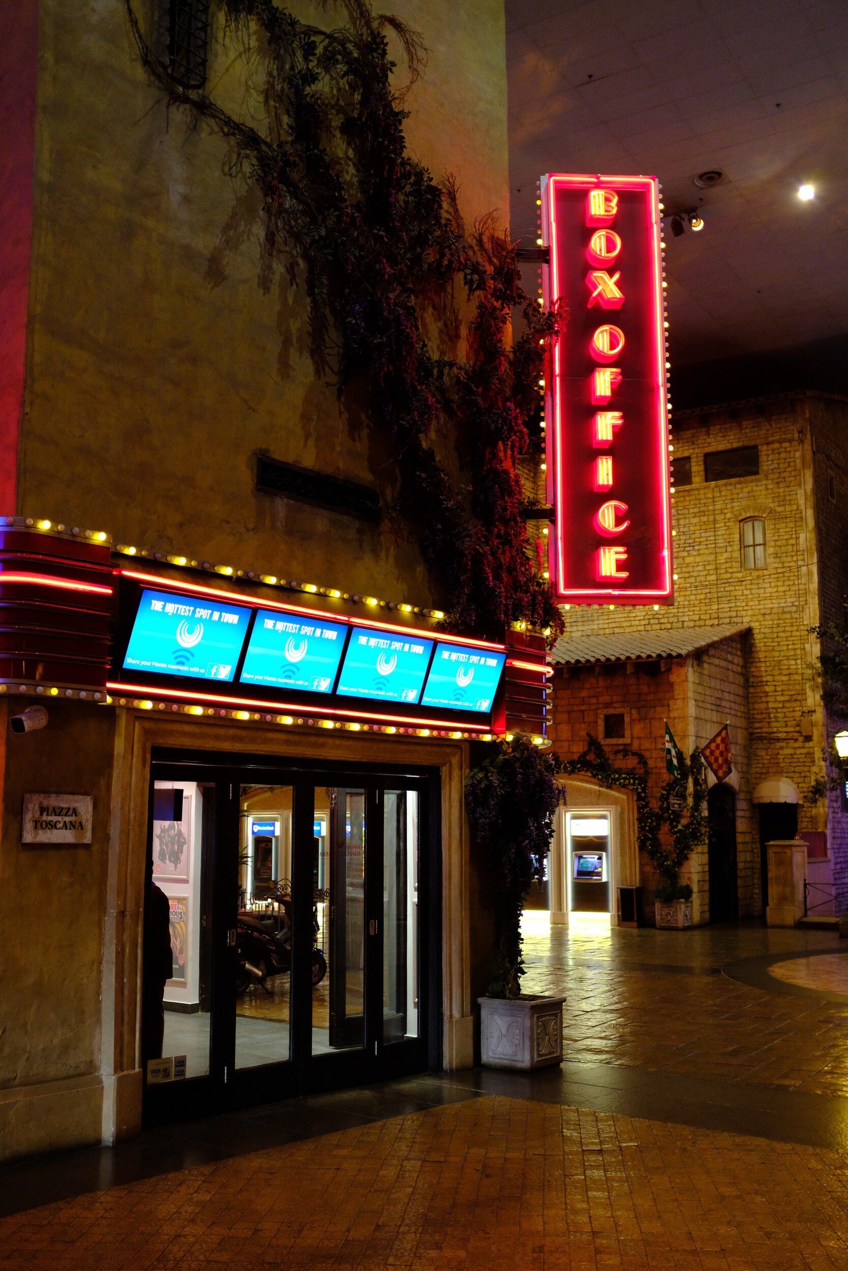
A very nice application of this color I saw a couple of weeks ago, walking downtown Greenville (SC) to take pictures for a project I started working on (a project I will have to postpone for quite some time for reasons I can not disclose yet; but more to come in a future blog post!).
I was taking pictures from a band and the crowd in front of the Hyatt Regency on Noma square when I turned around and saw this amazing light coming through the windows of the hotel front. And of course, I could not resist to capture it. Is the purple actually Pantone Ultra Violet? Probably not. But for sure it looks very much like it. Anyhow, I very much like how the purple and blue lines created by the light interact with the gray metallic lines of the window frames and with the dark areas created by the windows. To add dynamics, I took the image with a Dutch angle (or Dutch tilt).

While we all are in expectation for December's announcement of the Pantone Color of the Year 2019, I thought this was a great reminder of the fantastic color we focused on during 2018.

Medium Format Still Life
Bringing the Mamiya RZ67 Pro II out for some still life shots
Since you never know when inspiration strikes I always keep some film stock ready in the fridge for…
Bringing the Mamiya RZ67 Pro II out for some still life shots
Since you never know when inspiration strikes I always keep some film stock ready in the fridge for immediate use. A couple of weeks ago I noticed that some 120 (medium format) rolls of Ilford Pan F Plus were nearing their expiration date. I therefore brought the Mamiya RZ67 Pro II out, found some grey cloth in my wife's craft room, and created a small table-top setup for a couple of still life images.
The Mamiya RZ67 is a great camera for this type of photography: the bellows focusing mechanism allows for very fine-tuned focusing and the 110mm "standard" lens I used is very sharp and, with it being medium format, gives a very shallow depth of field. Combining this with the Ilford Pan F Plus black and white film created some quite nice still life images with great grey scales. Developing and scanning of the film was (as usual) done by TheFindlab in Utah.
Of course I wanted to show off some cameras, and the Ansco Shur Flash and the Graflex Century Graphic are amongst the nicest I have. Both are actually still in use; in fact, the images from last week's post were made with the Graflex. Don't these two make great models?


Dried palm leaves and seed pods we collected during our trips abroad made also good subjects for still life images with their nice structures .


And what do you think of these tiny reed baskets we purchased when we lived in South Africa? Aren't they just adorable?
But you don't have to go far from home to find objects that are interesting for still life photography: the pieces of wood below I found in our own back yard, and the shells we brought from that same trip that inspired last week's blog post about Ghost Hunting In Savannah.


I thought some kitchen utensils we use on a daily basis would also be great subjects. The garlic jar actually has quite some wabi sabi content.


Especially when they have shiny surfaces.


Ghost Hunting In Savannah
Taking the Graflex Century Graphic on a ghost hunt
Some months ago my family and I spend a couple of nights in Savannah, Georgia. It is one of the oldest…
Taking the Graflex Century Graphic on a ghost hunt
Some months ago my family and I spend a couple of nights in Savannah, Georgia. It is one of the oldest cities in the USA and has a rich history that includes pirates, major events from the Revolutionary War and the Civil War, and.... ghosts...
Although this was a family vacation and not a photography trip, I brought several cameras with me; one being the Graflex Century Graphic my wife had given me a couple of weeks before. It is a cousin of the famous Graflex Speed Graphic 4x5 cameras used by many press photographers from the 1920's to the 1970's. You can see these cameras often in older movies, being handled by journalists and used with humongous bulb flashlights. One of the most famous photographers to use the Speed Graphic was Arthur (Usher) Fellig, better known by his pseudonym Weegee.
The Century Graphic model I have is from a series build from 1949 until 1970, and uses 120 medium format film rolls instead of 4x5 large format film sheets. Since I happened to have some rolls of Ilford Delta 3200 Professional in the fridge, I thought taking these to Savannah for some ghostly night shots would be a nice idea.
I shot the film at an Exposure Index of 1600, and had it only recently developed at its box rate by TheFindlab. I took the images handheld while roaming the streets of Savannah, composing some shots with the optical tube viewfinder and some with the retractable sports viewfinder. Focusing was accomplished with the attached Kalart rangefinder that came with the camera, and apperture and shutter speed were selected with support of a hand held Sekonic light meter. For ease of use I had a cable release attached to the shutter release, which helped making hand held shooting a bit more steady.
It was quite an experience walking the streets with this huge camera, and it was funny how many people noticed and made remarks or asked about the camera. Some even recognized the make and model!
I am rather pleased with the results: the images below are exactly as they came scanned from the lab, with only in one case some minor cropping applied; no other changes made. Most are made hand held, in some cases using walls and lamp posts to brace myself. For the fountain image, however, I placed the camera on the ground to capture the shot; which made composing quite challenging. And in one instance, as you can see, I probably forgot to forward the film; which actually created an unintended but nice double exposure.
Now have a look at the results below, and let me know what you think. Do you see the ghosts?


The Gondolier
The Gondolier
Another day almost finished…
Another day almost finished
Specs of gold on the vastness of the canal
Reflections of the setting sun under Rialto's arch
A hard day's work
Moving 1400 pounds of romance
Along Grande's turns
Thinking about my own sunshine will get me through
O Sole Mio
Working my oar
20 passages a day
Speeding 36 feet of shiny black wood carrying
Pairs of lovers along this watery highway
Their romance will pay our dowry
Water ripples against ancient walls


A New Photo Book Is In The Works
A new coffee table photo book with PicTales to be published soon!
After having created two magazine-type photo books and one square book, I decided to try my hand at a…
A new coffee table photo book with PicTales to be published soon!
After having created two magazine-type photo books and one square book, I decided to try my hand at a more substantial volume.
A photo book is another great way to collect fine art photography. It will not break the bank, no need for framing, no need for wall space, and it provides a great collection of a photographer's work, and insight in his/her vision and approach of the medium.
With 28 PicTales published on the blog as per today, I thought it would be a great opportunity to bundle these in a nice coffee-table type book.
Since creating the other books directly in LightRoom with Blurb worked so well, I will go that path again with this new book:
the LightRoom and Blurb combination is easy to use;
I retain complete creative control over the production;
and the print-on-demand solution Blurb offers doesn't make me need to take out a second mortgage to pre-finance printing.
The PicTales I am going to select for this book are aligned with my vision as photographer: showing what not clearly can be seen, or providing a new narrative to an existing situation.
At this moment it is still early stages, and there are several decisions I need to make during the next two weeks:
what PicTales to include: all would probably be too many. I also need to decide whether to only choose stories that have black and white images, or also include some with color images. This will have an immediate impact on sequencing.
What cover to use: hardbound with image wrap, or hardbound with a sleeve.
What paper to use: I have not made a final decision regarding the paper, but it most likely will be the Proline Uncoated paper I used for the 10 Haiku booklet. It has a very nice rendering of black & white and color images, and it has a very nice feel to it.
What title to use: I have some ideas, but these need to be thought through a bit more.
I aim to have the book ready for purchase before Christmas shopping season starts.
As a sneak peek, below some images that already have been selected for the book (can you find the accompanying PicTales?).


Memories (A Haiku)
Memories
a faded picture…
Memories
a faded picture
bringing to life what once was
gone, not forgotten
What Are You Looking For?
What can I do to improve my services to you? A brief survey.
As per today, I have 106 blog articles posted. These are a mix of Haiku, PicTales, Essays, information…
What can I do to improve my services to you? A brief survey.
[Update: the survey has been closed]

As per today, I have 106 blog articles posted. These are a mix of Haiku, PicTales, Essays, information about fine art photography, and information about my photography in general.
While visitors to the site have the opportunity to purchase open edition prints, I am also considering to offer limited edition prints and maybe some gift articles (e.g. phone cases, coasters, greeting cards).
To explore what you like from the blog, and what products you would be interested in, I have designed a brief survey (9 questions only) that can be completed in just a couple of minutes (updated: the survey is closed).
Of course, the survey will be anonymous (IP addresses or other info will not be collected), and I will share the results in a future blog post.
I will highly appreciate it if you take this survey and share your thoughts regarding the site, the blog, and product offerings with me.
Thanks for participating!
Eric

What Aspect Ratios For Fine Art Images
Explaining why I have a preference for the 5:4 aspect ratio
For displaying and printing my images, I have a distinct preference for using the 5:4 aspect ratio. In this…
Explaining why I have a preference for the 5:4 aspect ratio
For displaying and printing my images, I have a distinct preference for using the 5:4 aspect ratio. In this post, I will explain why but first allow me to talk a bit about aspect ratios in general.
The Difference Between Aspect Ratios and Film/Sensor Size
Why I Prefer The 5:4 Aspect Ratio
Challenges Of The 5:4 Aspect Ratio
Aspect Ratios Explained
The Aspect Ratio of an image can be defined as the relationship of the with of the image in relation to its height.
In photography, we have several aspect ratios for images, based on the film negative, the camera sensor, or the print. The most common are:
4:3 Aspect Ratio
This is the aspect ratio used by most point and shoot and other digital cameras aimed at the general consumer market. This aspect ratio actually is based on the standard ratio of computer monitors. This way, the images from the camera would nicely fill the full screen of the monitor. Interestingly, the monitor aspect ratios seem to be influenced by the old cinematic film.

3:2 Aspect Ratio
While this is the aspect ratio most 'pro' DSLRs and some other digital cameras use, it actually originates from the 35mm film that became the standard for most film cameras from the mid-1940's onwards. It was actually developed from the 4:3 aspect ratio cinematic film mentioned above (3:2 is half 4:3). The 3:2 aspect ratio is also the reason why so many "one-hour" film labs produced 6x4 prints as their standards. On a side note: while 'everyone' talks about 35 mm film, the official name actually is 135 film.

1:1 Aspect Ratio
This is, as you might have guessed, square. Images with this aspect ratio were (and still are!) produced by so-called Twin Lens Reflex (TLR) cameras. These are the cameras with two lenses on the front: one to take the image, and one to compose the image. The photographer looks through a screen on top of the camera which shows the image from the top lens. This is a very convenient and inconspicuous way to take pictures. Hasselblad is a famous producer of SLR cameras that also produce 1:1 ratio images.

5:4 Aspect Ratio
This is the aspect ratio most commonly associated with large format cameras: the ones where you see the photographer 'hiding' behind a black cloth while composing the image. Large format for most people means 8x10 inch sheet negatives. But 4x5 inch negatives are also still quite popular, while larger and extremely large negative sheets are in existence. <back to top>

The Difference Between Aspect Ratios and Film/Sensor Size
Aspect ratios should not be confused with film or sensor sizes. While with modern image handling tools like LightRoom any digital (originally digital or scanned film) image can be cropped to any aspect ratio (and more on that later), I would like to point out that film and sensor sizes are something totally different. While sensors in digital cameras will be built according to one of the aspect ratios mentioned above, especially with film the build of the camera will have a direct impact on the size of the negative, and as a consequence, the aspect ratio of the negative.
This is specifically the case for cameras that use 120 film:
Some cameras (e.g. Hasselblad, TLRs) create images 6x6 centimeters in size (1:1 aspect ratio);
Some cameras (e.g. Mamiya RZ67 Pro II, Pentax 67) create images 6x7 centimeters in size (5:4 aspect ratio);
Some cameras (e.g. Fujifilm GS645S) create images 6x4.5 centimeters in size (4:3 aspect ratio);
Some cameras (e.g. Fujifilm 6x9) create images 6x9 centimeters in size (3:2 aspect ratio);
And some cameras create panoramic images, even to 6x17 centimeters in size (3:1 aspect ratio).
Why I Prefer The 5:4 Aspect Ratio
The quick and easy answer is: it is all a matter of taste. I find images with this aspect ratio very pleasing to the eye. For me, 5:4 is the 'perfect' balance of height and width.
But there is actually a bit more to it.
Common print sizes, influenced by large format photography, are 4x5, 8x10, and 16x20 inches. And when I already have a negative that has a 5:4 aspect ratio, there is no need for cropping and throwing away part of the image I created.
Another reason is the fact that the 3:2 aspect ratio from my X-Pro1 and 35mm film cameras is actually quite a 'long' format.


This especially becomes obvious when creating images in portrait orientation. Sometimes the 3:2 aspect ratio results in just too much sky, too much sea, or too much land at the top or bottom of the image to make a good composition. The 5:4 aspect ratio solves this problem in a natural way because it is...shorter. <back to top>
Challenges Of The 5:4 Aspect Ratio
Now that I decided that I want to create and print most of my images in the 5:4 aspect ratio I created quite a challenge for myself. It means that when I am not shooting with a camera that creates images with this aspect ratio, I have to shoot with cropping in mind. Since most of my cameras are either digital with a 3:2 sensor or use 135 film, this is actually most of the time.
While composing the image and looking through my viewfinder, I already need to allow for the cropping needed to create the final image with an aspect ratio of "width: height = 5 : 4". For the image below, for example, I already knew that I would like a composition with three flags better than one with four flags. I however also wanted the Capitol at about one third from the bottom of the image.


Does that mean that all my images are in the 5:4 aspect ratio? No: I also like square images very much (and with those come other, specific composition challenges), and I also like panoramic images once in a while. As you can see in my portfolio. <back to top>
I hope the above has provided some insight into image aspect ratios, and the reasons why I like the 5:4 ratio so much.
Now go ahead, have a look at my portfolio, and let me know what you like most.

What Type Of Photographic Print Did You Buy?
A brief introduction to photographic prints
You decided you want to collect fine art photography and you have bought, framed, and displayed your…
A brief introduction to photographic prints
You decided you want to collect fine art photography and you have bought, framed, and displayed your first print.
You are admiring your purchase, and probably showing it off to your friends. But do you actually know what type of print it is (your friends might ask...)? Ideally, you should have known before you bought the print. Or at least you should have seen it on the certificate of authenticity.
Assuming you want to buy more photographic prints in the future, and to offer a helping hand for making educated decisions, I have listed after the break a brief overview of the most common photography print types you might encounter when searching for your collection.

Contemporary print types
The first group of photographic printing techniques is what I like to call 'contemporary'. Although some of these techniques have been in use since the early 20th century, all are still currently being used by a broad range of photographers. The more modern printing techniques in this section are very commonly used by fine art photographers and are most likely the ones you might encounter at art fairs and even in high-quality galleries.
Gelatin silver print (silver halide print)
This is what most people have in mind when talking about black and white photography. These prints are made in a 'wet process', using chemicals in a darkroom. The printer uses an enlarger to project the image from a negative film onto photographic paper that has been made sensitive to light by adding a gelatin silver layer. Changes to the final print can be made by exposing the photographic paper for a shorter or longer time, sometimes using dodging and/or burning tools to impact certain areas of the image.
After exposing the photographic paper, it is put through several chemical baths to develop and fix the image.
When correctly done, this process delivers beautiful black and white images of a very high archival quality and longevity.
C-Print (Chromogenic print)
This is basically the same technique as for the gelatine silver print but printed from a color negative or slide. It is the most common type of color photographic prints made in the darkroom.
The big difference is the photographic paper used. C-Print paper has different layers, with each layer on the paper sensitized to one of the primary light colors (red, green, and blue). Since color is rendered different on paper than with light, the light-sensitive layers on this paper are composed of cyan, magenta, and yellow.
Whereas the enlarger, photographic paper, and chemicals are different than for gelatin silver prints, the whole darkroom process basically is similar. And this process also creates (color) images of very high archival quality and longevity.
Digital C-Print
Where gelatin silver printing and C-printing has been available since the early and mid 20th century, the Digital C-Print is from a more recent era.
With C-printing the wet part of the developing process is actually the same as with the former two printing techniques (putting exposed photographic paper through several chemical baths). The difference concerns exposing the paper: where for gelatin silver printing and C-printing a traditional negative is used in an enlarger, for Digital C-Printing a digital 'negative' is projected with laser light on the paper.
This means that it is no longer necessary to have actually a negative film available to make darkroom prints: images can be directly used from photo manipulation programs like Lightroom, Photoshop, PhaseOne, etcetera.
Since the actual developing process is similar to gelatin silver and traditional C-printing, the prints created with Digital C-Printing also have a very high archival quality and longevity.
Giclee or archival inkjet prints
With the development of high-quality inkjet printers and pigment-based inks, the giclee or archival inkjet print probably has become the most common printing technique for fine art photography today.
It is important to distinguish the giclee print from regular inkjet prints: it is imperative that pigment-based inks are used to achieve the archival quality and longevity that true giclee prints have. When purchasing a limited edition print this, of course, should be indicated on the certificate of authenticity.
Polaroid
Like other traditional analog (film-based) photography, Polaroid photography has made quite a come back recently. The Polaroid process creates dye diffusion transfer prints, where the chemicals included in the film package create an 'instant' image on the light sensitive paper that also is held within the camera.
This printing process generally creates unique, 'one edition' images. However, when the peel-apart version of instant film is used it is possible to retrieve a negative from the sheet with the chemicals (which usually is thrown away). That negative then can be used for other printing techniques as mentioned above.
The archival quality and longevity of instant prints are not as good as prints created with any of the other processes mentioned in this blog.
Vintage print types
The second group of photographic printing techniques contains processes I like to call 'vintage'. Although some of these processes are still in use by fine art photographers, they are more specialized and less commonly used than those above.
Cibachrome (silver dye bleach print)
Although I placed this process in the Vintage group, it is quite new: being developed in the early 1960's.
Prints created using this technique are recognizable from their high-gloss, plastic-like paper base and the very bold colors. The prints are created through a process where dyes that exist in the photographic paper are selectively dyed, providing one of the most stable and long-lasting of all color prints.
Photogravure
With this process a traditional negative is transferred to a copper plate, which then can be used for making multiple prints. Since this is copper plate printing, there is no use of light sensitive paper or darkroom chemicals. The images sometimes are recognizable by the imprint the copper plate left on the paper.
Albumen print
This is an old technique where images from a negative are printed on paper that has been made light-sensitive with a coat of egg white sensitized with silver salts. The negatives used often were glass plate negatives.
Albumen prints, which were very common during the 19th century, render a very high level of detail.
Cyanotype
Cyanotypes are created using a contact-printing process. Paper is made light-sensitive by brushing iron salts on it. An object, or a negative, is then placed directly on the paper and exposed by light (this can be done with an enlarger or any other light source; even just laying it in the sun will work).
Prints created using this process are easily recognizable by their bright blue tone.
Daguerreotype
This is actually one of the oldest processes for making photographs, and it produces one-of-a-kind type of images. A copper plate is coated with a silver emulsion and then directly exposed in-camera. After further chemical treatment in a darkroom it produces an image directly on the copper plate.
Daguerreotypes are immediately recognizable because of their very shiny surface, almost like a mirror, and the very high level of detail in the image.
These photographs are also extremely fragile and usually are kept within a protective sleeve or presentation frame.
Daguerreotypes were later replaced by Platinum and Palladium prints: whereas the basic technique of creating an image is the same as with the Daguerreotype, they are longer lasting and have a greater tonal range.
I hope the information above provides some helpful starting points for you to make educated decisions regarding building your fine art photography collection.